Unlock a world of possibilities! Login now and discover the exclusive benefits awaiting you.
- Subscribe to RSS Feed
- Mark as New
- Mark as Read
- Bookmark
- Subscribe
- Printer Friendly Page
- Report Inappropriate Content
A scatter chart or a bubble chart is easy to make in QlikView – if you know how to… There are however a couple of things that may be confusing when you make the chart.
The first thing is the Dimension. Many think that this is identical to one of the axes of the chart, and for most chart types it is. But not for a scatter chart. Here, the logical dimension is not the same as the graphical.
Instead, you should visualize your graph and ask yourself: “What should each dot or bubble represent?”
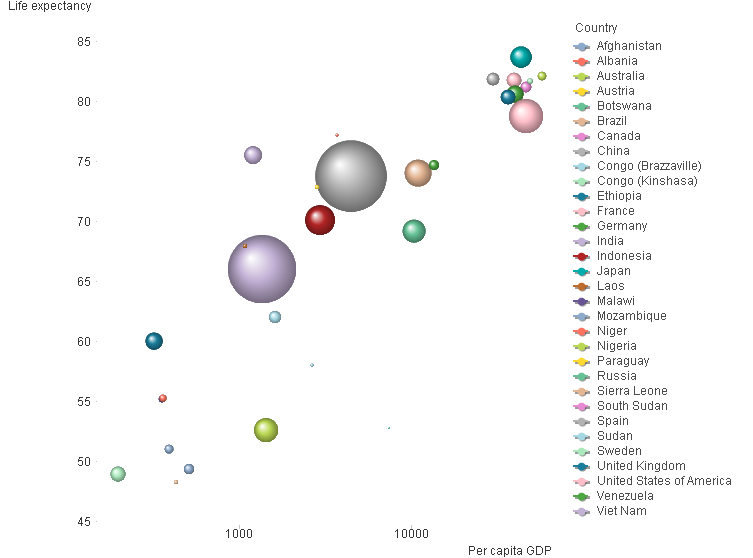
In the graph above, each bubble represents a country. In your case, it could perhaps be one bubble per customer, supplier or product. This is your dimension.
The next question is: “Where should the bubble be positioned?” In the graph above, the x-coordinate is per capita GDP and the y-coordinate is the life expectancy. You may want to use e.g. the total order value, gross margin, net cost or some other numbers. These are your measures. These are used for the axes in the graph.
You need at least two expressions. Optionally, you can have a third expression that will be used for the size of the bubbles. In the chart above, the country population is used as third expression.
When defining the measures, you encounter the next confusing thing: A country has only one GDP, but QlikView still wants you to use an aggregation function, e.g. Sum() or Avg(). The reason is that QlikView cannot “know” if your data has one or several records for each dimensional value. So, you need to use an aggregation function to tell QlikView what to do, should there be more than one record. If there really is only one record per dimensional value, then it doesn’t matter if you use Sum() or Avg(). Both will work fine.
But if you have several records per dimensional value, then you need to stop and think. Do you want to sum the records? Or do you want the average?
Once you know which dimension and expressions to use, it is straightforward:
![]()
- Create a chart and choose Scatter Chart. Click Next.
- Add your dimension. Click Next.
- Add the fields that you want to use for your two expressions in the “X” and “Y” controls.
- If you want a bubble chart, you need to add the third expression that determines the size of the bubbles.
- Check “Advanced mode” to the lower left. QlikView 11 unfortunately jumps to the “Sort” page here, so you need to click “Back” to verify that the right aggregation functions for your expressions are used. You may need to change the functions.
- Click Finish.
Now you will have made a scatter chart. To make it more beautiful, you should also consider the following:
- Choose a style [Style – Look]
- Increase the Bubble size [Presentation – Max bubble Size]
- Change the scale of one or both axes. [Axes]
- Remove the “Force 0” option.
- Use a logarithmic scale.
If you want to try to make a scatter chart using some good sample data, look at the document Creating a Scatter Chart.
You must be a registered user to add a comment. If you've already registered, sign in. Otherwise, register and sign in.