Unlock a world of possibilities! Login now and discover the exclusive benefits awaiting you.
- Subscribe to RSS Feed
- Mark as New
- Mark as Read
- Bookmark
- Subscribe
- Printer Friendly Page
- Report Inappropriate Content
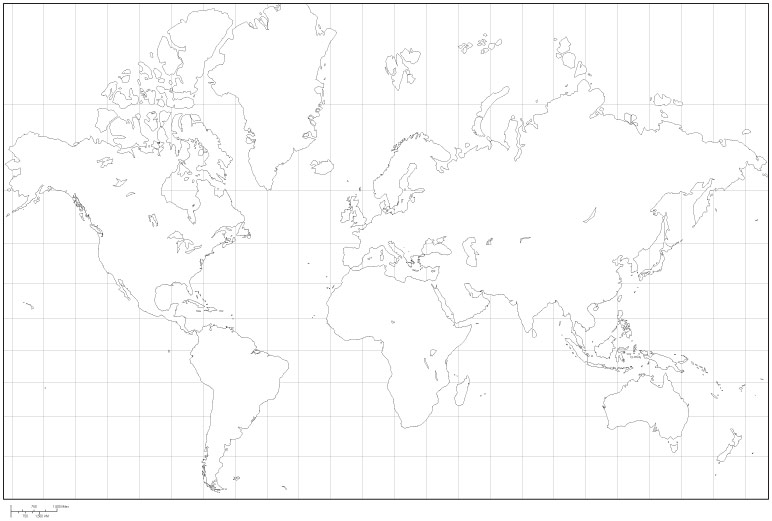
Like all map projections, the Mercator projection (a cylindrical map projection presented by the Flemish geographer and cartographer Gerardus Mercator in 1569) is attempting to fit a curved surface onto a plane distorting the results. If you look at a map constructed using Mercator projection (see example above) you will get a distorted idea about the size of geographical objects. For instance, take a look at Greenland and compare its extension with Australia. It seems to be bigger, isn't it?

If we overlap the shapes of the continent and the island we can see that, in fact Australia is 3+ times bigger than Greenland.
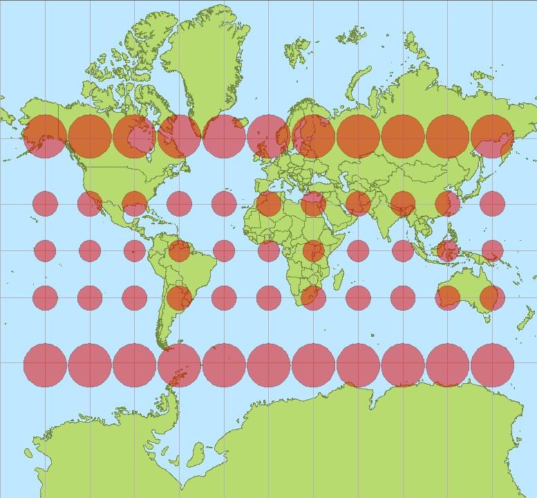
The classic way of showing the distortion inherent in a projection is to use Tissot's indicatrix, as in the picture below you will notice that the size of the red ellipsis representing distortion becomes bigger in areas that are far from equator, in fact by construction, the Mercator projection is perfectly accurate along the equator and nowhere else.
Map projections in Qlik Sense
The current release of Qlik Sense ships with two map projections, Mercator and Unit (1:1 projection). We recently covered the available Geo Functions in a post called Hidden gems in Qlik Sense geospatial functions.
By using some of those functions we could create maps as in the example below where the projection function helps to shrink the Canada shape.

Please note that in many free KML files some sort of projection (usually Mercator) has already been applied.
AMZ
Thanks to Jonathan Pole and Yang Yang
You must be a registered user to add a comment. If you've already registered, sign in. Otherwise, register and sign in.