Unlock a world of possibilities! Login now and discover the exclusive benefits awaiting you.
- Qlik Community
- :
- All Forums
- :
- QlikView App Dev
- :
- Second expression as a line in combo
- Subscribe to RSS Feed
- Mark Topic as New
- Mark Topic as Read
- Float this Topic for Current User
- Bookmark
- Subscribe
- Mute
- Printer Friendly Page
- Mark as New
- Bookmark
- Subscribe
- Mute
- Subscribe to RSS Feed
- Permalink
- Report Inappropriate Content
Second expression as a line in combo
Hello,
I want to create chart like this:
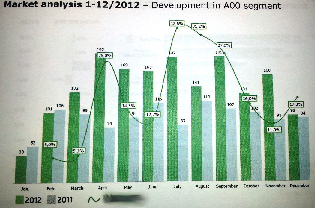
I am able to create bar chart comparing the two years value, with month as a dimension.
I am also able to create line chart showing the value of change between the two years. (fisrt calculate value for 2011, than for 2012, variance 2012-2011 and finally variance/2011... and showed as a line)
What I am not able to do is to display both data in one combo chart.. If I try to, I get regular "bar chart" values, but my line is a flat line in the bottom of the chart... I am completely unable to change the position of the line expression to next side of the chart...or at least to raise the zero from the ground and to change the scale for the line expression.
As you can see here - where there is 5,0% for line expression, there is something around 38 for bar chart.
I tried settings in Properties/Axes/Position... but nothing happens, only chart was bit smaller.
Please help!  THX
THX
- Tags:
- new_to_qlikview
- Mark as New
- Bookmark
- Subscribe
- Mute
- Subscribe to RSS Feed
- Permalink
- Report Inappropriate Content
Try changing in the chart's properties -> Axes -> Click on the Expression represented by the line, and then Position = Right. This will put the axis on the top for the line instead of using the larger numbered values on the bottom that represent the bars
- Mark as New
- Bookmark
- Subscribe
- Mute
- Subscribe to RSS Feed
- Permalink
- Report Inappropriate Content
After changing the position to top... This is what I get:
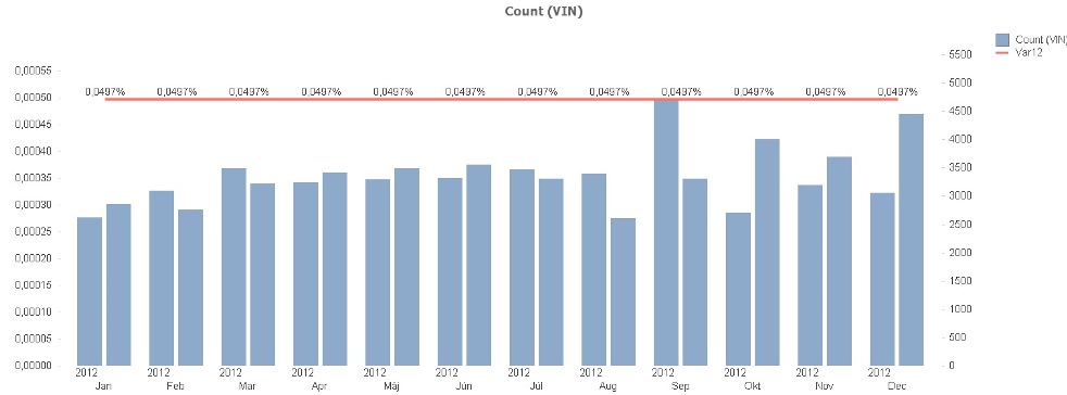
In line chart "the four expressions" work fine... here in combo, something affects them... maybe the year dimension?
- Mark as New
- Bookmark
- Subscribe
- Mute
- Subscribe to RSS Feed
- Permalink
- Report Inappropriate Content
Could you post what your expression is? What is the dimension in the line chart that works?
- Mark as New
- Bookmark
- Subscribe
- Mute
- Subscribe to RSS Feed
- Permalink
- Report Inappropriate Content
BAR expression: Count(VIN)
LINE expression:
Var12 =Variance/2012
NOT SHOWED expressions:
Variance =2013-2012
2013 =Count({<[Year]={'2013'}>} [VIN])
2012 =Count({<[Year]={'2012'}>} [VIN])
Chart dimensions: Year, Month
- Mark as New
- Bookmark
- Subscribe
- Mute
- Subscribe to RSS Feed
- Permalink
- Report Inappropriate Content
So the line expression is:
[Variance Field from Source] / 2012? Why 2012? What if you add another bar for Variance in your chart? It seems to me that 'Variance' for year is the same for every year, at least based on what the line is saying 
- Mark as New
- Bookmark
- Subscribe
- Mute
- Subscribe to RSS Feed
- Permalink
- Report Inappropriate Content
Combination of the four expressions is working fine - I used the same here:
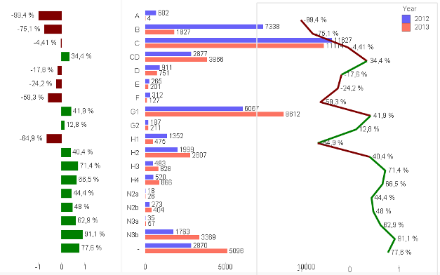
In the middle there is Count(VIN) as well with two dimensions year and segment (in previous charts it was year and month, but it is the same for this pupose)
On the sides there are almost identical charts - only expressed as a bar or as a line... The difference is, that the side charts have only one dimension - and it is not a year!
- Mark as New
- Bookmark
- Subscribe
- Mute
- Subscribe to RSS Feed
- Permalink
- Report Inappropriate Content
Uncheck the box named: Forced 0
- Mark as New
- Bookmark
- Subscribe
- Mute
- Subscribe to RSS Feed
- Permalink
- Report Inappropriate Content
I'm not sure if you need an extra symbol in your set anasyis, just give it a try and see if it works:
2012 = Count({$<[Year]={'2012'}>} [VIN])
2013 = Count({$<[Year]={'2013'}>} [VIN])