Unlock a world of possibilities! Login now and discover the exclusive benefits awaiting you.
- Qlik Community
- :
- Forums
- :
- Analytics
- :
- New to Qlik Analytics
- :
- Adding Avg line in a line chart
- Subscribe to RSS Feed
- Mark Topic as New
- Mark Topic as Read
- Float this Topic for Current User
- Bookmark
- Subscribe
- Mute
- Printer Friendly Page
- Mark as New
- Bookmark
- Subscribe
- Mute
- Subscribe to RSS Feed
- Permalink
- Report Inappropriate Content
Adding Avg line in a line chart
What I have :
Annual Income of customers. (CustId, AnnualIncome)
Monthly spending data for customers. (CustId, Month, Amount )
What I want to do :
1. Chart % of income spent by customers each month ( Amount / AnnualIncome ).
2. Create a 'band' and point out outliers. For example, if you spend more than $500 above or below the average, you are outside the band.Ideally this band would be bound by two lines (like Reference lines) and have its own background color.
My attempts:
Use line chart and 'Reference lines'.
Problems:
1. The 'Reference lines' are just straight lines, and not the average of a particular month. ( i.e. they should follow the monthly average spend).
2. Don't know how to color the background bound by these lines.
Use combo chart
I can get the 'reference' lines follow the actual average (they are a measure).
Problem:
1. I don't know how to apply multiple dimensions to Combo chart. I tried using drill-down but no luck.
Attaching example with both approaches.
My actual use case is more complicated than this (using aggr, rangesum, above ) and Reference lines don't seem to like that kind of expression.
- « Previous Replies
-
- 1
- 2
- Next Replies »
Accepted Solutions
- Mark as New
- Bookmark
- Subscribe
- Mute
- Subscribe to RSS Feed
- Permalink
- Report Inappropriate Content
You can do that .
A bit more on the 3 charts. The one on the right is static. Each customer has a measure that is calculated with Set Analysis. There could be a lot of setup which is OK but not if the customer list is not static.
The 2 on the left are dynamic and will support changing customer lists and work for long or short lists.
The one with the legend is autocolored by the engine 'by dimension'.
When you color by expression you can control the line colors . For example the following randomizes the color for customers but keeps black for the +/-500 lines. The only thing is that the legend disappears which i'm not sure why but would need to investigate. To enact the following change in the sample, go to either of the line charts, and under 'Colors and Legends' on the right, change the Color from 'auto' to custom and select 'expression' in the drop down. (notice you lose the ability to control/show a legend). then enter the following expression.
if(ChartDimension='500$ Below Average' or ChartDimension='500$ Above Average', black(), argb(255,rand()*255,rand()*255,rand()*255))
- Mark as New
- Bookmark
- Subscribe
- Mute
- Subscribe to RSS Feed
- Permalink
- Report Inappropriate Content
Is that not possible ? seems simple enough thing on other platforms.
- Mark as New
- Bookmark
- Subscribe
- Mute
- Subscribe to RSS Feed
- Permalink
- Report Inappropriate Content
Which would be the dimensions? Month and Customer? Or just Month?
You can build the Combo chart as you described and visualize for each Month a bar and one or two points (lines). Also, you could use two Reference lines: one with the 500$ reference and another one with the total average for the whole year.
- Mark as New
- Bookmark
- Subscribe
- Mute
- Subscribe to RSS Feed
- Permalink
- Report Inappropriate Content
Both Month and Customer are needed dimensions. Ideally month would be on x-axis and each line(in chart) represents a customer.
- Mark as New
- Bookmark
- Subscribe
- Mute
- Subscribe to RSS Feed
- Permalink
- Report Inappropriate Content
Could you post a screenshot of what you try to accomplish (drawing or screenshot of the chart created with another tool)? I'm afraid what you are trying to do is not possible.
- Mark as New
- Bookmark
- Subscribe
- Mute
- Subscribe to RSS Feed
- Permalink
- Report Inappropriate Content
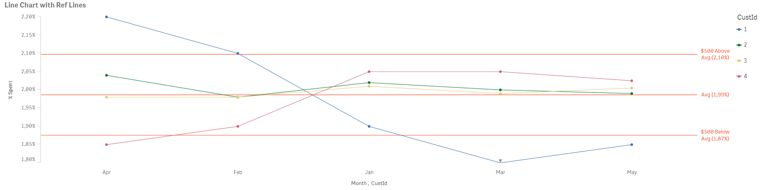
It should look like this except the Avg and other lines should not be straight likes (they should be real average for respective months).
The expression I am using for Avg Reference line is =Avg(Amount/AnnualIncome).
Thanks
- Mark as New
- Bookmark
- Subscribe
- Mute
- Subscribe to RSS Feed
- Permalink
- Report Inappropriate Content
I think I get what you are trying to accomplish and I'm afraid it is not possible in the current version.
Just to be sure, I'll ping plu.
- Mark as New
- Bookmark
- Subscribe
- Mute
- Subscribe to RSS Feed
- Permalink
- Report Inappropriate Content
Hi,
Try this expression
1. Chart % of income spent by customers each month ( Amount / AnnualIncome ).
=Sum(Amount)/Sum(Total <CustId> Amount)
HOpe this helps you.
Regards,
Jagan.
- Mark as New
- Bookmark
- Subscribe
- Mute
- Subscribe to RSS Feed
- Permalink
- Report Inappropriate Content
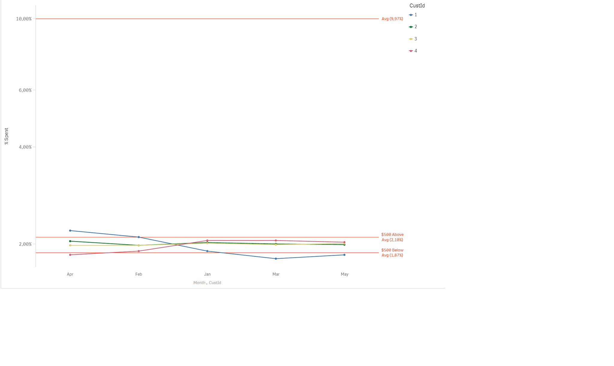
I guess you ment
Sum(Total <CustId> Amount)/SUM(Total <CustId> AnnualIncome)
as the average line. I also tried Sum(Total <Month> Amount)/SUM(AnnualIncome)
This doesn't work either, it shows a straight line at 10% ( while I am expecting a line that actually represents the monthly average, at around 2%)
Attaching the latest qvf.
- Mark as New
- Bookmark
- Subscribe
- Mute
- Subscribe to RSS Feed
- Permalink
- Report Inappropriate Content
Folks, no solution to this thing ?
- « Previous Replies
-
- 1
- 2
- Next Replies »