Unlock a world of possibilities! Login now and discover the exclusive benefits awaiting you.
- Qlik Community
- :
- Blogs
- :
- Technical
- :
- Design
- :
- Accumulations
- Subscribe to RSS Feed
- Mark as New
- Mark as Read
- Bookmark
- Subscribe
- Printer Friendly Page
- Report Inappropriate Content
When building analytical applications you very often encounter cases where you want to accumulate numbers inside a chart. It could be that you want to calculate a Year-to-date number, or a rolling 6 month average, or a moving annual total.
When creating an accumulation, there are two fundamental challenges. First, there is the question on how to treat dimensional values with no data. The tables below illustrate the problem:
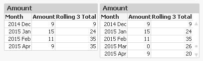
In this example, there is no data for the month of March. The default behaviour is that this row then is omitted, see left table. This leads to an incorrect accumulation – the rolling 3 total for April includes January, which it shouldn’t. The table to the right however treats missing months correctly.
Secondly, there is the question on how to treat the first dimension when there are several dimensions. The tables below illustrate the problem:
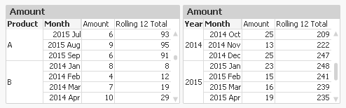
In the left table, you want the accumulation to re-start for each new product. You do not want the accumulation to continue from the previous product. Note that for ‘2014 Jan’ the accumulation is reset.
But in the right table, it is the other way around: A moving annual total should span over two calendar years, so you want the accumulation to continue over into a new value of the first dimension.
In QlikView and Qlik Sense there are several ways to create accumulations, each with its own pros and cons.
1. Using the control in QlikView charts
In a QlikView chart, you can easily create an accumulation just by selecting the right chart setting:
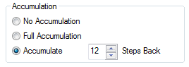
This method will however fail both the above challenges. Also, an accumulation can only be made over the first dimension, and the accumulation will always be reset for a new value in the second dimension.
Further, you cannot use it to calculate moving averages. It only works for calculations of sums.
2. Using the Above() function
If you use the Above() function in a chart table like
RangeSum(Above(total Sum(Amount) , 0, 12))
or in an Aggr() table like
Only(Aggr(RangeSum(Above(total Sum({Amount),0,12)), YearMonth))
you will get a 12-month moving total. It will pass the “multiple dimensions” challenge: By using – or not using – the total specifier in the Above() function you can decide which behaviour you want.
But it will fail the “no data” challenge. There is a however a way to make an accumulation in an Aggr() table work also for this problem: Trick the QIX engine to show all rows by adding a zero term for all dimensional values:
Only(Aggr(RangeSum(Above(totalSum(Amount) + Sum({1} 0),0,12)), YearMonth))
and enable the display of zero values. Then you will get the right numbers also when some dimensional values are excluded.
3. Using an As-Of table in the data model
The As-Of table, is an excellent solution that will pass both challenges. Here you must set the condition using Set Analysis:
Sum({$<MonthDiff={"<12"}>} Amount)
However, it has one drawback: When a user clicks in the chart, a selection will be made in the AsOfMonth. But you don’t want the user to make selections here: You want month selections to be made in the real month field. So I usually make my charts read-only if they use the AsOfMonth as dimension.
With this, I hope that you understand accumulations better.
Further reading related to this topic:
Calculating rolling n-period totals, averages or other aggregations
You must be a registered user to add a comment. If you've already registered, sign in. Otherwise, register and sign in.