Unlock a world of possibilities! Login now and discover the exclusive benefits awaiting you.
- Subscribe to RSS Feed
- Mark as New
- Mark as Read
- Bookmark
- Subscribe
- Printer Friendly Page
- Report Inappropriate Content
“Cardification” might not be one of the shiniest new features in Qlik Sense 3.1 but it’s an important step towards something bigger*.
For me, and I guess for some of you as well, one of the challenges when it comes to create a nice looking new app appears when composing a multi-object sheet in Qlik Sense. My struggles are related with the fact that the objects have no borders (thank you nordic minimalism) making it hard to distinguish where an object ends and the following starts.
To overcome that challenge some of us opted for leaving empty columns and/or rows to separate the app contents. For example to make a "cut" between the filters and the main charts.
Sales Discovery app is a good example of this. As you can see in the example below, we are leaving some breathing space to separate some areas within the app.
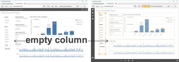
This method works just fine for me most of the time, and it has let me to compose complex layouts without any further issues. However, one of the most obvious disadvantages of leaving empty columns or/and rows is that we are losing precious pixels that in some cases could have made a great difference to display data properly.
Another approach commonly used to separate content consists in using a Text & Image object and then a background image containing a single line, making it look like a divider. It works OK when in a desktop-like device but it will force me to keep an unnecessary object when in a mobile device plus it doesn't solve any of the issues described before.
To ease our pains Qlik Sense 3.1 includes the so-called “cardification” feature. It's a theme (yes a *theme) called Qlik-Standard. It changes the aspect of your app by adding a nice light gray background, a border, and a lovely subtle padding to the objects. Although I’m not completely abandoning the idea of eventually using white space in my apps, or even the Qlik-Classic theme, this new theme will streamline the process of making my apps look nicer and to be more readable and digestible.
Please see the example below to discover how to activate it.
Extra tip: Once you have expanded the app options panel at the very top of your screen you may want to check out the color picker under sheet title styling section 
So, do you think you will be using this new theme in your apps?
AMZ
- « Previous
-
- 1
- 2
- Next »
You must be a registered user to add a comment. If you've already registered, sign in. Otherwise, register and sign in.