Unlock a world of possibilities! Login now and discover the exclusive benefits awaiting you.
- Subscribe to RSS Feed
- Mark as New
- Mark as Read
- Bookmark
- Subscribe
- Printer Friendly Page
- Report Inappropriate Content
Qlik GeoAnalytics is known for its powerful mapping capabilities. I had the opportunity to dig down into the layers of Qlik GeoAnalytics when working on a project about Indian Migration. In this project, the team wanted to illustrate which states in India migrants moved to and left from. The plan was to show this on a map. Here were the requirements:
- Use color to show the selected state (the state users move to or from)
- Use color to show the number of migrants who moved
- Use arrows to show the direction of the move
- Place dots on each state that migrants move to or from
Here is a look at one of the resulting maps. In order to build it, we used 3 GeoAnalytic layers: the Area layer, the Bubble layer and the Line layer.
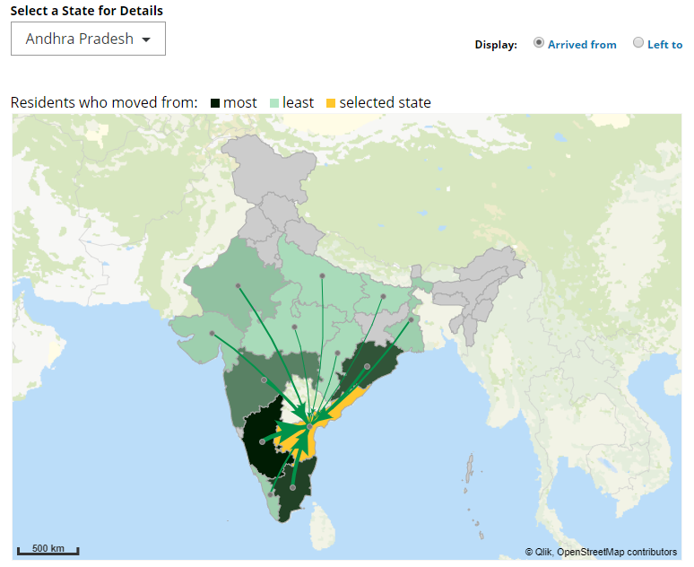
In the screenshot above, the selected state is Andhra Pradesh and it is highlighted in orange. All the states that migrants came from are colored in a shade of green using the ColorMix1 function. Darker shades of green indicate a larger number of migrants than the lighter shades of green.
Before we can begin to add the layers, we first had to add the GeoAnalytics Map to the app. Once this is done, the layers can be added. The first step was to use the Area layer to show which states users left from. The color expression (which you can see in the attached app) first checked for the selected state and colored it orange, then it checked for states where no one migrated from and colored them gray. The last part was to use the ColorMix1 function to color the states in shades of green based on the number of people who migrated from that state. The second step was to add dots or bubbles to the state. To do this the Bubble layer was used. The third step was to add the Line layer to illustrate the direction of the move. In the screenshot above, the arrows are all leading to the selected state, Andhra Pradesh. The width and size of the arrows are based on the number of migrants. The final few steps included using the Draw Order Adjustment property to indicate the order that we wanted the layers drawn – first the Area layer, then the Bubble layer and last the Line layer. We also made use of the Info Bubble so that we could provide informative data when users hover over an area, line or bubble.
Feel free to check out the attached app using Qlik Sense to see how all the pieces were put together. If you do not have Qlik Sense, you can download and try Qlik Sense Desktop for free from here. In this project, we only used 3 of the layers available with Qlik GeoAnalytics. There are other layers available as well as advanced geospatial information and geographic relationships. Learn more about Qlik GeoAnalytics and check out our Getting Started Videos.
Thanks,
Jennell
You must be a registered user to add a comment. If you've already registered, sign in. Otherwise, register and sign in.