Unlock a world of possibilities! Login now and discover the exclusive benefits awaiting you.
- Qlik Community
- :
- Forums
- :
- Analytics
- :
- App Development
- :
- Shrinking (Zoom out) a chart with time dimension
- Subscribe to RSS Feed
- Mark Topic as New
- Mark Topic as Read
- Float this Topic for Current User
- Bookmark
- Subscribe
- Mute
- Printer Friendly Page
- Mark as New
- Bookmark
- Subscribe
- Mute
- Subscribe to RSS Feed
- Permalink
- Report Inappropriate Content
Shrinking (Zoom out) a chart with time dimension
Hi,
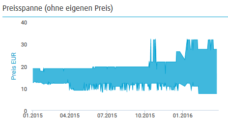
I have a price overview as chart which can go over quite a long period.
It should only show a trend for the price 'evolution'.
Without qlik an old version looks like this:
I try to recreate this in Qlik now.
Beside the problem how to create an area-range I have a more severe problem.
How can I zoom out to show all values on the x axis?
I don't want to loose datapoint, just change the axis-range.
Basically I want to show the chart which is used inside the navigation.
See the screenshot:
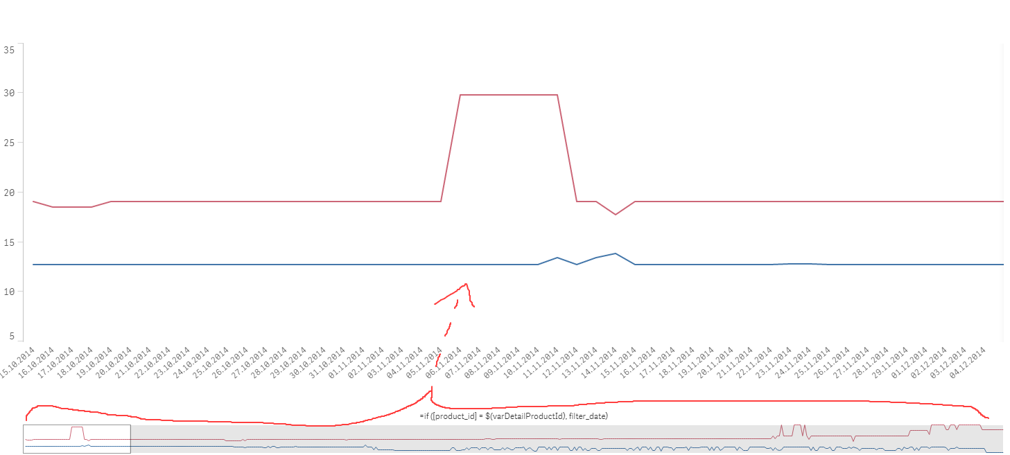
Can I transform this dimension axis to achive my goal?
- Mark as New
- Bookmark
- Subscribe
- Mute
- Subscribe to RSS Feed
- Permalink
- Report Inappropriate Content
u can create a dimesion with year it wil gives u exact values with data points.
or even try with week as dimension.
i think ur trying wih dates
its seems too clumsy so...it will be tricky to get the exact.
- Mark as New
- Bookmark
- Subscribe
- Mute
- Subscribe to RSS Feed
- Permalink
- Report Inappropriate Content
I dunno if i tried it correct, but if I put Year() around my dimension, then the measures are calculated by the data of the whole year.
I don't want to change the granularity from the dimension itself, i just need to set the min and max for the axis.
(as one can do this to the y axis).
- Mark as New
- Bookmark
- Subscribe
- Mute
- Subscribe to RSS Feed
- Permalink
- Report Inappropriate Content
Adding YEAR or MONTH around your time dimension will reduce the granularity.
Qlik natively scrolls when the dimension is too long.
You could look for an extension to add a chart that doesn't scroll. D3 Visualization library is very good.
- Mark as New
- Bookmark
- Subscribe
- Mute
- Subscribe to RSS Feed
- Permalink
- Report Inappropriate Content
- Mark as New
- Bookmark
- Subscribe
- Mute
- Subscribe to RSS Feed
- Permalink
- Report Inappropriate Content
Ok, thanks.
I hoped qlik has some native way to do so.