Unlock a world of possibilities! Login now and discover the exclusive benefits awaiting you.
- Qlik Community
- :
- Forums
- :
- Analytics
- :
- App Development
- :
- Re: Showing Missing Time Data in QS
- Subscribe to RSS Feed
- Mark Topic as New
- Mark Topic as Read
- Float this Topic for Current User
- Bookmark
- Subscribe
- Mute
- Printer Friendly Page
- Mark as New
- Bookmark
- Subscribe
- Mute
- Subscribe to RSS Feed
- Permalink
- Report Inappropriate Content
Showing Missing Time Data in QS
Hi All,
Does anyone know if the solution in the blog post below is possible in Qlik Sense? Sample he used attached.
Showing Missing Time Data in QV « BI Commons
Thanks!
- Mark as New
- Bookmark
- Subscribe
- Mute
- Subscribe to RSS Feed
- Permalink
- Report Inappropriate Content
I think there is even an easier solution for both QV and QS:
Use an expression like
=Sum(Sales)+Sum({1}0)
and disable 'suppress zero values' on presentation tab of QV chart properties.
- Mark as New
- Bookmark
- Subscribe
- Mute
- Subscribe to RSS Feed
- Permalink
- Report Inappropriate Content
Thank you for this, this seems to work except for the 'suppress zero values' option in QS. Does this option exist? otherwise it just seems to flatline everything that should be a blank
- Mark as New
- Bookmark
- Subscribe
- Mute
- Subscribe to RSS Feed
- Permalink
- Report Inappropriate Content
I think the option is on AddOns - Data Handling in chart properties and called 'Show zero values' or similar.
I am not sure what you mean with 'flatline everything', though?
- Mark as New
- Bookmark
- Subscribe
- Mute
- Subscribe to RSS Feed
- Permalink
- Report Inappropriate Content
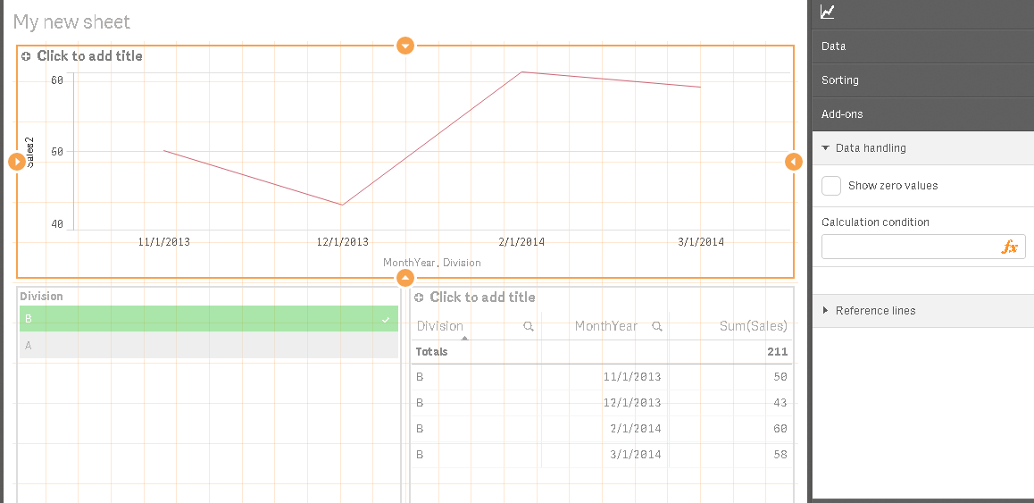
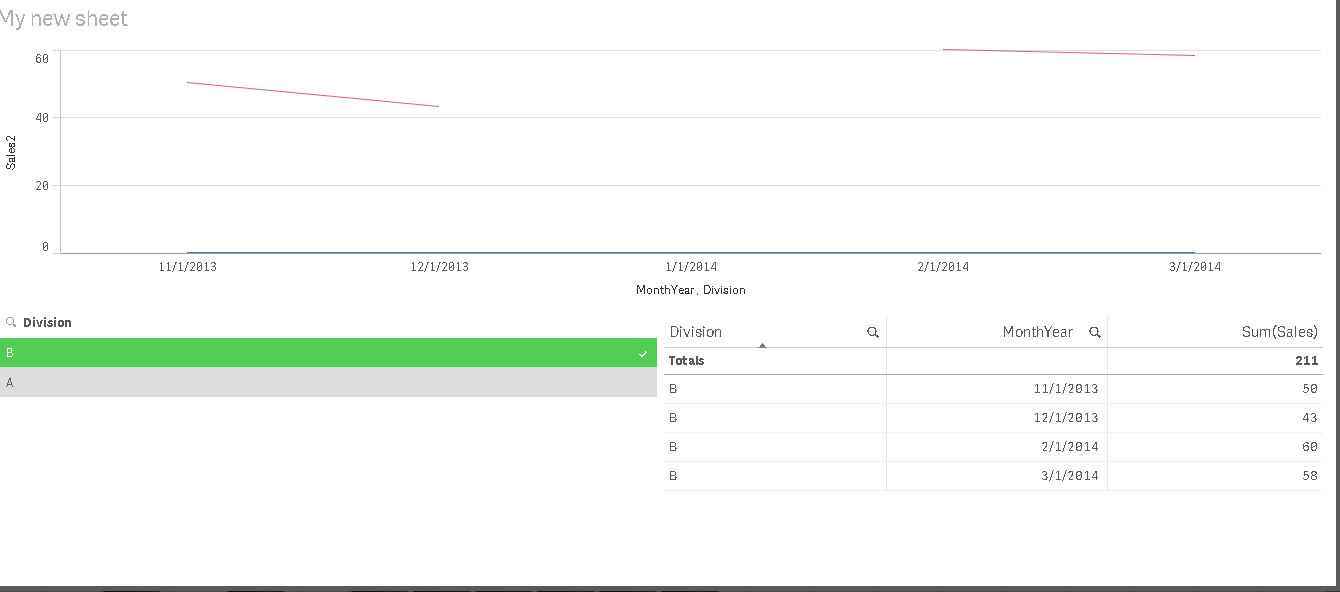
I guess it means it creates a visible line along the axis of all the other zero'd out items. and when I remove 0 values, the issue of a mislead graph appears again. please see below and attached.
with the sum+ option there is a blue line at the bottom (aka flatlined):
with the show zero's option removed you have a misleading graph: