Unlock a world of possibilities! Login now and discover the exclusive benefits awaiting you.
- Qlik Community
- :
- All Forums
- :
- QlikView App Dev
- :
- Re: Creating average from "above" created expressi...
- Subscribe to RSS Feed
- Mark Topic as New
- Mark Topic as Read
- Float this Topic for Current User
- Bookmark
- Subscribe
- Mute
- Printer Friendly Page
- Mark as New
- Bookmark
- Subscribe
- Mute
- Subscribe to RSS Feed
- Permalink
- Report Inappropriate Content
Creating average from "above" created expression in a chart
Hi All,
I was trying to build this for 4 hours and I failed miserably. Basically what I am trying to do is:
Imagine that you have set of time constraints (that can vary - but I can easily fix that). For the sake of the example, let them be weeks - that are the dimension of the chart = week1, week 2 etc.I am creating the chart from a dataset that looks like below:
Week number Volume Done
1 100
2 123
3 93
4 97
What also I did is I created a line (the chart was bar + line, when bar shows the volume in total) that shows the movement in the volume shown in percentage - for example - in week 2 we have 23 % increase compared to week 1 and in week 3 we have around 30 % decrease compared tpo week 2) etc.
I used similar expression in the chart = sum(Volume)/above(sum(volume)) -1 and it works fine.
However i am failing to achieve an AVERAGE movement per week. For example if we have -15%, + 5% - 10%, I want to get them all in Positive % and divide them by 3 - simple as that - it should show 10% if we stick to the 3 numbers shown above.
I am trying to show this average percentage either in a text inside the chart or in a textbox outside of the chart. If I am using straight table and if I use the average total it works but it does not show accurate values (when aggr and avg used) inside the chart or in a textbox (same formula used) - it only provides accurate numbers in a straight table (average total).
Please can you help as this is driving me crazy 
- « Previous Replies
-
- 1
- 2
- Next Replies »
Accepted Solutions
- Mark as New
- Bookmark
- Subscribe
- Mute
- Subscribe to RSS Feed
- Permalink
- Report Inappropriate Content
I think if you can create a master calendar first thing in the script, you are set with all your date related field to be sorted in the correct manner.
- Mark as New
- Bookmark
- Subscribe
- Mute
- Subscribe to RSS Feed
- Permalink
- Report Inappropriate Content
- Mark as New
- Bookmark
- Subscribe
- Mute
- Subscribe to RSS Feed
- Permalink
- Report Inappropriate Content
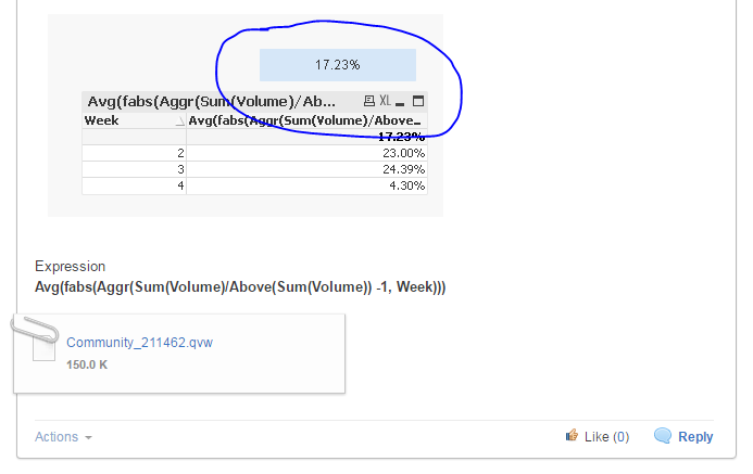
What about this:
Avg(fabs(Aggr(Sum(Volume)/Above(Sum(volume)) -1, Week)))
Update: Missed a parenthesis
- Mark as New
- Bookmark
- Subscribe
- Mute
- Subscribe to RSS Feed
- Permalink
- Report Inappropriate Content
Sample attached based on the sample data provided
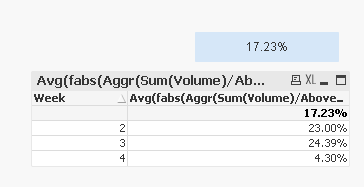
Expression
Avg(fabs(Aggr(Sum(Volume)/Above(Sum(Volume)) -1, Week)))
- Mark as New
- Bookmark
- Subscribe
- Mute
- Subscribe to RSS Feed
- Permalink
- Report Inappropriate Content
Can you implement this in chart or in text object? I mean I tried with aggr and average but in straight table it work - in chart it doesnt' and this is the worst part.
- Mark as New
- Bookmark
- Subscribe
- Mute
- Subscribe to RSS Feed
- Permalink
- Report Inappropriate Content
Did it in a text box only
- Mark as New
- Bookmark
- Subscribe
- Mute
- Subscribe to RSS Feed
- Permalink
- Report Inappropriate Content
Perhaps I am doing something wrong here. When i extract the chart data and compare it to the text box avg I get completely different results:
SUM(Alpha)/(above(Sum (Alpha),1))-1 (avg: 1480 % (as we have huuge increase from week 1 Jan to week 2)
=avg(fabs(aggr(SUM(Alpha)/(above(Sum (Alpha),1))-1,WEEK_NBR))) - I get 16 % on average
VOlumes:
- 26.0
4,231.0
4,477.0
4,600.0
4,682.0
4,901.0
4,575.0
4,688.0
4,657.0
4,696.0
4,582.0
3,435.0
:
- Mark as New
- Bookmark
- Subscribe
- Mute
- Subscribe to RSS Feed
- Permalink
- Report Inappropriate Content
Which data are you using to calculate these percentages? Can you share a sample of where you are working?
- Mark as New
- Bookmark
- Subscribe
- Mute
- Subscribe to RSS Feed
- Permalink
- Report Inappropriate Content
Please note that your WEEK_NBR field values need to show a LOAD ORDER in the order you have used in your chart (e.g. just sorted numeric ascending).
If the LOAD ORDER is different from that, create this first in your script;
TMP:
LOAD Recno() as WEEK_NBR
Autogenerate 53; // or how many weeks you have at max
Then load your data.
Finally, you can drop your TMP table, if you want.
edit: Or, if you are using QV12
- Mark as New
- Bookmark
- Subscribe
- Mute
- Subscribe to RSS Feed
- Permalink
- Report Inappropriate Content
In general I have a data pulled from SQL Server - then when I put the data in weekly dimension I have those figures above. You can see that the difference between 26 and 4231 in the first two weeks only is over 1k % increase. The most annoying part is when i put the data in straight table and make an average total it calculates it correctly - but in the chart ot text object it gives me totaly different thing. Once again the volumes weekly are(in positive percentage):
I get it in the chart with:
SUM(Alpha)/(above(Sum (Alpha),1))-1
| Weekly view | Volume vs SLA Movement | Volume Movement | positive |
| 1 | 26,0 | - | |
| 2 | 4 231,0 | 16 173,1% | 16 173,1% |
| 3 | 4 477,0 | 5,8% | 5,8% |
| 4 | 4 600,0 | 2,7% | 2,7% |
| 5 | 4 682,0 | 1,8% | 1,8% |
| 6 | 4 901,0 | 4,7% | 4,7% |
| 7 | 4 575,0 | -6,7% | 6,7% |
| 8 | 4 688,0 | 2,5% | 2,5% |
| 9 | 4 657,0 | -0,7% | 0,7% |
| 10 | 4 696,0 | 0,8% | 0,8% |
| 11 | 4 582,0 | -2,4% | 2,4% |
| 12 | 3 435,0 | -25,0% | 25,0% |
in the text box I use:
=avg(fabs(aggr(SUM(Alpha)/(above(Sum (Alpha),1))-1,WEEK_NBR)))so if I use the same expression with aggr in text box
I get 0.1613.... which is clearly not the case
- « Previous Replies
-
- 1
- 2
- Next Replies »