Unlock a world of possibilities! Login now and discover the exclusive benefits awaiting you.
- Qlik Community
- :
- Forums
- :
- Analytics
- :
- New to Qlik Analytics
- :
- Re: Create chart showing multiple filter items and...
- Subscribe to RSS Feed
- Mark Topic as New
- Mark Topic as Read
- Float this Topic for Current User
- Bookmark
- Subscribe
- Mute
- Printer Friendly Page
- Mark as New
- Bookmark
- Subscribe
- Mute
- Subscribe to RSS Feed
- Permalink
- Report Inappropriate Content
Create chart showing multiple filter items and their individual measurements
Apologies if this has already been asked - I'm a complete beginner to Qlik Sense.
I have a filter pane set up to filter products we sell (List of Items)
I've set up a combo chart to show the quantity sold (Measure) against the date by month(Dimension).
I can filer for each product or for multiple products which will add the quantities of each selected product together and show me total on graph for each month.
I would like to set up a new filter showing the products we sell as same list of items but this time show me a graph with a line for each selected item rather than a sum of the selected, say for instance we select Burgers, Pizzas, Coffees etc it will plot a seperate line for each of the products showing their relevant sales against date.
Is this possible please? If so how?
Many thanks for taking the time to read.
Accepted Solutions
- Mark as New
- Bookmark
- Subscribe
- Mute
- Subscribe to RSS Feed
- Permalink
- Report Inappropriate Content
Hi Simon,
If I understood you right, you would like to plot a line for each Type of Item over time for comparison right? If so, check this out:
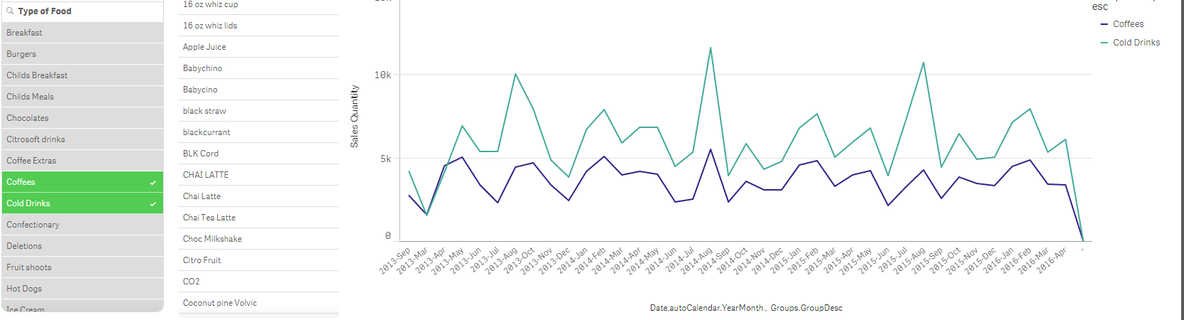
I have even attached the file for reference.
Thanks,
Sangram.
- Mark as New
- Bookmark
- Subscribe
- Mute
- Subscribe to RSS Feed
- Permalink
- Report Inappropriate Content
Hi Simon,
can you upload a sample qvf to illustrate the issue please?
Andy
- Mark as New
- Bookmark
- Subscribe
- Mute
- Subscribe to RSS Feed
- Permalink
- Report Inappropriate Content
Thanks for looking into this Andy.
qvf file attached.
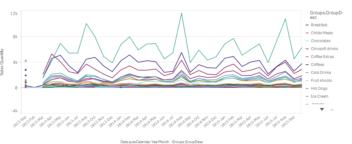
Just to clarify - I have created chart that shows Sales Quantity against time.
I have filters on the left - Date Filters and Filter for Major Food / Bev Group then filter for sub groups (Type of Food) and another filter for individual items.
I would like to be able to select a few items from the list (either same filer list or a copy of it) and show them as their own line on the chart so I can then compare how each item is doing month by month against other items.
Thanks again
Simon
- Mark as New
- Bookmark
- Subscribe
- Mute
- Subscribe to RSS Feed
- Permalink
- Report Inappropriate Content
Hi Simon,
If I understood you right, you would like to plot a line for each Type of Item over time for comparison right? If so, check this out:
I have even attached the file for reference.
Thanks,
Sangram.
- Mark as New
- Bookmark
- Subscribe
- Mute
- Subscribe to RSS Feed
- Permalink
- Report Inappropriate Content
Fantastic, thanks Sangram, I owe you a drink!!!
Out of interest and for my reference, how did you do it? Would be great to apply to other similar examples that I have.
- Mark as New
- Bookmark
- Subscribe
- Mute
- Subscribe to RSS Feed
- Permalink
- Report Inappropriate Content
Hi Simon,
Pretty simple. Make use of a line char. -> add two dimmension : YearMonth and Group.Groupdesc -> add 1 meaure:Sales Qualtity. Thats it! 
As you make selections a new hypercube is generated every time and hence lines and axis keep changing.
Thanks,
Sangram.