Unlock a world of possibilities! Login now and discover the exclusive benefits awaiting you.
- Qlik Community
- :
- Forums
- :
- Analytics
- :
- New to Qlik Analytics
- :
- Re: Creating dynamic measure selection in Qliksens...
- Subscribe to RSS Feed
- Mark Topic as New
- Mark Topic as Read
- Float this Topic for Current User
- Bookmark
- Subscribe
- Mute
- Printer Friendly Page
- Mark as New
- Bookmark
- Subscribe
- Mute
- Subscribe to RSS Feed
- Permalink
- Report Inappropriate Content
Creating dynamic measure selection in Qliksense
Hi community,
Is there a way in qliksense to create a sort of measure drop down, that has multiple measure values a user can choose from to populate the measure fields in a chart.
For E.g. Avg. Age, % Literacy rate, Total population can be different measures I want to look at across time ( These are say variables in my data set). A single chart should achieve it based on user selection of the measure. (Dimension remains same - e.g. across years)
(This is achieved using parameters in Tableau. Would like to know if a equivalent exists)
Thanks in advance.
- « Previous Replies
- Next Replies »
Accepted Solutions
- Mark as New
- Bookmark
- Subscribe
- Mute
- Subscribe to RSS Feed
- Permalink
- Report Inappropriate Content
check this
- Mark as New
- Bookmark
- Subscribe
- Mute
- Subscribe to RSS Feed
- Permalink
- Report Inappropriate Content
- Mark as New
- Bookmark
- Subscribe
- Mute
- Subscribe to RSS Feed
- Permalink
- Report Inappropriate Content
Hi,
Can you check if the alternative measures fits your requirement.
Thanks.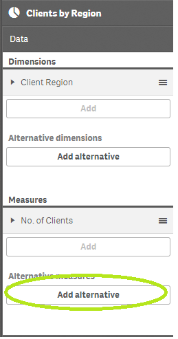
- Mark as New
- Bookmark
- Subscribe
- Mute
- Subscribe to RSS Feed
- Permalink
- Report Inappropriate Content
Hi,
Looks like this feature is not currently available! or am I looking in the wrong place. I looked at the discussion thread and some jquery has been used. Is that what you were suggesting.
Thanks in advance.
- Mark as New
- Bookmark
- Subscribe
- Mute
- Subscribe to RSS Feed
- Permalink
- Report Inappropriate Content
Hi,
This is great, but I am not sure if end user can use the exploration menu every time. Is there are way to show the alternative field on the viz in presentation mode?
Thanks
- Mark as New
- Bookmark
- Subscribe
- Mute
- Subscribe to RSS Feed
- Permalink
- Report Inappropriate Content
Hi,
This Option is Available from the latest versions of Qlik Sense (2.2.3).
Can you please update the qlik sense client if not done already and see if the options are there.
Thanks.
- Mark as New
- Bookmark
- Subscribe
- Mute
- Subscribe to RSS Feed
- Permalink
- Report Inappropriate Content
Hi,
I have the 2.2.3 version and i checked out this video on how to use alternative measures:
Alternative dimensions and measures - Qlik Sense - YouTube
It says I can use the same in Exploration mode. But I guess exploration mode is not feasible for a end user to open every time he/she needs to select alternative measures.
Thnx
- Mark as New
- Bookmark
- Subscribe
- Mute
- Subscribe to RSS Feed
- Permalink
- Report Inappropriate Content
can you post some sample what you need
- Mark as New
- Bookmark
- Subscribe
- Mute
- Subscribe to RSS Feed
- Permalink
- Report Inappropriate Content
Please find attached the qvf from world indicators data.
I have 4 charts populated in the qvf for four different measures.
I want the four measures in the Data as a user selection in a single chart. The Y axis should change dynamically with the selection of either of the measures.
Note: (If we can have multiple aggregations that's a added plus. For e.g: some measures can have count aggregation and others can have sum among the selections)
Any help is much appreciated. Thanks
- Mark as New
- Bookmark
- Subscribe
- Mute
- Subscribe to RSS Feed
- Permalink
- Report Inappropriate Content
check this
- « Previous Replies
- Next Replies »