Unlock a world of possibilities! Login now and discover the exclusive benefits awaiting you.
- Qlik Community
- :
- Forums
- :
- Analytics
- :
- New to Qlik Analytics
- :
- Re: Qlik Sense graphs
- Subscribe to RSS Feed
- Mark Topic as New
- Mark Topic as Read
- Float this Topic for Current User
- Bookmark
- Subscribe
- Mute
- Printer Friendly Page
- Mark as New
- Bookmark
- Subscribe
- Mute
- Subscribe to RSS Feed
- Permalink
- Report Inappropriate Content
Qlik Sense graphs
Why all of my graphs on Qlik sense showing me the breakdown; as well as the total of all the breakdowns added together? This is screwing up my visuals.
EG
Cakes 342
Chocolates 111
Peanuts 222
Total adds up to 673 so if I show a pie graph is displays 342; 111; 222 and 673. I dont want it to show 673
- « Previous Replies
-
- 1
- 2
- Next Replies »
- Mark as New
- Bookmark
- Subscribe
- Mute
- Subscribe to RSS Feed
- Permalink
- Report Inappropriate Content
Could you post a screenshot or a sample QVF that shows your issue?
- Mark as New
- Bookmark
- Subscribe
- Mute
- Subscribe to RSS Feed
- Permalink
- Report Inappropriate Content
Can you provide a screenshot of what the problem is?
- Mark as New
- Bookmark
- Subscribe
- Mute
- Subscribe to RSS Feed
- Permalink
- Report Inappropriate Content
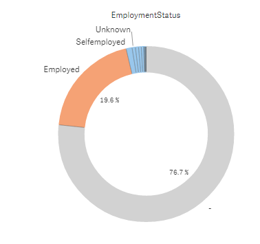 see all the grey that shouldnt be there
- Mark as New
- Bookmark
- Subscribe
- Mute
- Subscribe to RSS Feed
- Permalink
- Report Inappropriate Content
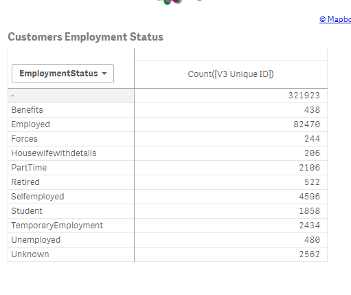 the greyed out bit - 321923 is the sum of all of the numbers in a row. I dont want to see the sum in graphs or tables or anything. And its not like my data has the sum at the end, so not too sure why its displaying it in the graphs etc
- Mark as New
- Bookmark
- Subscribe
- Mute
- Subscribe to RSS Feed
- Permalink
- Report Inappropriate Content
Hi Barbara,
Looks there is an issue with your datamodel. You have duplicates of all the records in your data model and thats the reason why your totals look doubled.
Review your datamodel. Check for joins/auto concatenation etc
Thanks,
Sangram.
- Mark as New
- Bookmark
- Subscribe
- Mute
- Subscribe to RSS Feed
- Permalink
- Report Inappropriate Content
Those are all values aggregated for having no dimension value (NULL). You can filter them out in dimension properties..
- Mark as New
- Bookmark
- Subscribe
- Mute
- Subscribe to RSS Feed
- Permalink
- Report Inappropriate Content
Thanks Guys
I have checked both comments. I dont have duplicate data and I havent got null at all
- Mark as New
- Bookmark
- Subscribe
- Mute
- Subscribe to RSS Feed
- Permalink
- Report Inappropriate Content
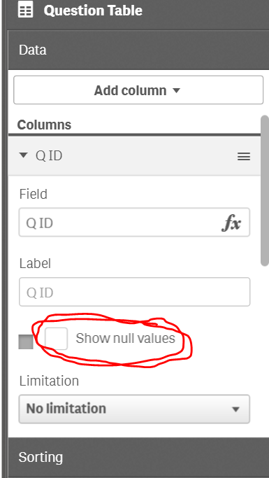
All of your charts will have this button to show null values. Make sure it is not checked.
Additionally, depending on your data model, you may consider using the DISTINCT keyword to avoid counting duplicate records where you do not intend to.
- Mark as New
- Bookmark
- Subscribe
- Mute
- Subscribe to RSS Feed
- Permalink
- Report Inappropriate Content
Then you have data from two different tables with no overlap..
- « Previous Replies
-
- 1
- 2
- Next Replies »