Unlock a world of possibilities! Login now and discover the exclusive benefits awaiting you.
- Qlik Community
- :
- Forums
- :
- Analytics
- :
- New to Qlik Analytics
- :
- Re: How to display "join residuals" in tables
- Subscribe to RSS Feed
- Mark Topic as New
- Mark Topic as Read
- Float this Topic for Current User
- Bookmark
- Subscribe
- Mute
- Printer Friendly Page
- Mark as New
- Bookmark
- Subscribe
- Mute
- Subscribe to RSS Feed
- Permalink
- Report Inappropriate Content
How to display "join residuals" in tables
Hi everybody,
I would like to visualise the result of an analysis where I compare sets of products offered by a company and the demand of customers for these products. The idea is that the user can explore different matches for specific customers in the sense of "If I offer this customer a certain set or a combination of sets, will their needs be satisfied?"
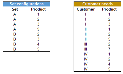
The input tables look like this:
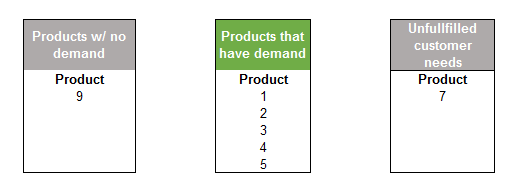
And the results like this. There are three potential "buckets" for a product:
I would like to visualise the result buckets as simple tables. Then on top of these tables two filter panes, one for 'Set configurations' one for 'Users'.
Thank you very much for your help!
- Tags:
- joins
- « Previous Replies
-
- 1
- 2
- Next Replies »
- Mark as New
- Bookmark
- Subscribe
- Mute
- Subscribe to RSS Feed
- Permalink
- Report Inappropriate Content
Good to hear.
If your request is resolved, please consider closing this thread.
- « Previous Replies
-
- 1
- 2
- Next Replies »