Unlock a world of possibilities! Login now and discover the exclusive benefits awaiting you.
- Qlik Community
- :
- Forums
- :
- Analytics
- :
- App Development
- :
- Re: Struggling to color a grouped bar chart
- Subscribe to RSS Feed
- Mark Topic as New
- Mark Topic as Read
- Float this Topic for Current User
- Bookmark
- Subscribe
- Mute
- Printer Friendly Page
- Mark as New
- Bookmark
- Subscribe
- Mute
- Subscribe to RSS Feed
- Permalink
- Report Inappropriate Content
Struggling to color a grouped bar chart
I need to build some bar charts with grouped information, like this:
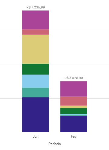
So far, it's set as Multicolored, but I wanted to pick the colors By Expression.
The thing is, each group of info in the bar come from a different colunm in my database ("Restaurants Revenue", "Coffee Places Revenue", "Candy Shops Revenue", and so on).
I know that if they were all in the same one, I could use something like IF([XXX]='YYY',Blue(),Red()), but all my measures come from different fields/columns, so I dunno how to organize the expression. What I've tried so far didn't work, so anyone has an idea to solve it? Thank you a lot in advance.
- Mark as New
- Bookmark
- Subscribe
- Mute
- Subscribe to RSS Feed
- Permalink
- Report Inappropriate Content
Mariana,
Other posts I've found say it's not possible and you need to pivot your data.
Mike
- Mark as New
- Bookmark
- Subscribe
- Mute
- Subscribe to RSS Feed
- Permalink
- Report Inappropriate Content
Thank you, Michael.
I really need a chart to display that data.
Would you know another chart that could present the grouped info in different colors?
- Mark as New
- Bookmark
- Subscribe
- Mute
- Subscribe to RSS Feed
- Permalink
- Report Inappropriate Content
Nothing comes to mind but here are some posts with possible work arounds: