Unlock a world of possibilities! Login now and discover the exclusive benefits awaiting you.
- Qlik Community
- :
- All Forums
- :
- QlikView Integrations
- :
- scatter graph for the provided excel sheet
- Subscribe to RSS Feed
- Mark Topic as New
- Mark Topic as Read
- Float this Topic for Current User
- Bookmark
- Subscribe
- Mute
- Printer Friendly Page
- Mark as New
- Bookmark
- Subscribe
- Mute
- Subscribe to RSS Feed
- Permalink
- Report Inappropriate Content
scatter graph for the provided excel sheet
Hi
Can any one please help me in creating scatter graph for the below attached excel data. the should have x-axiz as A1,A2,A3,........ and so on...y-axis will should have mob,wate.... so on.. same data as in the excel sheet should be on the graph. no need of any aggregation functions. like example A1 to mob has value " ? ". this has to be displayed on the graph. corresponding to x and y axis.
- « Previous Replies
- Next Replies »
Accepted Solutions
- Mark as New
- Bookmark
- Subscribe
- Mute
- Subscribe to RSS Feed
- Permalink
- Report Inappropriate Content
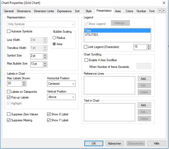
Hi,
here are some screenshots of the chart properties tabs:
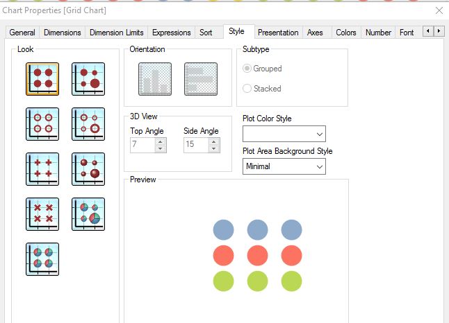
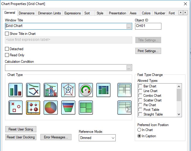
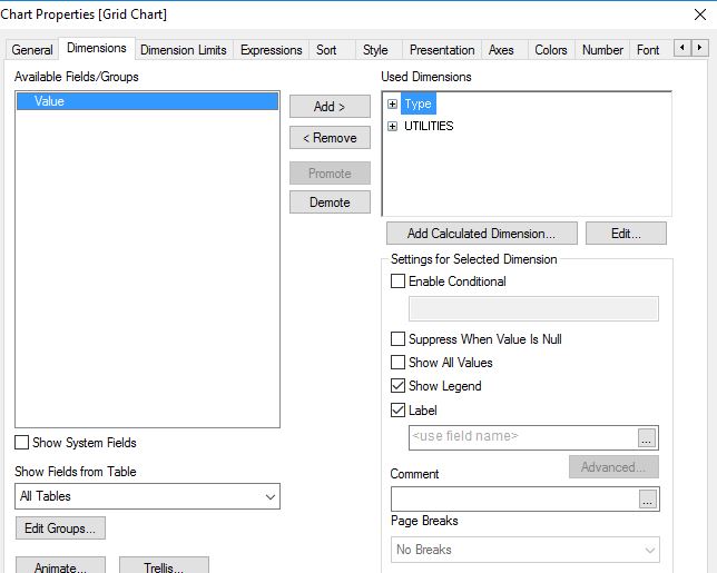
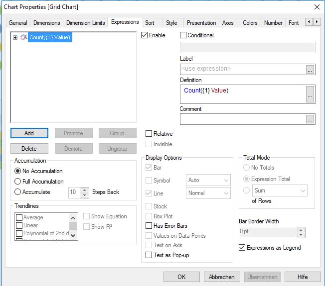
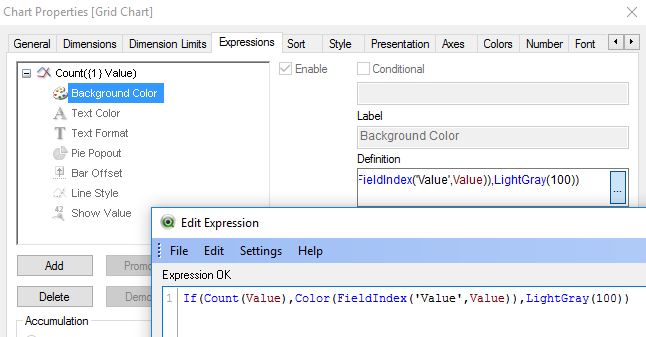
please evaluate the pivot table solution Stefan suggested as well because it can deliver the same colour results including the actual values in each cell.
hope this helps
regards
Marco
- Mark as New
- Bookmark
- Subscribe
- Mute
- Subscribe to RSS Feed
- Permalink
- Report Inappropriate Content
A scatter chart is for using numeric values as axes and plotting a numeric value.
If you want to just show your crosstable, use a pivot table chart.
In the script:
CrossTable(As, Value)
LOAD UTILITIES,
A1,
A2,
A3,
A4,
A5,
A6,
A7,
A8,
A9,
A10,
A11,
A12,
A13,
A14,
A15,
A16,
A17,
A18,
A19,
A20,
A21,
A22,
A23,
A24
FROM
[Book1 (4).xlsx]
(ooxml, embedded labels, table is Sheet1);
Then in the UI, create a pivot table chart with dimensions UTILITIES and As, and =Only(Value) as expression
| UTILITIES | As | A1 | A2 | A3 | A4 | A5 | A6 | A7 | A8 | A9 | A10 | A11 | A12 | A13 | A14 | A15 | A16 | A17 | A18 | A19 | A20 | A21 | A22 | A23 | A24 |
|---|---|---|---|---|---|---|---|---|---|---|---|---|---|---|---|---|---|---|---|---|---|---|---|---|---|
| CCCC | + | + | + | + | ? | ? | - | - | - | - | - | - | - | ? | ? | + | + | - | - | - | - | - | - | - | |
| ELE | ? | - | - | + | ? | - | - | + | ? | - | + | - | - | - | ? | - | - | + | + | - | ? | - | + | - | |
| MOB | ? | - | + | - | - | + | ? | ? | - | - | - | + | ? | - | + | - | - | + | + | + | + | - | - | - | |
| SSSS | - | - | ? | ? | + | + | + | - | - | - | - | - | ? | + | + | + | + | + | - | - | - | + | + | + | |
| WATE | - | ? | - | - | - | - | - | + | + | + | ? | ? | ? | ? | + | + | + | + | - | - | - | - | - | - |
- Mark as New
- Bookmark
- Subscribe
- Mute
- Subscribe to RSS Feed
- Permalink
- Report Inappropriate Content
Hi swuel,
Thanks for your reply. there is no chance to plot graph for this? there is no solution for this in nook and corner of qlikView?
Regards
Ranjani.H.Gowda
- Mark as New
- Bookmark
- Subscribe
- Mute
- Subscribe to RSS Feed
- Permalink
- Report Inappropriate Content
Maybe if you create underlying numeric values for all your values. But what's wrong with the pivot table chart?
- Mark as New
- Bookmark
- Subscribe
- Mute
- Subscribe to RSS Feed
- Permalink
- Report Inappropriate Content
you mean the table data should be numeric or x and y axis values to be numeric?. our clients needs it in the graph.
- Mark as New
- Bookmark
- Subscribe
- Mute
- Subscribe to RSS Feed
- Permalink
- Report Inappropriate Content
Could you upload a sketch of what your client expects and where it differs from a pivot table chart?
- Mark as New
- Bookmark
- Subscribe
- Mute
- Subscribe to RSS Feed
- Permalink
- Report Inappropriate Content
i have put up my requirements in this link [link to not existing topic removed; please just attach the document to your reply]
- Mark as New
- Bookmark
- Subscribe
- Mute
- Subscribe to RSS Feed
- Permalink
- Report Inappropriate Content
Please just post it as an attachment to your reply. The other topic does not exist.
- Mark as New
- Bookmark
- Subscribe
- Mute
- Subscribe to RSS Feed
- Permalink
- Report Inappropriate Content
i am able to attach file in reply. just guide me if you can.
- Mark as New
- Bookmark
- Subscribe
- Mute
- Subscribe to RSS Feed
- Permalink
- Report Inappropriate Content
Click on reply, click on "use advanced editor" in the top-right corner, click on "attach" in the bottom-right corner.
- « Previous Replies
- Next Replies »