Unlock a world of possibilities! Login now and discover the exclusive benefits awaiting you.
- Qlik Community
- :
- All Forums
- :
- QlikView App Dev
- :
- Re: How to show a line chart with two dimensions w...
- Subscribe to RSS Feed
- Mark Topic as New
- Mark Topic as Read
- Float this Topic for Current User
- Bookmark
- Subscribe
- Mute
- Printer Friendly Page
- Mark as New
- Bookmark
- Subscribe
- Mute
- Subscribe to RSS Feed
- Permalink
- Report Inappropriate Content
How to show a line chart with two dimensions with different expressions?
In a line chart, I want to show the production values for two different periods. What is the best way to realize this?
- Mark as New
- Bookmark
- Subscribe
- Mute
- Subscribe to RSS Feed
- Permalink
- Report Inappropriate Content
Use if statement in the background color
If(Dim2 = 'XYZ', Yellow(), Blue())
- Mark as New
- Bookmark
- Subscribe
- Mute
- Subscribe to RSS Feed
- Permalink
- Report Inappropriate Content
The color isn't the problem... How to show the second line with a different timestamp?
- Mark as New
- Bookmark
- Subscribe
- Mute
- Subscribe to RSS Feed
- Permalink
- Report Inappropriate Content
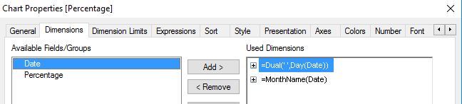
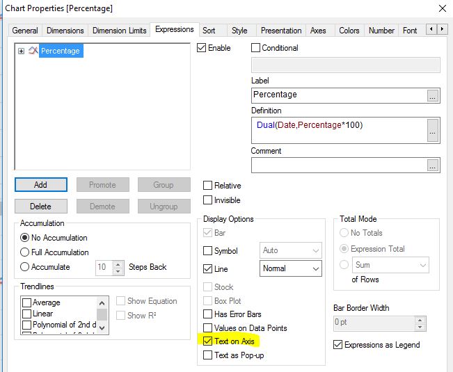
May be like this as your calculated dimension
Dual(Date & Chr(10) & AddYear(Date, -1), Date)
- Mark as New
- Bookmark
- Subscribe
- Mute
- Subscribe to RSS Feed
- Permalink
- Report Inappropriate Content
Hi,
front end solution could be:
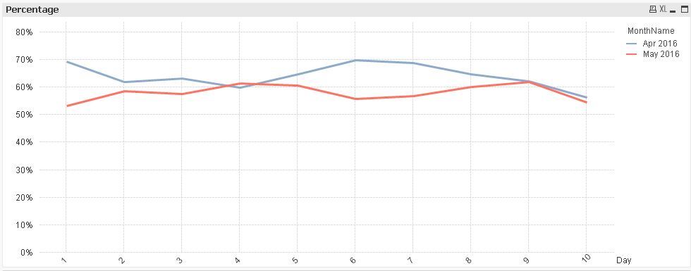

or
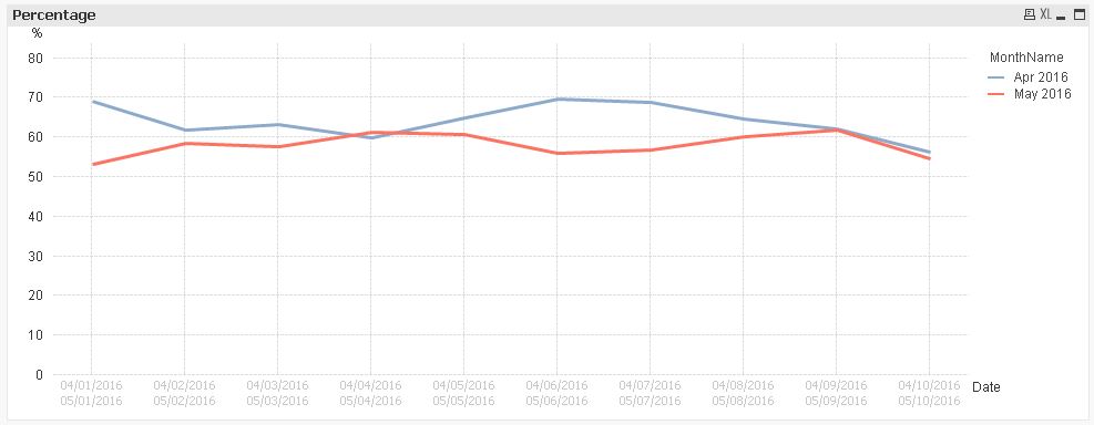
but I would suggest to use the calculated dimension expressions in the script to generate additional fields you could use in the charts instead.
hope this helps
regards
Marco
- Mark as New
- Bookmark
- Subscribe
- Mute
- Subscribe to RSS Feed
- Permalink
- Report Inappropriate Content
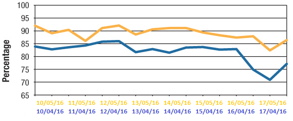
Thanks Marco for your examples. They are helpful for my problem, but not the complete solution. The two dates belong to two different (independent) fields, with a selection for both fields...
A_Timestamp A_Percentage
18-04-2016 54.6
19-04-2016 76.4
B_Timestamp B_Percentage
20-05-2016 12.4
21-05-2016 54.3
22-05-2016 65.3
- Mark as New
- Bookmark
- Subscribe
- Mute
- Subscribe to RSS Feed
- Permalink
- Report Inappropriate Content
Thanks for your answer, but my problem is unfortunately more difficult. See below...