Unlock a world of possibilities! Login now and discover the exclusive benefits awaiting you.
- Qlik Community
- :
- Forums
- :
- Analytics
- :
- New to Qlik Analytics
- :
- Re: stacked bar graph with fixed colors
- Subscribe to RSS Feed
- Mark Topic as New
- Mark Topic as Read
- Float this Topic for Current User
- Bookmark
- Subscribe
- Mute
- Printer Friendly Page
- Mark as New
- Bookmark
- Subscribe
- Mute
- Subscribe to RSS Feed
- Permalink
- Report Inappropriate Content
stacked bar graph with fixed colors
Hey guys,
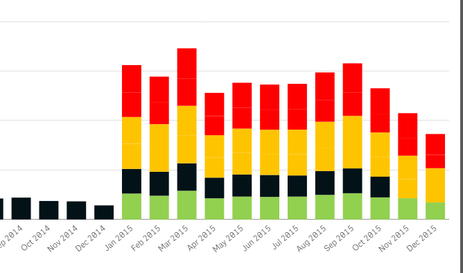
I have a stacked bar graph, there's 2 values on top of each other and now I would like to make the color for the first bar green and the color for the second bar on top of that, red. Can I do this with an expression and how? It's not depending on the value, just want to make the bottom bar green and the one on top of it, red.
Thanks a bunch!
Toon
- Mark as New
- Bookmark
- Subscribe
- Mute
- Subscribe to RSS Feed
- Permalink
- Report Inappropriate Content
Hi.
In my example I have data for the years 2009 and 2010 and set the colors for each year as follows:
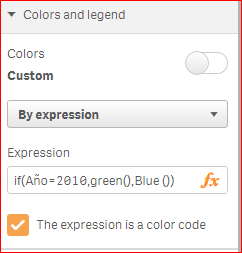
Hope this help!
Regards.
- Mark as New
- Bookmark
- Subscribe
- Mute
- Subscribe to RSS Feed
- Permalink
- Report Inappropriate Content
Hi,
Thanks for the reply, I have actually tried something like this but this considers the value of year, correct? I have 2 stacked bars, I'd like the bottom bar to have a specific color and the top one to have a different color. Not based on the actual values.
Thanks in advance for suggestions,
Toon
- Mark as New
- Bookmark
- Subscribe
- Mute
- Subscribe to RSS Feed
- Permalink
- Report Inappropriate Content
So I have 1 dimension and 2 measures, I want measure 1 to be a certain color and measure 2 in another color. Maybe I have to use a valuelist? Not sure about the correct way to go, I am using dates for both measures.
Thanks for any suggestions,
Toon
- Mark as New
- Bookmark
- Subscribe
- Mute
- Subscribe to RSS Feed
- Permalink
- Report Inappropriate Content
Found it after fiddling around a bit more, solution based on Qlik Sense: How to set custom colors by measure in a bar chart.
I removed my Dimensions and added a Measure with Duration which is a ValueList('Start','Duration'). Then I added a Measure with the expression if(ValueList('Start','Duration')='Start', Start, if(ValueList('Start','Duration')='Duration', [Date Deliver]-Start)). My problem here was I couldn't add a new Dimension because I had 2 Measures already. It only allowed me to create a new Dimension after removing the Measures.
NOTE: Start, Duration and [Date Deliver] come from my excel file and was manipulated in the Data connections
The color code was then rather simple: if(ValueList('Start','Duration')='Start', white(), if(ValueList('Start','Duration')='Duration',rgb(192,0,192))). Basically I was creating a Gantt chart here.
Thanks forum,
Toon
- Mark as New
- Bookmark
- Subscribe
- Mute
- Subscribe to RSS Feed
- Permalink
- Report Inappropriate Content