Unlock a world of possibilities! Login now and discover the exclusive benefits awaiting you.
- Qlik Community
- :
- Forums
- :
- Analytics
- :
- App Development
- :
- Re: Color bar chart by expression
- Subscribe to RSS Feed
- Mark Topic as New
- Mark Topic as Read
- Float this Topic for Current User
- Bookmark
- Subscribe
- Mute
- Printer Friendly Page
- Mark as New
- Bookmark
- Subscribe
- Mute
- Subscribe to RSS Feed
- Permalink
- Report Inappropriate Content
Color bar chart by expression
I'm trying to replicate a bar chart in Qlik Sense that we previously made in Qlikview. The thing is that many of the options available in Qlikview do not exist in Sense.
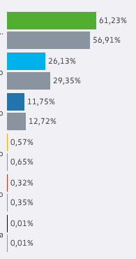
So, this is the original chart:
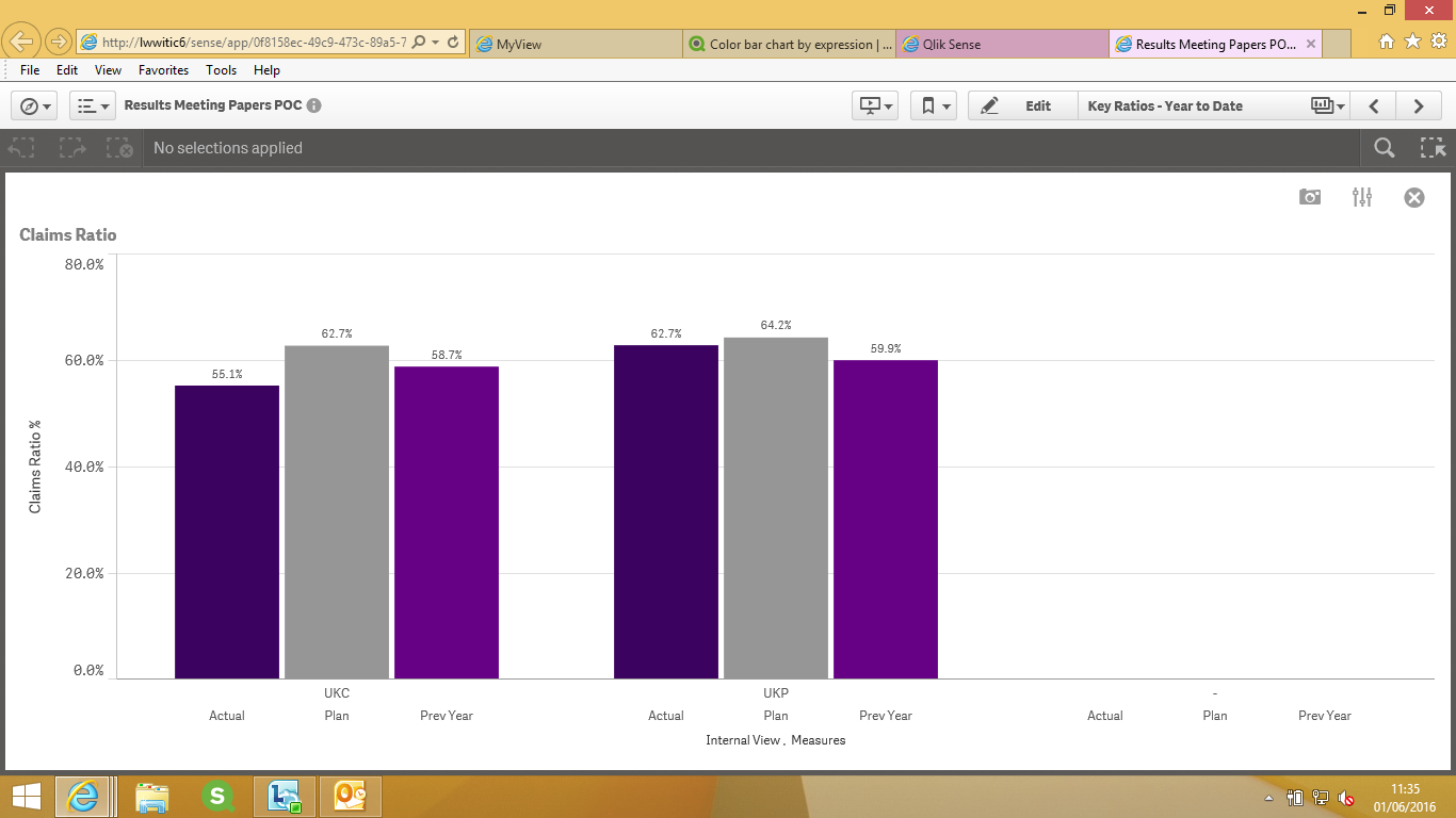
And this is what I'm getting in Sense:
(I know the numbers aren't quite the same, this is because of new data that has been loaded in Sense but not in Qlikview).
What I'd like to know is a way to make the inferior bars in each case gray, like we did in qlikview.
In qlikview we used one dimension (X), and two expressions: (Y, with colors) and (Z, without colors). To obtain thiswe added an IF statement in the background color of that expression.
If anyone knows some way to accomplish this we'd be very grateful.
Many thanks,
Joan
- Mark as New
- Bookmark
- Subscribe
- Mute
- Subscribe to RSS Feed
- Permalink
- Report Inappropriate Content
Hi Joan,
I have used the below expression for my below chart may be this helps..
if(ValueList ('Actual', 'Plan', 'Prev Year')= 'Actual',rgb(60,2,95),
if(ValueList ('Actual', 'Plan', 'Prev Year')= 'Plan',rgb(150,150,150),rgb(102,0,133)))
You can use your dimensions and the conditions similar to above in the colours and legends and choose
colours custom and choose by expression