Unlock a world of possibilities! Login now and discover the exclusive benefits awaiting you.
- Qlik Community
- :
- All Forums
- :
- QlikView App Dev
- :
- Re: How to standardise the pie size?
- Subscribe to RSS Feed
- Mark Topic as New
- Mark Topic as Read
- Float this Topic for Current User
- Bookmark
- Subscribe
- Mute
- Printer Friendly Page
- Mark as New
- Bookmark
- Subscribe
- Mute
- Subscribe to RSS Feed
- Permalink
- Report Inappropriate Content
How to standardise the pie size?
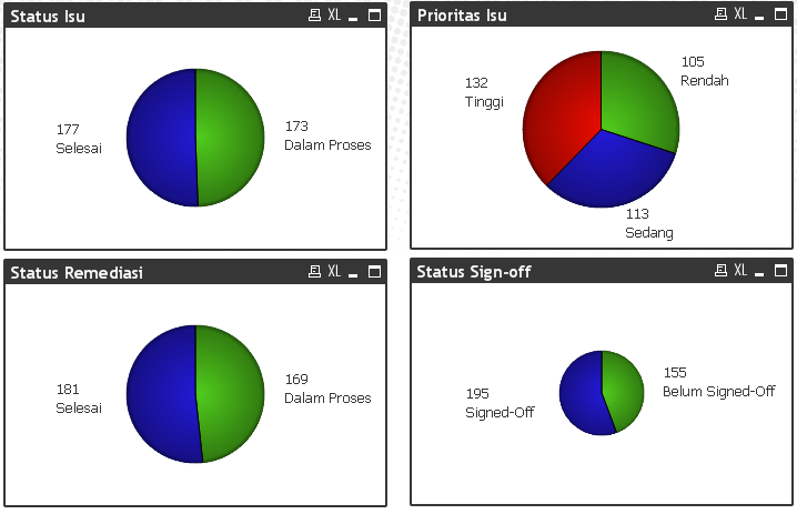
As shown below, the pie size is determined by data label and window size, which is now kind of misleading as if smaller pie has different priorities. Anyway to fix this?
Accepted Solutions
- Mark as New
- Bookmark
- Subscribe
- Mute
- Subscribe to RSS Feed
- Permalink
- Report Inappropriate Content
If the only difference between the pies is a filter on a single field, you might want to try a trellis chart. That should ensure the pies are all the same size. Alternatively, you may want to move the labels to the legend and not place them in the chart. The differences in the label sizes are creating the different pie sizes.
- Mark as New
- Bookmark
- Subscribe
- Mute
- Subscribe to RSS Feed
- Permalink
- Report Inappropriate Content
Hello, do you mean the entire dashboard window? Or that the "Status Sign-off" has a different layout size than the other?
Best regards,
Andrés
- Mark as New
- Bookmark
- Subscribe
- Mute
- Subscribe to RSS Feed
- Permalink
- Report Inappropriate Content
Hi, yup I would like to keep the pie size similar across entire dashboard windows.
- Mark as New
- Bookmark
- Subscribe
- Mute
- Subscribe to RSS Feed
- Permalink
- Report Inappropriate Content
Anything we can do about this?
- Mark as New
- Bookmark
- Subscribe
- Mute
- Subscribe to RSS Feed
- Permalink
- Report Inappropriate Content
Yes you could press CTRL and Shift on your pie chart and then when you see the red outlined boxes around the chart move the legend to the top of your chart to free up space and then re-size your pie chart by dragging the red lines around the pie to fill the available chart space. Once you have the size you want you could just clone that chart for all your other pie charts to maintain the same size. Would that be any use for you?
Kindest Regards
Brian
- Mark as New
- Bookmark
- Subscribe
- Mute
- Subscribe to RSS Feed
- Permalink
- Report Inappropriate Content
Have you tried my suggestion or are you looking for another solution?
- Mark as New
- Bookmark
- Subscribe
- Mute
- Subscribe to RSS Feed
- Permalink
- Report Inappropriate Content
If the only difference between the pies is a filter on a single field, you might want to try a trellis chart. That should ensure the pies are all the same size. Alternatively, you may want to move the labels to the legend and not place them in the chart. The differences in the label sizes are creating the different pie sizes.
- Mark as New
- Bookmark
- Subscribe
- Mute
- Subscribe to RSS Feed
- Permalink
- Report Inappropriate Content
Thanks, trellis chart does the trick well.
While I agree that labels better sit in legend, legend itself is not very flexible in Qlikview compared to the original mock screen (prototype chart) which was developed in Excel. After all, I have six different chart functions with each requiring different legend, that would not look very nice.
- Mark as New
- Bookmark
- Subscribe
- Mute
- Subscribe to RSS Feed
- Permalink
- Report Inappropriate Content
I was looking for a solution with more precision and so far I think trellis chart does the job. Thanks though.