Unlock a world of possibilities! Login now and discover the exclusive benefits awaiting you.
- Qlik Community
- :
- Forums
- :
- Analytics
- :
- New to Qlik Analytics
- :
- Re: [From a newbie in Qlik Sense] Understanding Sc...
- Subscribe to RSS Feed
- Mark Topic as New
- Mark Topic as Read
- Float this Topic for Current User
- Bookmark
- Subscribe
- Mute
- Printer Friendly Page
- Mark as New
- Bookmark
- Subscribe
- Mute
- Subscribe to RSS Feed
- Permalink
- Report Inappropriate Content
[From a newbie in Qlik Sense] Understanding Scatter, Grid Charts better in Qlik Sense
attached data (xlsx).
Item Name, Calendar Date, Importance.
Interested in plotting a Scatter Chart, Grid Chart to see distrbution of Importance categories over Calendar Date.
Item as a dimension not worried for now. Can provide as a separate selection.
Was following this discussion Scatter Chart on plotting a grid chart, scatter chart using Date as x-axis in QlikView.
And interested to do similar using Qlik Sense Desktop or Cloud.
[Reason of going with Qlik Sense is mainly for cloud and business reasons from company view.]
1. There is no direct listing of Grid Chart for selection in Qlik Sense. Is there any alternate way to use Grid Chart in Qlik Sense?
2. Can anybody help me to plot scatter chart using the data I have in QlikSense? (want Date in x-axis, Count(Importance) as y-axis and Importance categories to be displayed along with specific Date.)
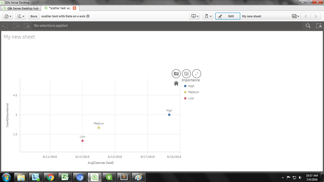
Please see attached image. I got an incorrect scatter chart in QlikSense. Wanted date wise split of Importance categories.
Accepted Solutions
- Mark as New
- Bookmark
- Subscribe
- Mute
- Subscribe to RSS Feed
- Permalink
- Report Inappropriate Content
Hi,
Extension for Grid chart can be found here.
Please refer the below for using the scatter plot in qlik sense.
Thanks.
- Mark as New
- Bookmark
- Subscribe
- Mute
- Subscribe to RSS Feed
- Permalink
- Report Inappropriate Content
Hi,
Extension for Grid chart can be found here.
Please refer the below for using the scatter plot in qlik sense.
Thanks.
- Mark as New
- Bookmark
- Subscribe
- Mute
- Subscribe to RSS Feed
- Permalink
- Report Inappropriate Content
Grid chart related info is helpful.
Related to scatter plot, gone thru the documentation link sent by you already and also Qlik Sense videos in Youtube on scatter plot. And whatever I did is based on that in ! scatter plot. Need some more inputs (to be exact a fine tuned input) specific to the scenario I have explained.
- Mark as New
- Bookmark
- Subscribe
- Mute
- Subscribe to RSS Feed
- Permalink
- Report Inappropriate Content
Hi Raghu,
Scatter Plot requires one dimension and at least two measures to show the results.
Can you share the qvf file with us.
Thanks.
- Mark as New
- Bookmark
- Subscribe
- Mute
- Subscribe to RSS Feed
- Permalink
- Report Inappropriate Content
attached the qvf.
Question here is more of using Date on x-axis. Not a problem whether to take it like a dimension or measure.
As of now used Avg(Date) as aggregation. And Importance categories are not distributed according to date wise.
- Mark as New
- Bookmark
- Subscribe
- Mute
- Subscribe to RSS Feed
- Permalink
- Report Inappropriate Content
Raghu,
If possible I would suggest you to use a different visualization.
Because, Scatter chart is used to compare two measures over a dimension (Example : Sales Vs Profit Over the year).
However, here you are not intended to compare measure. Hence suggesting a different visualization.
Pivot table must be an accurate option for your requirement.
Please let me us know otherwise.
Thanks
- Mark as New
- Bookmark
- Subscribe
- Mute
- Subscribe to RSS Feed
- Permalink
- Report Inappropriate Content
Nice to discuss with you.
I am not completely convinced with your suggestion of Pivot Table. Thank you for the clarity provided on scatter plot.
Looking at QlikView discussion, I was able to use Grid Chart for my data and got required one in QlikView. Let me try the same using GridChart extension in Qlik Sense.
Also used barchart in QlikSense and ok with the final visualization. Marking the question as answered since agreeing with some of your points. Please change the status, if you feel otherwise.
Thanks for the help.
- Mark as New
- Bookmark
- Subscribe
- Mute
- Subscribe to RSS Feed
- Permalink
- Report Inappropriate Content
I am glad your issue is fixed.
Thanks.