Unlock a world of possibilities! Login now and discover the exclusive benefits awaiting you.
- Qlik Community
- :
- Forums
- :
- Analytics
- :
- App Development
- :
- Accumulating Calculated Dimension in a Line Chart
- Subscribe to RSS Feed
- Mark Topic as New
- Mark Topic as Read
- Float this Topic for Current User
- Bookmark
- Subscribe
- Mute
- Printer Friendly Page
- Mark as New
- Bookmark
- Subscribe
- Mute
- Subscribe to RSS Feed
- Permalink
- Report Inappropriate Content
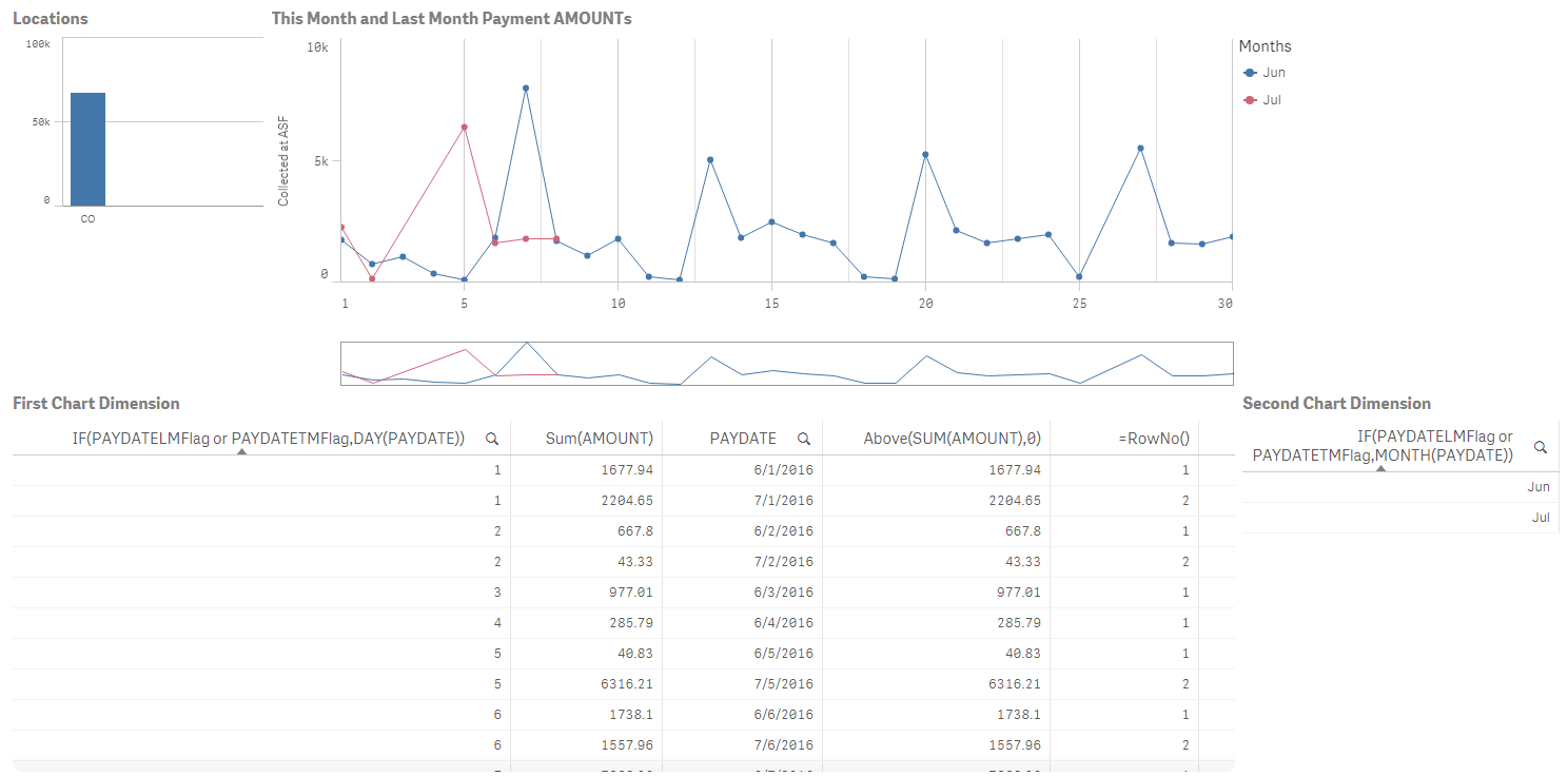
Accumulating Calculated Dimension in a Line Chart
My goal is to show accumulated values of an AMOUNT by date, comparing This Month to Last Month. The data table has 4 values
AMOUNT - Money received
PAYDATE - Date the amount was received
PAYDATETMFlag - 1 if the PAYDATE is This Month (TM), otherwise 0
PAYDATELMFlag - 1 if the PAYDATE is Last Month (LM), otherwise 0
The line chart 1st Dimension (X-axis) is the Days - IF(PAYDATELMFlag or PAYDATETMFlag,DAY(PAYDATE))
The line chart 2nd Dimension (the Lines) is the Months - IF(PAYDATELMFlag or PAYDATETMFlag,MONTH(PAYDATE))
The chart measure is simply Sum(AMOUNT)
This generates the desired chart without accumulation. You see the chart below showing each day's AMOUNT correctly for this month and last month.
I had intended to accumulate the chart using the techniques described earlier in Accumulating in Sense.My problem is that RowNo() returns 1 for all Last month AMOUNTS and 2 for This month AMOUNTS. I can't define an end point for RangeSum(). See my results below.
How can I accumulate the Measure?
- Mark as New
- Bookmark
- Subscribe
- Mute
- Subscribe to RSS Feed
- Permalink
- Report Inappropriate Content
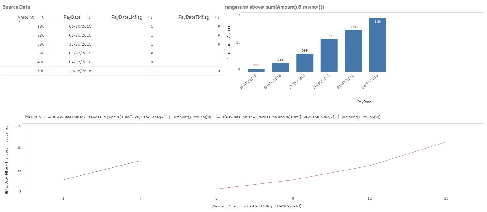
Hi Bob,
If I understood your requirements correctly you want to see 2 lines in your line chart with continuous dates.
So, what you need to do is to add in your expression for LM and TM simple set analysis as follow:
if(PayDateTMflag=1,rangesum( above( sum({<PayDateTMflag={'1'}>}Amount),0,rowno())))
if(PayDateLMflag=1,rangesum( above( sum({<PayDateLMflag={'1'}>}Amount),0,rowno())))
I got the following:
- Mark as New
- Bookmark
- Subscribe
- Mute
- Subscribe to RSS Feed
- Permalink
- Report Inappropriate Content
Thanks Tereza,
I guess I didn't explain this very well. Your solution has Last Month preceding This Month and I have them both on the same set of dates. So my x-axis dimension date "1" refers to both "June 1" on the June (LM) line and "July 1" on the July (TM) line. They appear together so we can compare This month's performance to last month's. I need for them both to accumulate on this same graph to complete this comparison. So there is only 1 measure, not 2; but there are 2 dimensions.
I reduced the app to just the fields involved and have attached it here. I removed the authentication information from the REST connector; however, the necessary data is already loaded. Others may find the connector interesting as I have been successful here using it to access a SOAP API.
See attached.
How can an we get this line graph to accumulate?