Unlock a world of possibilities! Login now and discover the exclusive benefits awaiting you.
- Qlik Community
- :
- Forums
- :
- Analytics
- :
- App Development
- :
- Re: Show dimension name for zero values
- Subscribe to RSS Feed
- Mark Topic as New
- Mark Topic as Read
- Float this Topic for Current User
- Bookmark
- Subscribe
- Mute
- Printer Friendly Page
- Mark as New
- Bookmark
- Subscribe
- Mute
- Subscribe to RSS Feed
- Permalink
- Report Inappropriate Content
Show dimension name for zero values
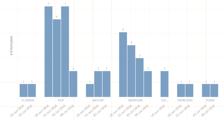
I have created a bar graph (also tried a line chart for the same) showing employee count corresponding each city and date. For a particular date/ city when there are no employees, I want to display a label on x axis so that the graph looks uniform.
Below is how the graph looks like. For Florida you can see only 2 dates as for Jun 25 and Jul 9th there are no employee entries. I would like it to show 4 columns for each of the date for Florida also.
I understand that it could be a Qlik design thing as I have the same issue using line/ combo chart as well but if you have a clever work around, it would help a lot.
- Mark as New
- Bookmark
- Subscribe
- Mute
- Subscribe to RSS Feed
- Permalink
- Report Inappropriate Content
I think you're out of luck. But if you can post a small demo qlik sense app we can have a go at it.
talk is cheap, supply exceeds demand