Unlock a world of possibilities! Login now and discover the exclusive benefits awaiting you.
- Qlik Community
- :
- All Forums
- :
- QlikView App Dev
- :
- Re: How to analyze multiple dimensions
- Subscribe to RSS Feed
- Mark Topic as New
- Mark Topic as Read
- Float this Topic for Current User
- Bookmark
- Subscribe
- Mute
- Printer Friendly Page
- Mark as New
- Bookmark
- Subscribe
- Mute
- Subscribe to RSS Feed
- Permalink
- Report Inappropriate Content
How to analyze multiple dimensions
Hi,
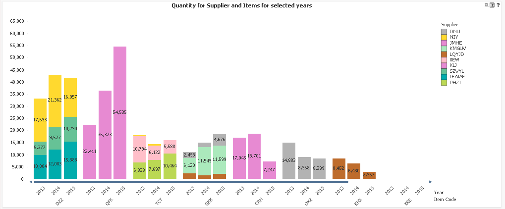
The customer requests to compare suppliers and items sales over years.
An item can be supplied by several suppliers, and a supplier can supply several items.
The attached (scrambled) chart does the job, but it is not friendly, especially when no selections are made.
The question is how to perform an effective analysis in the first place, and then with what objects?
I would appreciate some guidelines.
Thanks in advance!
- Mark as New
- Bookmark
- Subscribe
- Mute
- Subscribe to RSS Feed
- Permalink
- Report Inappropriate Content
I would try a calculated dimension of Item & Year (or a new Field). Use that field as the First Dimension and Supplier as the second dim. Style Horizontal, Stacked.
A heat map may also be a nice analysis
Qlikview Cookbook: Heat Table Chart http://qlikviewcookbook.com/recipes/download-info/heat-table-chart/
- Mark as New
- Bookmark
- Subscribe
- Mute
- Subscribe to RSS Feed
- Permalink
- Report Inappropriate Content
Lovely Rob!
Nice ideas and thanks for the Heat Map model!
- Mark as New
- Bookmark
- Subscribe
- Mute
- Subscribe to RSS Feed
- Permalink
- Report Inappropriate Content
Hi, you can use Trellis options with secondary dimension.
Regards!
- Mark as New
- Bookmark
- Subscribe
- Mute
- Subscribe to RSS Feed
- Permalink
- Report Inappropriate Content
Hi Manuel,
This is a good option too. The thing is that everything looks very small.
So I have to think how to use this feature in an effective way.
Thanks!
- Mark as New
- Bookmark
- Subscribe
- Mute
- Subscribe to RSS Feed
- Permalink
- Report Inappropriate Content
Hi, you can specify number of columns and number of rows to see this greather.
Regards!
- Mark as New
- Bookmark
- Subscribe
- Mute
- Subscribe to RSS Feed
- Permalink
- Report Inappropriate Content
Great tip!
Thanks!
- Mark as New
- Bookmark
- Subscribe
- Mute
- Subscribe to RSS Feed
- Permalink
- Report Inappropriate Content
You're wellcome!