Unlock a world of possibilities! Login now and discover the exclusive benefits awaiting you.
- Qlik Community
- :
- Forums
- :
- Analytics
- :
- New to Qlik Analytics
- :
- Re: Waterfall Chart
- Subscribe to RSS Feed
- Mark Topic as New
- Mark Topic as Read
- Float this Topic for Current User
- Bookmark
- Subscribe
- Mute
- Printer Friendly Page
- Mark as New
- Bookmark
- Subscribe
- Mute
- Subscribe to RSS Feed
- Permalink
- Report Inappropriate Content
Waterfall Chart
Hello All,
I am exploring QlikSense and in the process I downloaded a waterfall chart extension which I am using for different reports. One place where I am facing issue with this particular chart is when I am getting the top 5 sales reps with dimension as sales rep and expression as net sales. The values are being plotted properly but the chart is moving up, when I use the same chart with Month as the dimension, it is displaying the values properly. I have attached screenshots for your reference. Kindly suggest where the problem might be.
Thanks in Advance.
Accepted Solutions
- Mark as New
- Bookmark
- Subscribe
- Mute
- Subscribe to RSS Feed
- Permalink
- Report Inappropriate Content
Hi All,
The reason I found out for my issue may sound crazy but this is what has happened. As the length of the values of the dimension goes up, the chart starts moving upwards. The problem is we don't have X-axis text alignment like we do in QlikView. It would be great if it is included.
Thanks all for your effort and help.
- Mark as New
- Bookmark
- Subscribe
- Mute
- Subscribe to RSS Feed
- Permalink
- Report Inappropriate Content
Hi Uday,
Please upload your expression.
- Mark as New
- Bookmark
- Subscribe
- Mute
- Subscribe to RSS Feed
- Permalink
- Report Inappropriate Content
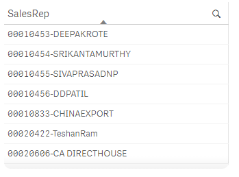
Hi,
Dimension : SalesRep
Expression : $(vNV)
$(vNV)=sum({<[Calendar.ZQDYear]={'$(vYearPrevious)'}>}VBRK.$(vCurrency)KZWI2)
- Mark as New
- Bookmark
- Subscribe
- Mute
- Subscribe to RSS Feed
- Permalink
- Report Inappropriate Content
The water extension is working fine. Please update your qvf file. let us check.
- Mark as New
- Bookmark
- Subscribe
- Mute
- Subscribe to RSS Feed
- Permalink
- Report Inappropriate Content
Hi,
The file is with live data with huge volume of data and I was not able to replicate the issue with the sample data, so I am providing the actual dimension and expression.
Dimension: =subfield(SalesRep,'-',2)
Expression : =sum({<[Calendar.ZQDYear]={'$(vYearPrevious)'}>}NetSales)
[Calendar.ZQDYear]= 2015,2015,2016
vYearPrevious=Year(Today())-1;
- Mark as New
- Bookmark
- Subscribe
- Mute
- Subscribe to RSS Feed
- Permalink
- Report Inappropriate Content
Hi All,
The reason I found out for my issue may sound crazy but this is what has happened. As the length of the values of the dimension goes up, the chart starts moving upwards. The problem is we don't have X-axis text alignment like we do in QlikView. It would be great if it is included.
Thanks all for your effort and help.
- Mark as New
- Bookmark
- Subscribe
- Mute
- Subscribe to RSS Feed
- Permalink
- Report Inappropriate Content
Hello,
Please open XL file to see my request.
I need to do different yield effect calculations and display them with a waterfall chart.
For this I made an example in Excel. But I would like to perform these calculations under Qlik sense.
The periods are not necessarily concurrent for the calculations
I have this input table :

And I do the calculations below :

Below are the formulas:

In the end I have this data:

the values are the sum of the above calculations.
And this graph :

Anyone to help me ?
Thank for your help