Unlock a world of possibilities! Login now and discover the exclusive benefits awaiting you.
- Qlik Community
- :
- All Forums
- :
- QlikView App Dev
- :
- Re: Show Daily-Data in Monthly Dimension in a Char...
- Subscribe to RSS Feed
- Mark Topic as New
- Mark Topic as Read
- Float this Topic for Current User
- Bookmark
- Subscribe
- Mute
- Printer Friendly Page
- Mark as New
- Bookmark
- Subscribe
- Mute
- Subscribe to RSS Feed
- Permalink
- Report Inappropriate Content
Show Daily-Data in Monthly Dimension in a Chart
Hello Q-Community
is there any solution to show daily-data in a monthly-dimension?
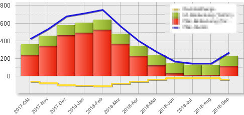
I want to show the blue line like this:
Thanks a lot.
- Mark as New
- Bookmark
- Subscribe
- Mute
- Subscribe to RSS Feed
- Permalink
- Report Inappropriate Content
May be you need this: Formatting on continuous Axis | Qlik Community
- Mark as New
- Bookmark
- Subscribe
- Mute
- Subscribe to RSS Feed
- Permalink
- Report Inappropriate Content
Hi Sunny
thanks for your quick response.
May be i have been unclear.
My problem is, that i have a chart with year-month as dimension. In this way I loose the daily granularity of the blue line (see first picture).
My purpose is to show the blue line with daily granularity in the first chart, which has year-month as dimension.
Thanks
- Mark as New
- Bookmark
- Subscribe
- Mute
- Subscribe to RSS Feed
- Permalink
- Report Inappropriate Content
Any sample data?
To achieve your desired output, your dimension on x-axis should have more value like 20+ ate one time...
Same you can't achieve with 5-10 dims value...
- Mark as New
- Bookmark
- Subscribe
- Mute
- Subscribe to RSS Feed
- Permalink
- Report Inappropriate Content
Sorry for not elaborating, but you need to use Continuous Axis on the presentation tab. Once you use that you will need to format your x-axis to view according to how you want to view it. The link helped with the second part, but I failed to mention that you will need to use Continuous Axis to do that 