Unlock a world of possibilities! Login now and discover the exclusive benefits awaiting you.
- Qlik Community
- :
- All Forums
- :
- QlikView App Dev
- :
- Re: Upper and lower bound limit
- Subscribe to RSS Feed
- Mark Topic as New
- Mark Topic as Read
- Float this Topic for Current User
- Bookmark
- Subscribe
- Mute
- Printer Friendly Page
- Mark as New
- Bookmark
- Subscribe
- Mute
- Subscribe to RSS Feed
- Permalink
- Report Inappropriate Content
Upper and lower bound limit
Hi Qlikview experts,
I have set of data several days worth of data with millions of records that have time stamps (e.g. every minute of 5 minute intervals) and several columns containing various information.
To simplify, the columns of interest are:
Time Stamp, User Name, network id, user status, region, throughput
Network status value is either IN or OUT
I am trying to create a chart showing number of distinct users accessing the network over the time (e.g. on hourly basis) or with variable interval and plotting upper and lower bound limit (w/ 95% confidence interval). In this case user status will need to be IN.
What I did was
Dimension = Hour (Time Stamp)
Expression is
count({<[user_status]={'*IN*'}>}distinct([User Name]))
While I can simply show the above expression in the chart, the lower and upper limit w/95% confidence is not properly shown.
Any suggestion how this should be done. Is there any aggregation function that should to be used here?
If I wanted to do the same thing for throughput (e.g. using sum(throughput)), will it be the same expression to be used?
Showing
Also I'd like to be able to show the same thing when changing the dimension to a calculated dimension like below
Timestamp((Ceil([Time Stamp],1/IntervalSize)),'DD-MMM-hh:mm')
The interval size for various period (15 min, 30 min , 1 hour, etc.) is predefined in the loading script.
- « Previous Replies
- Next Replies »
- Mark as New
- Bookmark
- Subscribe
- Mute
- Subscribe to RSS Feed
- Permalink
- Report Inappropriate Content
Well, this is not exactly what I wanted. I wanted to have another symbol
chart along with the line chart. The symbol colors will show different
color if the values exceed ULC or LCL limits.
- Mark as New
- Bookmark
- Subscribe
- Mute
- Subscribe to RSS Feed
- Permalink
- Report Inappropriate Content
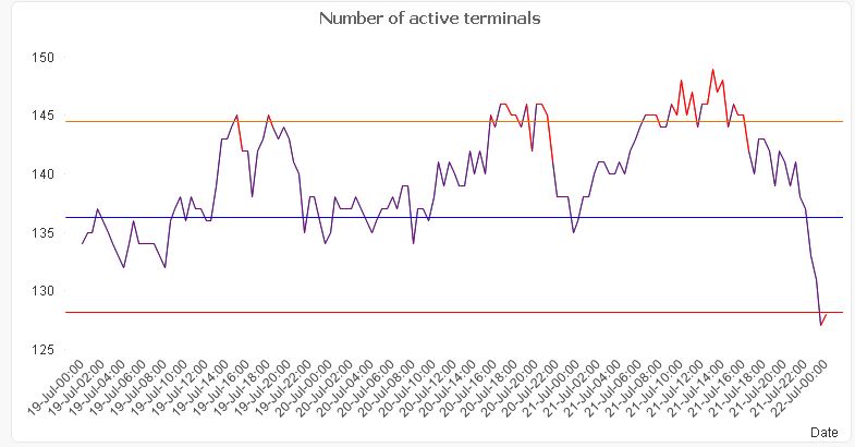
Is this what you want?
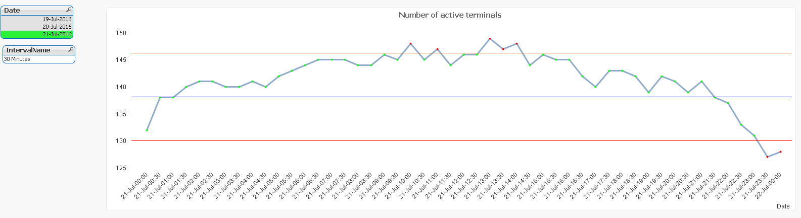
The problem is, when you don't have anything selected, it seems that everything is colored

- Mark as New
- Bookmark
- Subscribe
- Mute
- Subscribe to RSS Feed
- Permalink
- Report Inappropriate Content
Thanks, I was able to recreate both after applying the expression for the
background color. The only remaining issue now is the second chart that is
supposed to be a symbol chart remains as line chart instead of symbol
chart, even when I changed the symbol size.
>
- Mark as New
- Bookmark
- Subscribe
- Mute
- Subscribe to RSS Feed
- Permalink
- Report Inappropriate Content
I think I know what happened, it seems when all dates were selected the symbols occupied the whole lines and that's proabaly the eason they did not show up. When selected certain day the symbols showed up in the chart.
I think this thread can be closed. Again, many thanks to you!
- Mark as New
- Bookmark
- Subscribe
- Mute
- Subscribe to RSS Feed
- Permalink
- Report Inappropriate Content
No problem at all 
I am glad we were able to resolve the issue to your satisfaction.
Best,
Sunny
- « Previous Replies
- Next Replies »