Unlock a world of possibilities! Login now and discover the exclusive benefits awaiting you.
- Qlik Community
- :
- All Forums
- :
- QlikView App Dev
- :
- Re: Presentation of a chart like in the appendix?
- Subscribe to RSS Feed
- Mark Topic as New
- Mark Topic as Read
- Float this Topic for Current User
- Bookmark
- Subscribe
- Mute
- Printer Friendly Page
- Mark as New
- Bookmark
- Subscribe
- Mute
- Subscribe to RSS Feed
- Permalink
- Report Inappropriate Content
Presentation of a chart like in the appendix?
Hi all,
I want to know, if and how it is possible to present a chart like in the appendix.
There are different groups of data. Is this possible?
Ex:
| Group | A | B |
|---|---|---|
| Test1 | ||
| ABC | .93 | |
| DEF | 23.4 | |
| Test2 | ||
| XYC | 54 | |
| dhj | 64 | |
| etc | etc | etc |
As you can see in the appendix - the example is very huge.
Thank you for helping.
- « Previous Replies
-
- 1
- 2
- Next Replies »
Accepted Solutions
- Mark as New
- Bookmark
- Subscribe
- Mute
- Subscribe to RSS Feed
- Permalink
- Report Inappropriate Content
- Mark as New
- Bookmark
- Subscribe
- Mute
- Subscribe to RSS Feed
- Permalink
- Report Inappropriate Content
Hi Robert,
I suspect that there is no way to create a chart like this.
Thanks.
- Mark as New
- Bookmark
- Subscribe
- Mute
- Subscribe to RSS Feed
- Permalink
- Report Inappropriate Content
As i understand your need, This is might be Pivot Table.
Would you provide sample application
- Mark as New
- Bookmark
- Subscribe
- Mute
- Subscribe to RSS Feed
- Permalink
- Report Inappropriate Content
I only have the example from the appendix?
They asked if this presentation is possible with qlikview.
- Mark as New
- Bookmark
- Subscribe
- Mute
- Subscribe to RSS Feed
- Permalink
- Report Inappropriate Content
I feel that 'No (Easy )way' to implement like this
- Mark as New
- Bookmark
- Subscribe
- Mute
- Subscribe to RSS Feed
- Permalink
- Report Inappropriate Content
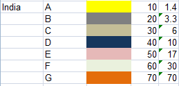
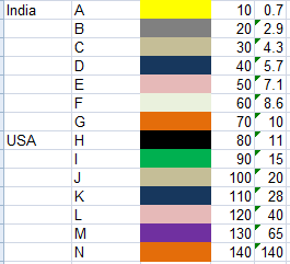
If you are expecting this, Yes it's possible
- Mark as New
- Bookmark
- Subscribe
- Mute
- Subscribe to RSS Feed
- Permalink
- Report Inappropriate Content
Thank you ...
and i can go on with another country, right?
How to get this?
- Mark as New
- Bookmark
- Subscribe
- Mute
- Subscribe to RSS Feed
- Permalink
- Report Inappropriate Content
Yes, You can try with Another Country by Your Hand.
In fact, This is way which i found for future as well
- Mark as New
- Bookmark
- Subscribe
- Mute
- Subscribe to RSS Feed
- Permalink
- Report Inappropriate Content
I don't get this - sorry.
I want to have a bar chart like in the appendix with different groups in the legend/underline.
Sorry, for my bad English
- Mark as New
- Bookmark
- Subscribe
- Mute
- Subscribe to RSS Feed
- Permalink
- Report Inappropriate Content
I am not sure, i understand your issue? Would you able to provide sample application and expected o/p, Please?
OR Yes, You can use bar chart using Straight table with bar graph instead of column values. For Ref, Check below image and try that way using Mini Chart.
- « Previous Replies
-
- 1
- 2
- Next Replies »