Unlock a world of possibilities! Login now and discover the exclusive benefits awaiting you.
- Qlik Community
- :
- All Forums
- :
- QlikView App Dev
- :
- Re: scatter chart
- Subscribe to RSS Feed
- Mark Topic as New
- Mark Topic as Read
- Float this Topic for Current User
- Bookmark
- Subscribe
- Mute
- Printer Friendly Page
- Mark as New
- Bookmark
- Subscribe
- Mute
- Subscribe to RSS Feed
- Permalink
- Report Inappropriate Content
scatter chart
Hi friends ,
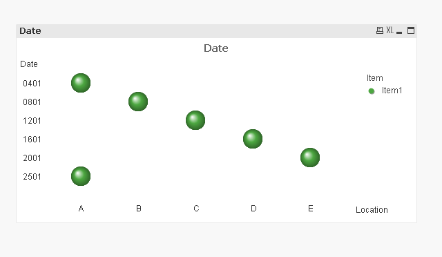
I was strucked in creating an scatter chart using the following data.In this data location A is coming twice based on the last seen time.so now how i want to show my chart is x-axis as Location , for each location it should show the last seen time as a bubble and when it comes to location A it should show the two bubbles.
When i tried to create this but i am not able to acheive.
| Item | Location | LastSeen time |
| Item 1 | A | 4-Jan |
| B | 8-Jan | |
| C | 12-Jan | |
| D | 16-Jan | |
| E | 20-Jan | |
| A | 25-Jan |
How can I achieve this . Can anyone suggest me how to implement this.
- Mark as New
- Bookmark
- Subscribe
- Mute
- Subscribe to RSS Feed
- Permalink
- Report Inappropriate Content
Like this :
- Mark as New
- Bookmark
- Subscribe
- Mute
- Subscribe to RSS Feed
- Permalink
- Report Inappropriate Content
Try this:
- Mark as New
- Bookmark
- Subscribe
- Mute
- Subscribe to RSS Feed
- Permalink
- Report Inappropriate Content
Hi Varsha Vig,
Thanks for your reply,
But what i am trying is in one location i need show it as one bubble with two different color.
Is it possible in scatter chart.
Thanks
Kumar KVP
- Mark as New
- Bookmark
- Subscribe
- Mute
- Subscribe to RSS Feed
- Permalink
- Report Inappropriate Content
- Mark as New
- Bookmark
- Subscribe
- Mute
- Subscribe to RSS Feed
- Permalink
- Report Inappropriate Content
Hi,
is this what your'e looking for,
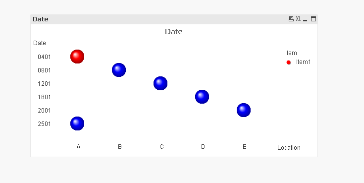
using this in Background color,
=IF(Aggr(Count(Date),Location)>1,LightRed(),LightBlue())
Else please elaborate your'e requirement.
-Hirish
“Aspire to Inspire before we Expire!”
- Mark as New
- Bookmark
- Subscribe
- Mute
- Subscribe to RSS Feed
- Permalink
- Report Inappropriate Content
Hi Hirish,
Thanks for your reply. Appricate of your example.
Actually, my requirement is I am having one image(image consists of blue print of building 1st floor , floor contains the locations(A,B,C,D,E) ) .So now i am going to plot a bubble or bubbles in the location it to show the date timestamps .
i.e if they are more than one timestamps for a particular location. I want to show the more than one timestamp as bubbles in that location.
So thay why i am trying to have the no of bubbles in particular location.
I am having one more doubt on it is like I can able to show the bubbles in the location.
And also I am not fixed to one chart.If possible it can be done by another chart it is okay for me.
The bleow are the sample data with xy coordinates.Here the coordinate i have take as a sample.
| Item | Location | DTTime | x | y |
| Item1 | A | 1/3/16 1:00 | 50 | 50 |
| Item1 | B | 1/5/16 2:00 | 20 | 20 |
| Item1 | C | 1/7/16 3:00 | 30 | 30 |
| Item1 | D | 1/9/16 0:00 | 40 | 40 |
| Item1 | E | 1/9/16 1:00 | 35 | 35 |
| Item1 | A | 1/13/16 1:00 | 50 | 50 |
- Mark as New
- Bookmark
- Subscribe
- Mute
- Subscribe to RSS Feed
- Permalink
- Report Inappropriate Content
Hi Varsha,
I'm also having the same problem as Kumar.
Unfortunately, I'm currently using the version of Qlikview that doesn't allow me to open up Qlikview files that were not created in my laptop. I believe your 86.qvw file would be able to illustrate the answer to me but I cannot open it.
Are you able to put in words what you actually did in the "Dimensions" & "Expressions" tab that enabled you to produce the scatter chart as shown in your message dated 24th Oct 2016 0258 hrs?
Alternatively, are you able to take screenshots and post it here?
Thanks
Lawrence