Unlock a world of possibilities! Login now and discover the exclusive benefits awaiting you.
- Qlik Community
- :
- Forums
- :
- Analytics
- :
- New to Qlik Analytics
- :
- Re: individual data values too low
- Subscribe to RSS Feed
- Mark Topic as New
- Mark Topic as Read
- Float this Topic for Current User
- Bookmark
- Subscribe
- Mute
- Printer Friendly Page
- Mark as New
- Bookmark
- Subscribe
- Mute
- Subscribe to RSS Feed
- Permalink
- Report Inappropriate Content
individual data values too low
Hi All,
when the individual data values are lower,with the bar chat can't show their comparison.How can i solve this problem?
Thanks in advance!
Accepted Solutions
- Mark as New
- Bookmark
- Subscribe
- Mute
- Subscribe to RSS Feed
- Permalink
- Report Inappropriate Content
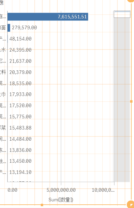
There is a huge difference between 7.6M and 279K (largest compared to second largest measured dimension).
Showing them on the same chart as with your other values and to make visual sense would require a very large screen.
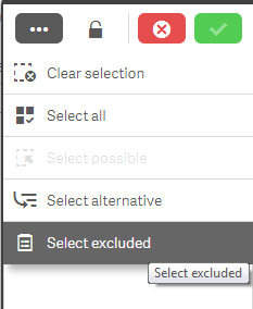
Alternatively you could remove your outliers (exclude them in your chart by using select excluded (after selecting them)).
Probably not what you want to hear, but visually presenting outliers for comparison with such a big difference in values will be a challenge.
Ps. Have you tried converting your bar chart to a tree map to see the result?
- Mark as New
- Bookmark
- Subscribe
- Mute
- Subscribe to RSS Feed
- Permalink
- Report Inappropriate Content
I think the problem is that you have one bar that is so much larger than all of the rest of them. Do you have to have that bar in this chart?
Do bars show up as you scroll down using the scroll on the right.
You also may be able to adjust the scale in the axis properties or set a custom range.
- Mark as New
- Bookmark
- Subscribe
- Mute
- Subscribe to RSS Feed
- Permalink
- Report Inappropriate Content
Split it to two charts.
One with the "Huge one" and ""Others".
The other one does not include the huge one so only compare within the rest.
Fei
- Mark as New
- Bookmark
- Subscribe
- Mute
- Subscribe to RSS Feed
- Permalink
- Report Inappropriate Content
Try changing scale in the Chart according the other values range
- Mark as New
- Bookmark
- Subscribe
- Mute
- Subscribe to RSS Feed
- Permalink
- Report Inappropriate Content
There is a huge difference between 7.6M and 279K (largest compared to second largest measured dimension).
Showing them on the same chart as with your other values and to make visual sense would require a very large screen.
Alternatively you could remove your outliers (exclude them in your chart by using select excluded (after selecting them)).
Probably not what you want to hear, but visually presenting outliers for comparison with such a big difference in values will be a challenge.
Ps. Have you tried converting your bar chart to a tree map to see the result?