Unlock a world of possibilities! Login now and discover the exclusive benefits awaiting you.
- Qlik Community
- :
- Forums
- :
- Analytics
- :
- New to Qlik Analytics
- :
- Re: Data point with Light blue lable in qliksense
- Subscribe to RSS Feed
- Mark Topic as New
- Mark Topic as Read
- Float this Topic for Current User
- Bookmark
- Subscribe
- Mute
- Printer Friendly Page
- Mark as New
- Bookmark
- Subscribe
- Mute
- Subscribe to RSS Feed
- Permalink
- Report Inappropriate Content
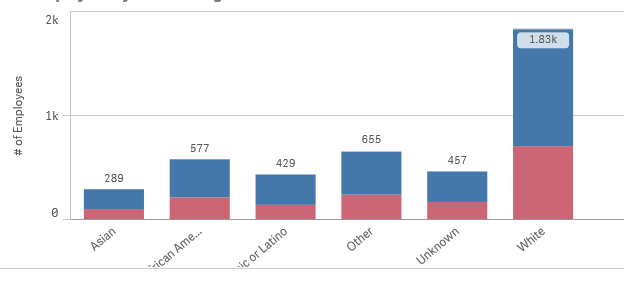
Data point with Light blue lable in qliksense
How to create the chart below with Data point inside the column bar in light blue (1.8k) as in the image below???
Accepted Solutions
- Mark as New
- Bookmark
- Subscribe
- Mute
- Subscribe to RSS Feed
- Permalink
- Report Inappropriate Content
Hi Hussain,
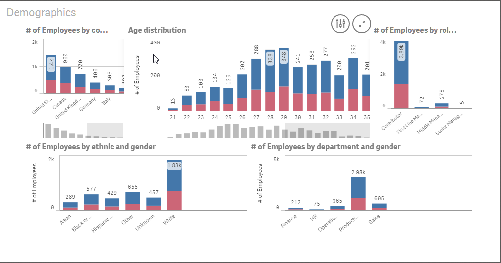
This is not something a developer has direct control over. Qlik Sense is optimising the chart based on the data and the available screen real estate. This is part of the responsive design and smart visualization capability that ensure optimal display on any device/screen size.
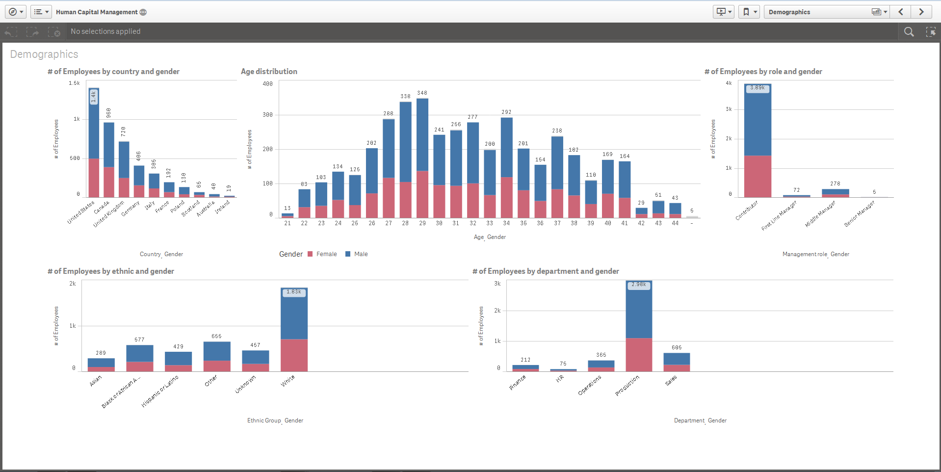
Please see below on how the labeling changes on the top centre chart based on changing the aspect ratio and size of my window.
Josh
Qlik
- Mark as New
- Bookmark
- Subscribe
- Mute
- Subscribe to RSS Feed
- Permalink
- Report Inappropriate Content
I do not think it is possible to have a value in a blue box.
There is an extension which plots values inside segments but you'll not get a box or blue color.
- Mark as New
- Bookmark
- Subscribe
- Mute
- Subscribe to RSS Feed
- Permalink
- Report Inappropriate Content
I saw this from the qlik official website. see the link below
- Mark as New
- Bookmark
- Subscribe
- Mute
- Subscribe to RSS Feed
- Permalink
- Report Inappropriate Content
Hello Hussain,
This is automatic based on the responsive nature of the charts. If you turn on labels on data points and use a stacked bar chart and color by that dimension will display the data label as such:

Here is the Capital Management Example:- full screen
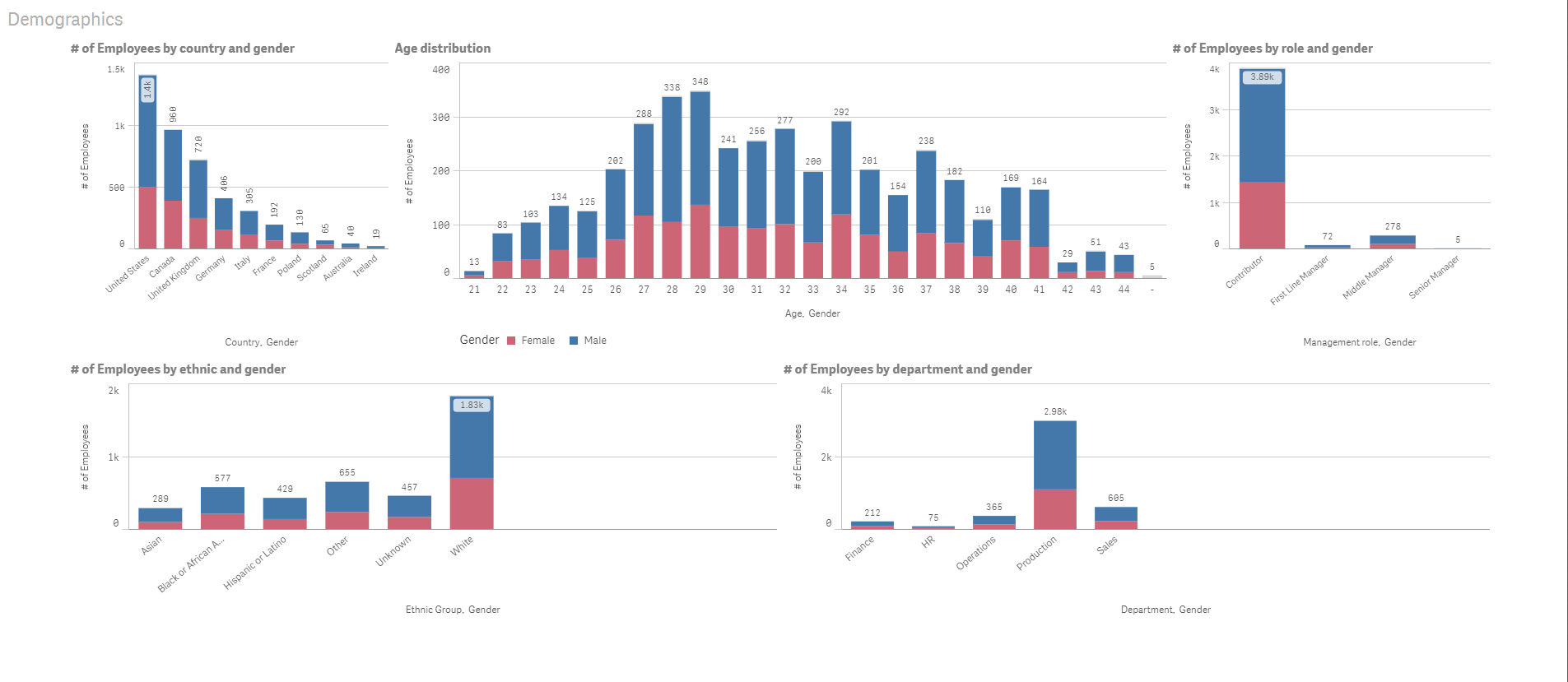
Condensed:

Notice many of the label light-blue boxes.
Hope this helps.
When applicable please mark the appropriate replies as CORRECT. This will help community members and Qlik Employees know which discussions have already been addressed and have a possible known solution. Please mark threads as HELPFUL if the provided solution is helpful to the problem, but does not necessarily solve the indicated problem. You can mark multiple threads as HELPFUL if you feel additional info is useful to others.
Regards,
Mike Tarallo
Qlik
Mike Tarallo
Qlik
- Mark as New
- Bookmark
- Subscribe
- Mute
- Subscribe to RSS Feed
- Permalink
- Report Inappropriate Content
Hi Hussain,
This is not something a developer has direct control over. Qlik Sense is optimising the chart based on the data and the available screen real estate. This is part of the responsive design and smart visualization capability that ensure optimal display on any device/screen size.
Please see below on how the labeling changes on the top centre chart based on changing the aspect ratio and size of my window.
Josh
Qlik