Unlock a world of possibilities! Login now and discover the exclusive benefits awaiting you.
- Qlik Community
- :
- All Forums
- :
- QlikView App Dev
- :
- Re: Show year only once in graph
- Subscribe to RSS Feed
- Mark Topic as New
- Mark Topic as Read
- Float this Topic for Current User
- Bookmark
- Subscribe
- Mute
- Printer Friendly Page
- Mark as New
- Bookmark
- Subscribe
- Mute
- Subscribe to RSS Feed
- Permalink
- Report Inappropriate Content
Show year only once in graph
Hi guys,
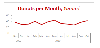
I recently started working with QlikView. Currently, I am building a dashboard in which I want to display a similar graph as below. Instead of repeating the year for every month, I would like to show it only once. I've tried many things, but I can not figure it out. Can you please help me?
- Mark as New
- Bookmark
- Subscribe
- Mute
- Subscribe to RSS Feed
- Permalink
- Report Inappropriate Content
Hmmm this seems to work with a bar chart but I am struggling with a line
- Mark as New
- Bookmark
- Subscribe
- Mute
- Subscribe to RSS Feed
- Permalink
- Report Inappropriate Content
I did not understand your need. Do you want the graphic to look like your image?
- Mark as New
- Bookmark
- Subscribe
- Mute
- Subscribe to RSS Feed
- Permalink
- Report Inappropriate Content
I actually want this for a bar chart! How do I do this?
I included an image of the bar chart i am working on. I basically want the x axisto resemble that of the line chart in my first post.
Thanks!
- Mark as New
- Bookmark
- Subscribe
- Mute
- Subscribe to RSS Feed
- Permalink
- Report Inappropriate Content
It just does it for me when I add two dimensions and one measure..... can you share your QVW file (or a cut down version of it) and I will see what I can do
- Mark as New
- Bookmark
- Subscribe
- Mute
- Subscribe to RSS Feed
- Permalink
- Report Inappropriate Content
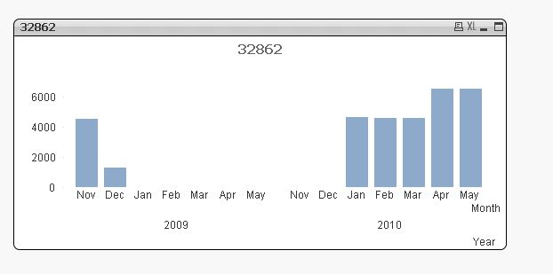
Oh no, I had to add a dummy calculated dimension of ='' to stop it grouping by the months.
Needs some sorting out but you get the idea
- Mark as New
- Bookmark
- Subscribe
- Mute
- Subscribe to RSS Feed
- Permalink
- Report Inappropriate Content
Thanks, that is a very good start already! I would have never thought to include ='' as a calculated dimension...
I get this now. Now, I would like to hide the days for which it is empty...