Unlock a world of possibilities! Login now and discover the exclusive benefits awaiting you.
- Qlik Community
- :
- All Forums
- :
- QlikView App Dev
- :
- Re: How to make a scatter chart with x with discre...
- Subscribe to RSS Feed
- Mark Topic as New
- Mark Topic as Read
- Float this Topic for Current User
- Bookmark
- Subscribe
- Mute
- Printer Friendly Page
- Mark as New
- Bookmark
- Subscribe
- Mute
- Subscribe to RSS Feed
- Permalink
- Report Inappropriate Content
How to make a scatter chart with x with discrete values ?
Hello,
I'm looking for a way to make a mix between Scatter Chart and Grid Chart.
I would like to make a Scatter chart but the x dimension is a value that has two different companies values
It means I want the y to be continuous and the x to be discrete values.
Is there a trick to do that ? and do you know an extension that could do that ?
Thanks
F.
Accepted Solutions
- Mark as New
- Bookmark
- Subscribe
- Mute
- Subscribe to RSS Feed
- Permalink
- Report Inappropriate Content
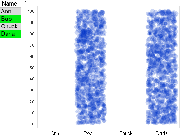
It's possible if you cheat a little by using a text object for the names, and dual() when defining the names so that each is in a specific position so that it always matches the text. See attached for that combined with the random X offset and semi-transparent colors. I've done this in a couple applications.
- Mark as New
- Bookmark
- Subscribe
- Mute
- Subscribe to RSS Feed
- Permalink
- Report Inappropriate Content
please post some sample data and your expected result.
thanks
regards
Marco
- Mark as New
- Bookmark
- Subscribe
- Mute
- Subscribe to RSS Feed
- Permalink
- Report Inappropriate Content
X can certainly just have two discrete values. Make a scatter chart and go.
But if you have a lot of data, you'll just see two lines on your screen, which isn't much use. So I'll give you a couple tricks I use. First, I make the color of the points fairly transparent. For instance, argb(50,100,100,200). I have no idea if that's a decent color, but the idea is that it takes multiple points in close proximity to build up color, so you can get a better idea what's going on with your Y dimension. The other thing I do is randomly offset the X value. So if I have X values 10 and 20, I might use x-4.5+rand()*9, say. I'll then get something more like bars instead of lines. This combines well with the semi-transparent colors if you still have so much data that you're getting fairly dark bars. I've even used a variable and slider for the transparency, because user selections can have a big impact on how much data there is, and if there's a lot, different levels of transparency can highlight different patterns in the data.
- Mark as New
- Bookmark
- Subscribe
- Mute
- Subscribe to RSS Feed
- Permalink
- Report Inappropriate Content
For example, I want to compare two shops
Shop1 and Shop2 would be on x axis.
On y, i would love to have prices
on size of bubbles, i would have the number of items sold for each price as the size of the bubble
The problem is if i use Scatter Chart I can't have a shop name on X
And if I use Grid Chart, i don't have continuous x for prices ..
- Mark as New
- Bookmark
- Subscribe
- Mute
- Subscribe to RSS Feed
- Permalink
- Report Inappropriate Content
Thanks John for you very interesting method with random x and alpha colors.
For the discrete values, I can convert my string values to numbers but I would have loved to be able to use names on x and continuous y .. I think it's not possible.
Thanks
- Mark as New
- Bookmark
- Subscribe
- Mute
- Subscribe to RSS Feed
- Permalink
- Report Inappropriate Content
It's possible if you cheat a little by using a text object for the names, and dual() when defining the names so that each is in a specific position so that it always matches the text. See attached for that combined with the random X offset and semi-transparent colors. I've done this in a couple applications.
- Mark as New
- Bookmark
- Subscribe
- Mute
- Subscribe to RSS Feed
- Permalink
- Report Inappropriate Content
Maybe "Text in Chart" could be an alternative for the Name axis.
Another way to present this data might be a trellis scatter chart:
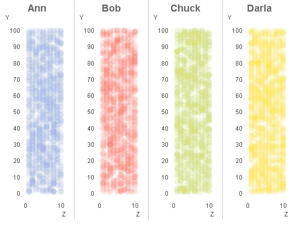
Using your example if I may.
hope this helps
regards
Marco
- Mark as New
- Bookmark
- Subscribe
- Mute
- Subscribe to RSS Feed
- Permalink
- Report Inappropriate Content
Thanks that's nice.
I had made an example with Treillis and it seems quite nice even if it is not what was requested.
With a mix of all the answers, I think I'll be able to make a very nice chart.
Thanks
- Mark as New
- Bookmark
- Subscribe
- Mute
- Subscribe to RSS Feed
- Permalink
- Report Inappropriate Content
Thanks, that's a very nice example. Great idea
- Mark as New
- Bookmark
- Subscribe
- Mute
- Subscribe to RSS Feed
- Permalink
- Report Inappropriate Content
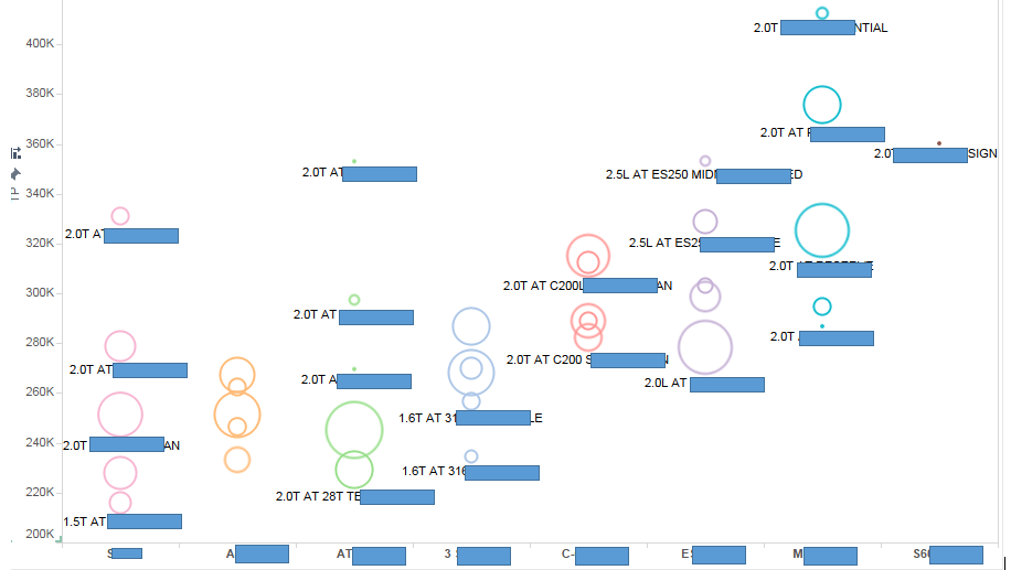
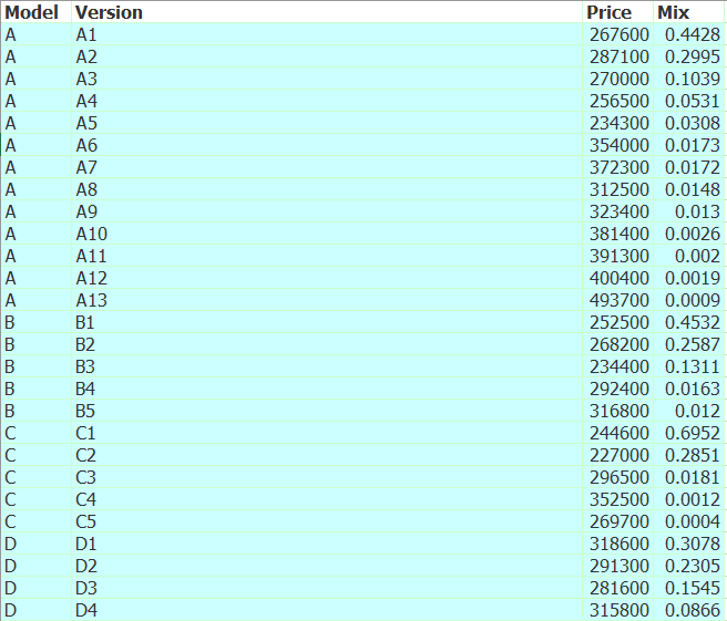
Hi F, John and Macro,
I suppose I met a same problem as your.
Here is my raw data (Excel) and screenshot for my expected output.
X axis is model, Y axis is price, bubble stands for version and size of bubble stand for mix.
Very Appreciate!! @ John Witherspoon @ Marco Wedel