Unlock a world of possibilities! Login now and discover the exclusive benefits awaiting you.
- Qlik Community
- :
- All Forums
- :
- Qlik NPrinting
- :
- Re: nprinting 16 - pivot table in powerpoint expor...
- Subscribe to RSS Feed
- Mark Topic as New
- Mark Topic as Read
- Float this Topic for Current User
- Bookmark
- Subscribe
- Mute
- Printer Friendly Page
- Mark as New
- Bookmark
- Subscribe
- Mute
- Subscribe to RSS Feed
- Permalink
- Report Inappropriate Content
nprinting 16 - pivot table in powerpoint export
Hi everyone,
Versions:
QlikView 12 SR4
NPrinting 16 SR4
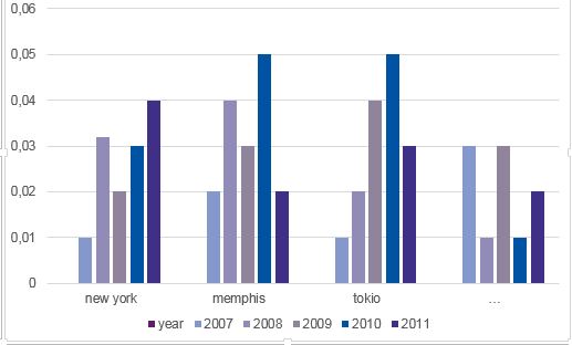
The values are for presentational purposes only and differ from chart to chart.
We want to export a bar chart, like the following one, into a powerpoint presentation (not via images -> native chart),
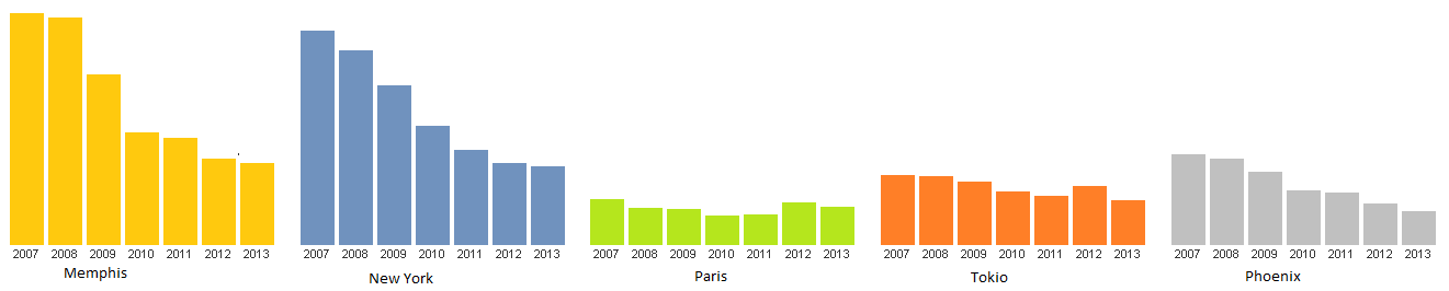
Here you can see three Fields:
1. Name of City (city)
2. Year (year)
3. Value of specific data (e. g. unemployment rate) - (unemploymentrate)
As shown, it works fine in QlikView.
-----
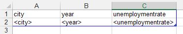
Now we want to rebuild this chart in Powerpoint, using the data of the diagram. Therefore, we added the chart to 'tables' to use the three columns mentioned above.
As we want to create a bar chart, the embedded excel data looks like this:
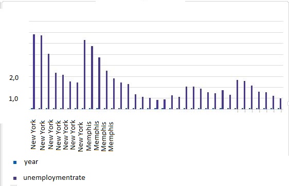
Unfortunately, this ends up in a data mess, such as:
city year unemploymentrate
New York 2009 1,4
New York 2010 2,4
New York ....... ....
New York 2015 1,7
Memphis 2009 3,0
.... ..... ....
Memphis 2015 2,7
....
and so on...
The resulting chart looks like this:
To have a native powerpoint bar chart, we therefore need to use something like a pivot table with a structure such as:
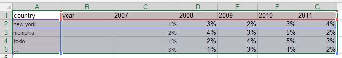
It did not work to embed a pivot table from Qlikview straight into the Excel data sheet of the powerpoint bar chart.
In addition, we did not manage neither to load a field like "year" as a row nor to eliminate all the country names for every single value.
Is there any option to directly load the data into the powerpoint bar chart template or do you have another good idea to solve this issue. Most of our charts refer to pivot tables, thus, for us, it is vital to solve this issue in an efficient way.
Your support is much appreciated! Regards
- Mark as New
- Bookmark
- Subscribe
- Mute
- Subscribe to RSS Feed
- Permalink
- Report Inappropriate Content
Hi Yannick,
1) QlikView 12.x is not supported by any version/SR of NPrinting 16 so I would address that first. Check this document: Requirements for NPrinting 14 and following versions up to NPrinting 16
2) You cannot use Pivot Tables as the source for PowerPoint native charts in NPrinting. You will need to create a straight table with the required structure in QlikView. When you add a pivot table to your NPrinting report as a table, you will not have access to the individual fields so you cannot build the chart source from that.

HTH - Daniel.
- Mark as New
- Bookmark
- Subscribe
- Mute
- Subscribe to RSS Feed
- Permalink
- Report Inappropriate Content
Hi Daniel,
thank you for your quick response! We actually didn't know that QV12 is not supported by NP16, however, we have not noticed any negative impact despite the missing pivot feature yet.
Do you have any idea how we could solve this issue? If we work with straight tables, we end up with the same data mess as shown in my first post above (city name several times and not only once combining all values).
Also, does it make any sense to downgrade our nprinting version for any reason or upgrade nprinting to V17?
- Mark as New
- Bookmark
- Subscribe
- Mute
- Subscribe to RSS Feed
- Permalink
- Report Inappropriate Content
Hi Yannick,
were you able to solve this problem?
I was trying to use the dual axis functionality but without luck.
Chart with a Dual Category Axis - Peltier Tech Blog
I was able to get the correct data input (from straight table), which can create such chart.
Name Period Value
Name1 Period1 10
Period2 20
Name2 Period1 10
Period2 20
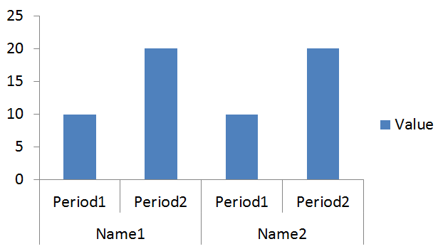
But when I create it in template and then preview or run the task it does not come out correctly. Somewhere during the export axes are changed and the chart is broken.
BR,
Matus
- Mark as New
- Bookmark
- Subscribe
- Mute
- Subscribe to RSS Feed
- Permalink
- Report Inappropriate Content
Dear Matus,
the good news first: We were able to solve this problem.
The bad news: It is not possible to do this with a direct export into PowerPoint.
We export our data to Excel using three main functionalities:
1. Tables and then making pivot tables out of them
2. Formula to fill cells with the data - these cells are input cells for graphs.
3. Levels to have tables that can change the amount of coloums we need.
I imagine, this might sound a bit overwhelming for the start, but what I initially did when I had to explore it on my own was to understand these three ways of exporting data to excel.
Once you ran the task in Nprinting and you have a filled excel sheet or even more, we copy paste the graphics from excel to powerpoint and embed these. After programming, the workaround looks like this.
1. Make selections in QlikView
2. Run the task
3. Open the output-Excels (this makes the updating process faster)
4. Open Powerpoint and update the embedded links (you can select automatic updates in powerpoint, which you have to do manually after every new graph you embed!)
This really works well for us. We have an output of currently 150 graphs - all of them coming from two generated excel files.
Time from running the task to updated powerpoint (around 6-8 minutes).
Regards,
Yannick