Unlock a world of possibilities! Login now and discover the exclusive benefits awaiting you.
- Qlik Community
- :
- All Forums
- :
- QlikView App Dev
- :
- Re: Combo chart multiple dimensions
- Subscribe to RSS Feed
- Mark Topic as New
- Mark Topic as Read
- Float this Topic for Current User
- Bookmark
- Subscribe
- Mute
- Printer Friendly Page
- Mark as New
- Bookmark
- Subscribe
- Mute
- Subscribe to RSS Feed
- Permalink
- Report Inappropriate Content
Combo chart multiple date dimensions
Hi,
Does anyone know a simple solution to fit two different line measures with different date dimensions from each other into one graph? I am trying to visualize the cumulative returns (daily for midweek data) with the corresponding Model score (+/- weekly) for a stock.
I thought a simple combo chart will do the work, but because both measures use different dimensions (frequent vs less frequent dates) only either one will be shown correctly. My solution is to reload the less frequent measure (Model score) for the dates for which no model score is available. In this way there would be the same amount of data available for both measures and hopefully this will result in the graph I am looking for.
As this is a brand new territory for me, could someone please help me creating this script if this indeed seems the correct solution?
Thank you for your time.
Sebastian
Summary: Combo chart only supports one dimension for multiple measures. How to fit two different line measures with two different date dimensions into one graph? Dimensions are called "Dates" (daily for midweek data) for returns and "DatesCockpit" (+/- weekly) for Model scores.
- « Previous Replies
- Next Replies »
Accepted Solutions
- Mark as New
- Bookmark
- Subscribe
- Mute
- Subscribe to RSS Feed
- Permalink
- Report Inappropriate Content
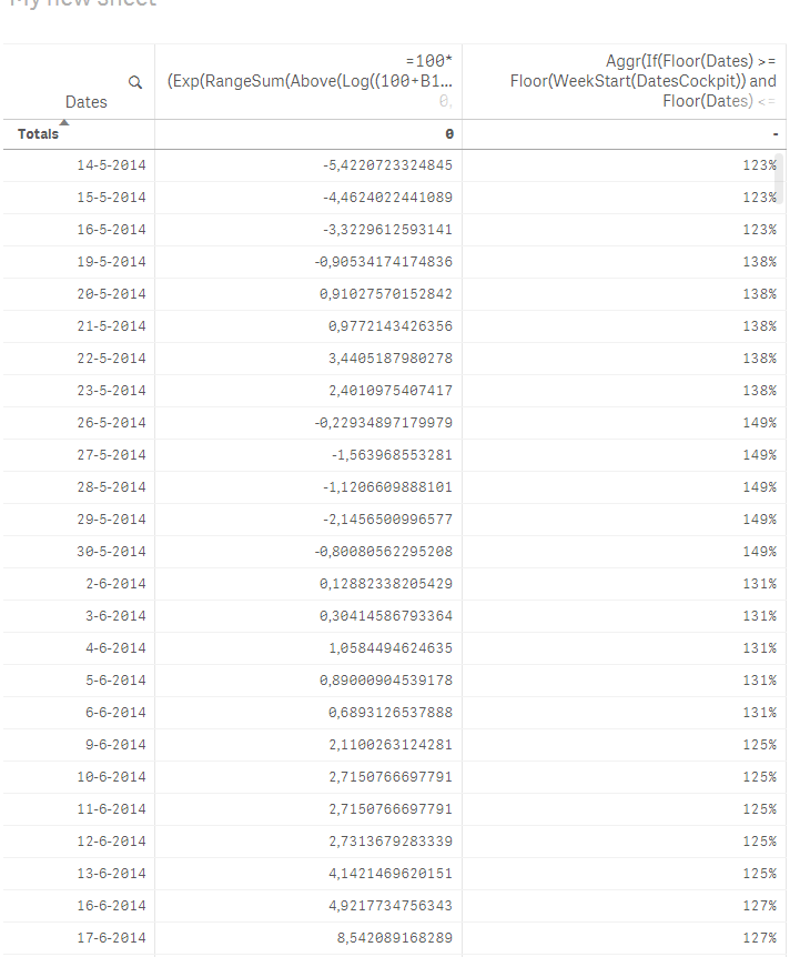
Try this for model with Dates as dimension
Aggr(If(Floor(Dates) >= Floor(WeekStart(DatesCockpit)) and Floor(Dates) <= Floor(WeekEnd(DatesCockpit)), Model), Dates, DatesCockpit)
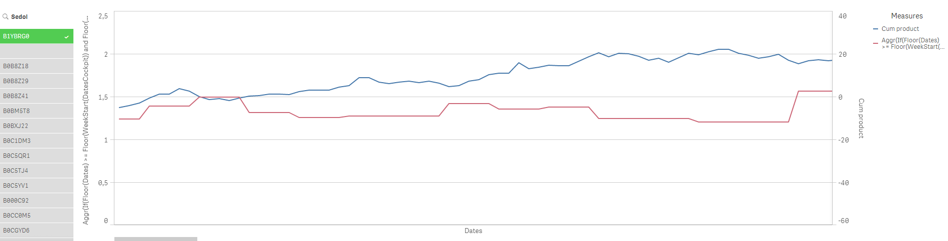
In table, it would look like this:
HTH
Best,
Sunny
- Mark as New
- Bookmark
- Subscribe
- Mute
- Subscribe to RSS Feed
- Permalink
- Report Inappropriate Content
Maybe if you concatenate the fields of your 4 different dimensions, creating 2 dimensions with the values you need and change your expressions you can do what you need
- Mark as New
- Bookmark
- Subscribe
- Mute
- Subscribe to RSS Feed
- Permalink
- Report Inappropriate Content
Just trying to ensure I'm following your question
You have mixed granularity on your dates? Daily for one data set and Weekly for the other?
As Clever suggested, perhaps you can join data sets on the dates - see threads on Mixed Granularity - perhaps start here Fact Table with Mixed Granularity
then your X axis would be common dates and you would have two distinct Y axis values?
- Mark as New
- Bookmark
- Subscribe
- Mute
- Subscribe to RSS Feed
- Permalink
- Report Inappropriate Content
Hi Anjos,
Thank you for your quick reply. Perhaps I should have been more clear, currently I am already dealing with two dimensions. These dimensions are both dates. However, one set of dates is daily (the ones of the measure returns), while the other set of dates is +/- weekly (the ones of the measure Model score).
When I try to visualize both lines in a combo graph, only the line of the Model score line will be shown correctly. The returns are now not shown on a daily, but weekly basis.
Please have a look at the figures below:
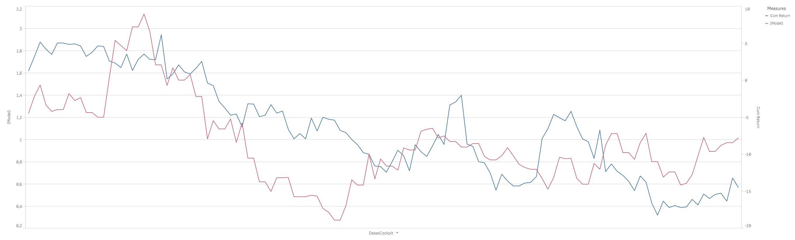
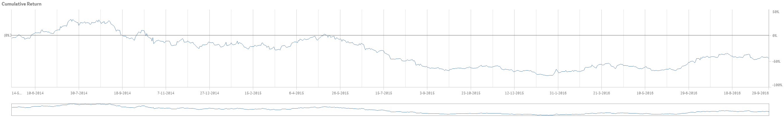
The lower figure represents the Returns on a daily basis. The upper figure represents the Model score & Returns, but uses the dates of the Model score which is on a weekly basis. Therefore, misrepresenting the returns series. I would like to find a solution for the latter if possible.
- Mark as New
- Bookmark
- Subscribe
- Mute
- Subscribe to RSS Feed
- Permalink
- Report Inappropriate Content
Hello Jon,
Thank you for your reply as well. I am going to have a more closer look on the link you provided. Please read my answer above to make sure my issue is clear to you. From you answer, I think you well understood my problem.
With kind regards,
Sebastian
- Mark as New
- Bookmark
- Subscribe
- Mute
- Subscribe to RSS Feed
- Permalink
- Report Inappropriate Content
Would you mind sharing a sample of your app?
- Mark as New
- Bookmark
- Subscribe
- Mute
- Subscribe to RSS Feed
- Permalink
- Report Inappropriate Content
Please find a sample app attached. It's the first time I attach a qvf file. I hope everything went well and you are able to open the app.
- Mark as New
- Bookmark
- Subscribe
- Mute
- Subscribe to RSS Feed
- Permalink
- Report Inappropriate Content
Please adapt your script and use Dates as your dimension
// Load Cockpit files with old column names (Newbet = WeightManualInput, Target = New Weight)
Cockpits:
LOAD
Date(Date#(LEFT(right(Filename(),13),8),'YYYYMMDD'),'DD-MM-YYYY') AS DatesCockpit,
Date(Date#(LEFT(right(Filename(),13),8),'YYYYMMDD'),'DD-MM-YYYY') AS Dates,
Sedol,
Reuters as "Ticker",
Name,
Model
FROM [lib://Mutation File/Renamed Cockpit List Full\Old Format\Cockpit *.xlsm]
(ooxml, embedded labels, header is 1 lines, table is [Stock Selection]);
// Load Cockpit files with new column names (Newbet = WeightManualInput, Target = New Weight)
Cockpits:
LOAD
Date(Date#(LEFT(right(Filename(),13),8),'YYYYMMDD'),'DD-MM-YYYY') AS DatesCockpit,
Date(Date#(LEFT(right(Filename(),13),8),'YYYYMMDD'),'DD-MM-YYYY') AS Dates,
Sedol,
Reuters as "Ticker",
Name,
Model
FROM [lib://Mutation File/Renamed Cockpit List Full\New Format\Cockpit *.xlsm]
(ooxml, embedded labels, header is 1 lines, table is [Stock Selection]);
- Mark as New
- Bookmark
- Subscribe
- Mute
- Subscribe to RSS Feed
- Permalink
- Report Inappropriate Content
Thank you for your quick responds Anjos. I have implemented your solution and it is certainly helpful. However, the return series is now shown on a weekly basis and not on a daily basis.
Could it be a solution to rewrite the code in the Data load editor such that we could equal the frequence of the Model score to the return series? That is, use the same Model score for each day for which no new Model score is available, until a new Model score is met. In this way we would equal the Return- and Model score frequency, namely on a daily basis. I have not much experience in writing these codes, but I could spend some time trying if this seems appropriate.
- Mark as New
- Bookmark
- Subscribe
- Mute
- Subscribe to RSS Feed
- Permalink
- Report Inappropriate Content
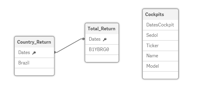
I´m not sure about what you have there
DatesCockipt are week based and Dates are daily based, right?
Would you mind attaching a screenshot of your new model (using my code)?
- « Previous Replies
- Next Replies »