Unlock a world of possibilities! Login now and discover the exclusive benefits awaiting you.
- Qlik Community
- :
- Forums
- :
- Analytics
- :
- New to Qlik Analytics
- :
- Re: Is it possible to map pivot table to heat map?
- Subscribe to RSS Feed
- Mark Topic as New
- Mark Topic as Read
- Float this Topic for Current User
- Bookmark
- Subscribe
- Mute
- Printer Friendly Page
- Mark as New
- Bookmark
- Subscribe
- Mute
- Subscribe to RSS Feed
- Permalink
- Report Inappropriate Content
Is it possible to map pivot table to heat map?
Hi
I have created a pivot table to sum fees per country per annum and want to apply this to a heat map to highlight spend per country. I'm a newbit to Qlik so apologies if this is v straightforward!
- Mark as New
- Bookmark
- Subscribe
- Mute
- Subscribe to RSS Feed
- Permalink
- Report Inappropriate Content
Map?
Can you please explain in detail?
I assume whatever selection you make in Pivot Table/Map the selection will reflect on both.
What is the name of extension you using? Is it Qlik Maps/Geo Qlik/Google Maps?
- Mark as New
- Bookmark
- Subscribe
- Mute
- Subscribe to RSS Feed
- Permalink
- Report Inappropriate Content
Hi
Not sure of what you want but
1 if you want a pivot table with fees per countries and annum and side by side a Map where countries will be colored depending of the Fees it is possible of course
2 if you want to color the cell of your pivot table depending of your mesure it is also possible : you will have to write the appropriate color expression in the color panel of your pivot table ( in that case we will use the colormix function
You can also try this extension JSPivotTable that's allow heatmap representation directly in the cells of the pivot table
Can you alaborate a little bit more with sample of data or by uploading your qliksense app and add some explanation or drawing of desired output
Regards
Bruno
- Mark as New
- Bookmark
- Subscribe
- Mute
- Subscribe to RSS Feed
- Permalink
- Report Inappropriate Content
This blog should help you
- Mark as New
- Bookmark
- Subscribe
- Mute
- Subscribe to RSS Feed
- Permalink
- Report Inappropriate Content
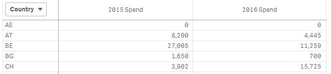
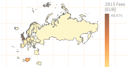
I have created a pivot table showing my data (below). I tried to represent this on a map but the sum per country isn't pulling through correctly (see second screenshot) so I want to apply the pivot table data to the map?
- Mark as New
- Bookmark
- Subscribe
- Mute
- Subscribe to RSS Feed
- Permalink
- Report Inappropriate Content
Cus expressions are not same for Pivot & Map hence the sum is not matching.
What are the expressions you using?