Unlock a world of possibilities! Login now and discover the exclusive benefits awaiting you.
- Qlik Community
- :
- Forums
- :
- Analytics
- :
- App Development
- :
- Re: Sankey Secret Decoder Ring
- Subscribe to RSS Feed
- Mark Topic as New
- Mark Topic as Read
- Float this Topic for Current User
- Bookmark
- Subscribe
- Mute
- Printer Friendly Page
- Mark as New
- Bookmark
- Subscribe
- Mute
- Subscribe to RSS Feed
- Permalink
- Report Inappropriate Content
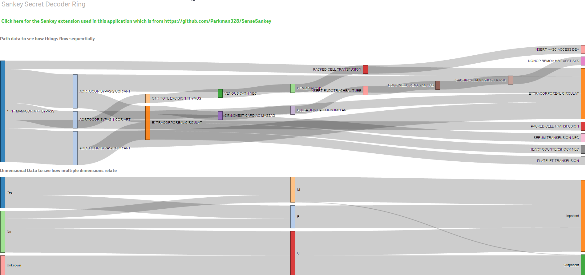
Sankey Secret Decoder Ring
I've gotten a lot of questions from blog posts where I've utilized the Sankey Diagram to visualize data. Enough so that I figured I'd make my life simple and simply post something that helps others understand how. Sort of a Secret Decoder Ring for Sankey Diagrams if you will.
There are two basic use cases for a Sankey Diagram:
- Workflow or Paths
- Dimensional data
A workflow or path is just what it sounds like ... a sequential flow of information from one to the next to the next to the next to the next. These are usually time driven. What happened first? What happened second? What happened third? The data in the attached example application was generated using Teradata Aster. An NPath query was utilized, gotta love Advanced Analytics, and the data was pulled back. All I did was simply copy a few of the rows of data and add it via an inline statement in the load script. You could also utilize the Qlik ETL and build the pathing by grouping, sorting and concatentating some values together. Ultimately you are looking to build "the path" as a single value. "1 INT MAM-COR ART BYPASS, AORTOCOR BYPAS-3 COR ART, EXTRACORPOREAL CIRCULAT". Not impressed by healthcare data like surgeries? Ok, what about website clicks? What are the first 5 most frequent things a customer touches on your website? What about a banking customer path, they opened a checking account then opened a bank account then took out an auto loan. If you are impressed with surgical paths what's to stop you from doing the same thing for Comorbidity? No reason at all you couldn't diagram patient is diagnosed with this first ... then this ... then this. You would not only see what they have in common, but you would immediately see the path they take in getting there.
Likewise, Dimensional data is just what it sounds like ... data that can be totally unrelated from different dimensions. In the sample application I used Gender, whether the patient is insured or not and the type of patient they are. Seems odd right? There is no order so why use a Sankey? The purpose of using the Sankey is to visualize multiple dimensions like that quickly and see if there are any relations to one another. Instead of 3 pie charts, you quickly get the same ratios of data in the Sankey bars. In addition I can quickly see that none of my patients that have an "unknown" gender are insured. I can also quickly determine that I have a data capture issue with patients having outpatient procedures because nearly all of them have an "unkown" gender.
Feel free to download the attached application for Qlik Sense and starting playing right now. Unless you have already installed a Sankey extension the visual itself will not render and instead will say "you can't see this yet you haven't installed it." Never fear, the text box at the top of the screen will allow you to jump directly to the Sankey extension that I used for the application and you can download it, and then install it. Play around with the data in the load script and setup some of the use cases you may have as a trial run. Use your dimensional names instead of mine. Then by all means jump into taking advantage of this type of visual in your existing applications to see what else your end users can find as part of their data discovery.
- Mark as New
- Bookmark
- Subscribe
- Mute
- Subscribe to RSS Feed
- Permalink
- Report Inappropriate Content
Hi Dalton, I suggest that you (also) convert this into a document. You can simply press the "convert to document" icon on the right-hand side of the webpage. That way this valuable information of Sankey diagrams would be easier to find and promote