Unlock a world of possibilities! Login now and discover the exclusive benefits awaiting you.
- Qlik Community
- :
- Forums
- :
- Analytics
- :
- New to Qlik Analytics
- :
- Can you colour different segments of a line graph ...
- Subscribe to RSS Feed
- Mark Topic as New
- Mark Topic as Read
- Float this Topic for Current User
- Bookmark
- Subscribe
- Mute
- Printer Friendly Page
- Mark as New
- Bookmark
- Subscribe
- Mute
- Subscribe to RSS Feed
- Permalink
- Report Inappropriate Content
Can you colour different segments of a line graph differently?
I have built a line graph of Month Complaint Raised (X axis) against Number of Complaints (Y axis). The dimension for the graph is MonthStart([Date_Comp_Raised]) and the expression is count(Complaint_Number).
Would it be possible to use an expression to colour certain date periods different colours?
I have used the following expression: if([Date_Comp_Raised] >= date(42234) and [Date_Comp_Raised] <= date(42447), rgb(96,162,80),black()). This works if the dates aren't grouped by 'MonthStart' but when they are the whole graph turns black.
- Mark as New
- Bookmark
- Subscribe
- Mute
- Subscribe to RSS Feed
- Permalink
- Report Inappropriate Content
Would you be able to share a sample qvf with us?
- Mark as New
- Bookmark
- Subscribe
- Mute
- Subscribe to RSS Feed
- Permalink
- Report Inappropriate Content
Hi Sunny,
Unfortunately I can't share the qvf.
Regards,
Paul
- Mark as New
- Bookmark
- Subscribe
- Mute
- Subscribe to RSS Feed
- Permalink
- Report Inappropriate Content
Maybe just use
if([Date_Comp_Raised] >= date(42234), rgb(96,162,80) , if( [Date_Comp_Raised] <= date(42447),black()))
or
if([Date_Comp_Raised] >= date(42234), rgb(96,162,80) ,black())
I've checked with my date fields and it gives me 2 different color for different range of dates.
I'm not sure what it means by 'Group by MonthStart'
I used if(DateKey>=date(2016-11-30),green(),red())
Better to convert those numerics to Date format.
Check for any syntax error in above expression
- Mark as New
- Bookmark
- Subscribe
- Mute
- Subscribe to RSS Feed
- Permalink
- Report Inappropriate Content
Hi Aehman,
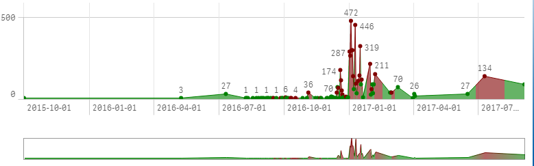
I want to colour a particular section of the graph, to show a particular phase of the project. This is correct when I use colour by expression: if([F.COMPLAINT_RECD_DATE] >= date(42234) and [F.COMPLAINT_RECD_DATE] <= date(42279), rgb(96,162,80),black()) with the dimension Date_Comp_Raised and measurement Count(Complaint_Number). The graph looks like this:
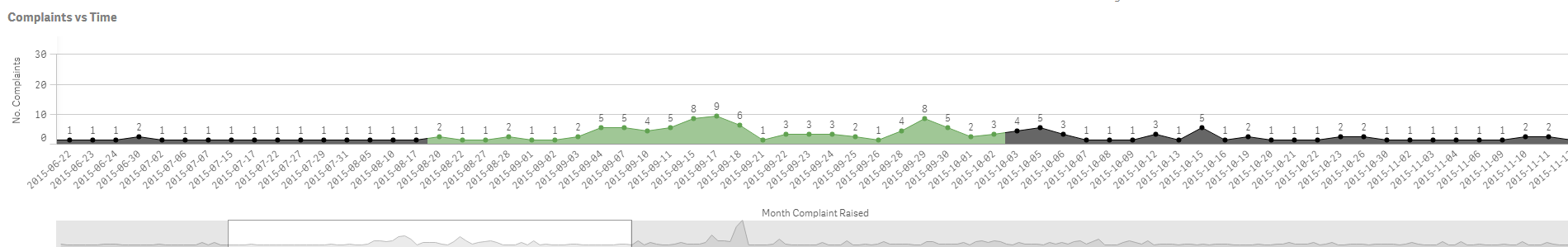
However the graph is too long, so if I change the dimension to MonthStart(Date_Comp_Raised) (to group the dates by month start) and the graph then looks like the below and the colour range has disappeared.
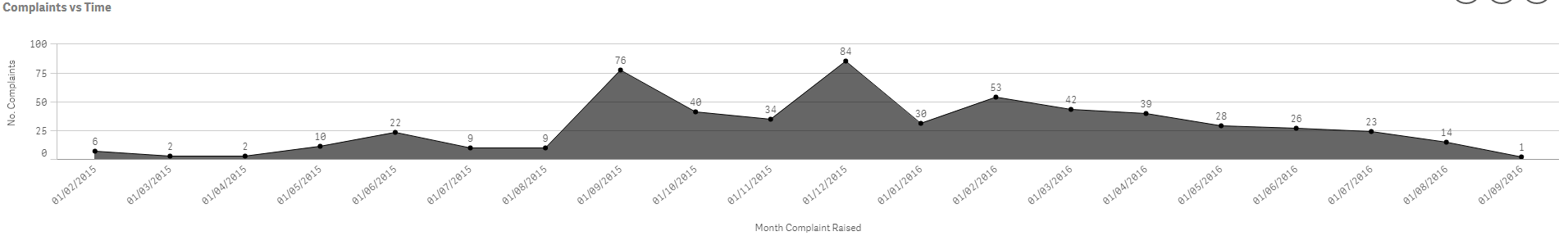
Any ideas how I can keep the relevant section of the graph a different colour whilst still using month start? I also tried grouping the dates by month (i.e. Month(Date_Comp_Raised), but the year doesn't show up, that is why I opted for monthstart.
Any help would be much appreciated!!
Paul
- Mark as New
- Bookmark
- Subscribe
- Mute
- Subscribe to RSS Feed
- Permalink
- Report Inappropriate Content
Maybe convert that Month(Date_Comp_Raised) as a dimension in script itself?
Ex: In your fact or wherever you getting those dates from, do a preceding load before script.
FactTable:
Load *,
MonthStart(Date_Comp_Raised) as FactMonthStart ;
Load:
........
From...
and in front end maybe use FactMonthStart as a Dimension instead of writing MonthStart(Date_Comp_Raised)
Not sure if this will work but you can try, cus sometimes in QlikSense calculated dimensions don't work.