Unlock a world of possibilities! Login now and discover the exclusive benefits awaiting you.
- Qlik Community
- :
- Forums
- :
- Analytics
- :
- New to Qlik Analytics
- :
- Re: Color of Associations in Qlik Sense Data Manag...
- Subscribe to RSS Feed
- Mark Topic as New
- Mark Topic as Read
- Float this Topic for Current User
- Bookmark
- Subscribe
- Mute
- Printer Friendly Page
- Mark as New
- Bookmark
- Subscribe
- Mute
- Subscribe to RSS Feed
- Permalink
- Report Inappropriate Content
Color of Associations in Qlik Sense Data Manager
Hi All,
In a Qlik Sense data manager, highly recommended associations are marked with green, and medium recommendations are orange. Non recommended associations are marked in red.
Can anyone please share basis on which are these recommendations performed? Is there any official document regarding the logic based on which the colors are recommend.
Thanks & Regards,
Som
.
- Tags:
- assiciation
Accepted Solutions
- Mark as New
- Bookmark
- Subscribe
- Mute
- Subscribe to RSS Feed
- Permalink
- Report Inappropriate Content
Hi Guys -
Here is what I know - its based on a whole host of factors including unique matches, total matches, cardinality, data type, symbol count, unique values - so there is a pretty sophisticated algorithm working to perform the data profiling. I know at one time we either displayed the percentage matched, or had percentages calculated and documented but it was difficult for this to be replicated so we removed them from the doc.
I attached a data set for you to play with
For example if you attempt to match Customers with Products - (orange)
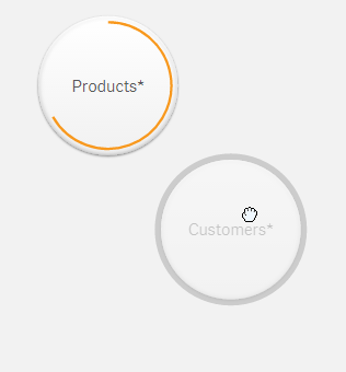
it associates on CustomerNumber and ProductsID - obviously they are numeric values that were the closest values in both tables to match.
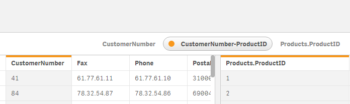
ProductID has values 1 to 77
CustomerNumber as 1 to 89
Even if I add more unique IDs to the products table to match the customer table 100% - I still get orange as it indicates a possible match - but based on other factors in the data - such as the supplier ID being available (also numeric and similar)- it still may not be the proper association. Also if remove supplierID form products - I still get Orange - this is because it recognizes in the CustomerNumber that the values are only 1:1 and not 1:many. (in other word there is exactly 1 value in Customer and 1 value in products that match, so this indicates the orange)
Let me know if this is clear - if not I can do some more digging for you.
Thanks Jagan for alerting me of the thread 🙂
When applicable please mark the appropriate replies as CORRECT. This will help community members and Qlik Employees know which discussions have already been addressed and have a possible known solution. Please mark threads as HELPFUL if the provided solution is helpful to the problem, but does not necessarily solve the indicated problem. You can mark multiple threads as HELPFUL if you feel additional info is useful to others.
Regards,
Mike Tarallo
Qlik
Mike Tarallo
Qlik
- Mark as New
- Bookmark
- Subscribe
- Mute
- Subscribe to RSS Feed
- Permalink
- Report Inappropriate Content
Hi,
I don't have any document, but it is by column name, number of matching values between the two fields.
Check this link may be it helps you.
Managing data associations ‒ Qlik Sense
Regards,
Jagan.
- Mark as New
- Bookmark
- Subscribe
- Mute
- Subscribe to RSS Feed
- Permalink
- Report Inappropriate Content
Hi Jagan,
Thanks for your reply. I also have gone through this link.
Have checked by giving the same column name in two tables, but still marked red. I am actually looking for what the % of ranges of matching values based on which the color codes are happening.
Regards,
Som
- Mark as New
- Bookmark
- Subscribe
- Mute
- Subscribe to RSS Feed
- Permalink
- Report Inappropriate Content
- Mark as New
- Bookmark
- Subscribe
- Mute
- Subscribe to RSS Feed
- Permalink
- Report Inappropriate Content
Hi Guys -
Here is what I know - its based on a whole host of factors including unique matches, total matches, cardinality, data type, symbol count, unique values - so there is a pretty sophisticated algorithm working to perform the data profiling. I know at one time we either displayed the percentage matched, or had percentages calculated and documented but it was difficult for this to be replicated so we removed them from the doc.
I attached a data set for you to play with
For example if you attempt to match Customers with Products - (orange)
it associates on CustomerNumber and ProductsID - obviously they are numeric values that were the closest values in both tables to match.
ProductID has values 1 to 77
CustomerNumber as 1 to 89
Even if I add more unique IDs to the products table to match the customer table 100% - I still get orange as it indicates a possible match - but based on other factors in the data - such as the supplier ID being available (also numeric and similar)- it still may not be the proper association. Also if remove supplierID form products - I still get Orange - this is because it recognizes in the CustomerNumber that the values are only 1:1 and not 1:many. (in other word there is exactly 1 value in Customer and 1 value in products that match, so this indicates the orange)
Let me know if this is clear - if not I can do some more digging for you.
Thanks Jagan for alerting me of the thread 🙂
When applicable please mark the appropriate replies as CORRECT. This will help community members and Qlik Employees know which discussions have already been addressed and have a possible known solution. Please mark threads as HELPFUL if the provided solution is helpful to the problem, but does not necessarily solve the indicated problem. You can mark multiple threads as HELPFUL if you feel additional info is useful to others.
Regards,
Mike Tarallo
Qlik
Mike Tarallo
Qlik
- Mark as New
- Bookmark
- Subscribe
- Mute
- Subscribe to RSS Feed
- Permalink
- Report Inappropriate Content
Hi Mike,
Thanks for your reply.
Yes, it is clear now that there are many factors involved behind this association color logic. This is calculating possible matching over multiple available fields.
Regards,
Som
- Mark as New
- Bookmark
- Subscribe
- Mute
- Subscribe to RSS Feed
- Permalink
- Report Inappropriate Content