Unlock a world of possibilities! Login now and discover the exclusive benefits awaiting you.
- Qlik Community
- :
- All Forums
- :
- QlikView App Dev
- :
- Re: Line Chart, choose date, accumulative sum?
- Subscribe to RSS Feed
- Mark Topic as New
- Mark Topic as Read
- Float this Topic for Current User
- Bookmark
- Subscribe
- Mute
- Printer Friendly Page
- Mark as New
- Bookmark
- Subscribe
- Mute
- Subscribe to RSS Feed
- Permalink
- Report Inappropriate Content
Line Chart, choose date, accumulative sum?
Hello gurus.
I'm quite new to QlikView, and have some trouble with creating a line chart with accumulative values.
I've searched around, but either I suck at searching, or the answers and solutions I've tried haven't worked.
I'm creating a report regarding warehouse stock over time.
I have a data file giving me different movement types on products, quantities in/out date-wise (if you're familiar with SAP, it's the MB51-report).
Now, I want to have a line-chart that will give me total value of the stock on a selected date, and total quantities.
As this is a "balance", I need to sum from day one up to the selected date.
In a straight table, this expression does the trick, at least showing me the stock on a particular date;
Sum({<Date={"<=$(=max(Date))"}>} [Quantity])
But my line chart (using month/year as dimension) seems to sum the quantity movements each month instead of giving me the total quantity (= stock quantity).
Would anyone be helpful on this problem? 
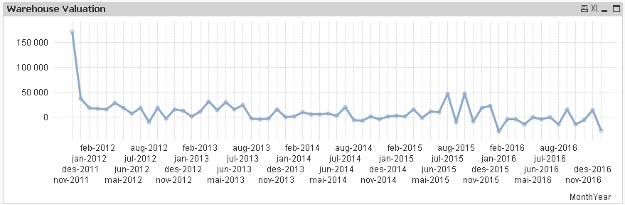
The in-going balance at the start in November 2011 shows a quantity of 171.000, and December 2011 shows 37.000.
But the stock quantity in December should be 171.000+37.000 = 208.000.
- « Previous Replies
-
- 1
- 2
- Next Replies »
Accepted Solutions
- Mark as New
- Bookmark
- Subscribe
- Mute
- Subscribe to RSS Feed
- Permalink
- Report Inappropriate Content
Use something like below
RangeSum(Above(SUM({<Date = {"<=$(=Max(Date))"}>}Quantity),0,RowNo()))
- Mark as New
- Bookmark
- Subscribe
- Mute
- Subscribe to RSS Feed
- Permalink
- Report Inappropriate Content
Use something like below
RangeSum(Above(SUM({<Date = {"<=$(=Max(Date))"}>}Quantity),0,RowNo()))
- Mark as New
- Bookmark
- Subscribe
- Mute
- Subscribe to RSS Feed
- Permalink
- Report Inappropriate Content
Hi Vegard,
You can use 'Accumulate' under Expression tab in the chart using graphically or you can use the set expression as said by @manish kachhia in above comment.
Regards,
Nitin
- Mark as New
- Bookmark
- Subscribe
- Mute
- Subscribe to RSS Feed
- Permalink
- Report Inappropriate Content
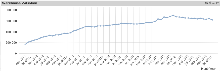
That's brilliant, Manish - works like a charm!
Now, I know this wasn't part of my original question, but say I'm choosing a year, lets say 2015.
The chart now only shows the 12 months in that year which is what I want, but it then just sums whatever happened that year.
Would it be possible to, in the same chart, to choose a year, and get the same values as from your expression?
It would basically be just a "zoom" of this result:
- Mark as New
- Bookmark
- Subscribe
- Mute
- Subscribe to RSS Feed
- Permalink
- Report Inappropriate Content
Ah, that was also helpful
Thanks, Nitin!
- Mark as New
- Bookmark
- Subscribe
- Mute
- Subscribe to RSS Feed
- Permalink
- Report Inappropriate Content
May be like this
RangeSum(Above(SUM({<Date = {"<=$(=Max(Date))"}, YearField>}Quantity), 0, RowNo())) * Avg({<Date = {"<=$(=Max(Date))"}>}1)
- Mark as New
- Bookmark
- Subscribe
- Mute
- Subscribe to RSS Feed
- Permalink
- Report Inappropriate Content
stalwar1solution will work.. Just check and update here.
- Mark as New
- Bookmark
- Subscribe
- Mute
- Subscribe to RSS Feed
- Permalink
- Report Inappropriate Content
Changed YearField to Year, but getting "No data to display".
RangeSum(Above(SUM({<Date = {"<=$(=Max(Date))"}, Year>}Quantity), 0, RowNo())) *
Avg({<Date = {"<=$(=Max(Date))"}>}1)
- Mark as New
- Bookmark
- Subscribe
- Mute
- Subscribe to RSS Feed
- Permalink
- Report Inappropriate Content
It should work.. I just checked with dummy data and it's working...
- Mark as New
- Bookmark
- Subscribe
- Mute
- Subscribe to RSS Feed
- Permalink
- Report Inappropriate Content
Yup, I don't see a reason why it shouldn't work. Would you be able to share a sample where this isn't working for you?
Preparing examples for Upload - Reduction and Data Scrambling
- « Previous Replies
-
- 1
- 2
- Next Replies »