Unlock a world of possibilities! Login now and discover the exclusive benefits awaiting you.
- Qlik Community
- :
- All Forums
- :
- QlikView App Dev
- :
- Re: How to create a Bar Chart that shows calls rec...
Options
- Subscribe to RSS Feed
- Mark Topic as New
- Mark Topic as Read
- Float this Topic for Current User
- Bookmark
- Subscribe
- Mute
- Printer Friendly Page
Turn on suggestions
Auto-suggest helps you quickly narrow down your search results by suggesting possible matches as you type.
Showing results for
Specialist
2017-03-07
12:06 PM
- Mark as New
- Bookmark
- Subscribe
- Mute
- Subscribe to RSS Feed
- Permalink
- Report Inappropriate Content
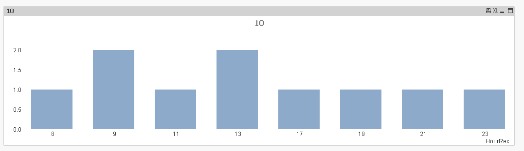
How to create a Bar Chart that shows calls received by each hour in 24hrs?
Hello there,
Here is some dummy data:
| CallID | Time Received | Time Ended |
| 1 | 01/03/2017 09:23 | 01/03/2017 09:55 |
| 2 | 01/03/2017 09:01 | 01/03/2017 09:21 |
| 3 | 02/03/2017 11:22 | 02/03/2017 12:21 |
| 4 | 02/03/2017 13:01 | 02/03/2017 13:45 |
| 5 | 15/02/2017 13:30 | 15/02/2017 13:33 |
| 6 | 21/02/2017 17:15 | 21/02/2017 17:45 |
| 7 | 25/02/2017 19:55 | 25/02/2017 20:11 |
| 8 | 27/02/2017 21:11 | 27/02/2017 21:32 |
| 9 | 04/03/2017 23:33 | 04/03/2017 23:39 |
| 10 | 06/03/2017 08:22 | 06/03/2017 10:32 |
How can I create a Bar Chart that shows number of calls received per each hour of 24hrs?
In the above dummy data you an see the first two calls were received at 9am, so the bar for 9 dimension value should show 2.
At 5pm there was only 1 call
At 9pm it was 1 call
etc
Any ideas please? I think the challenge is creating 23 dimensions from the date and time value 
555 Views
1 Solution
Accepted Solutions
MVP
2017-03-07
12:14 PM
- Mark as New
- Bookmark
- Subscribe
- Mute
- Subscribe to RSS Feed
- Permalink
- Report Inappropriate Content
487 Views
3 Replies
Partner - Specialist III
2017-03-07
12:11 PM
- Mark as New
- Bookmark
- Subscribe
- Mute
- Subscribe to RSS Feed
- Permalink
- Report Inappropriate Content
MVP
2017-03-07
12:14 PM
- Mark as New
- Bookmark
- Subscribe
- Mute
- Subscribe to RSS Feed
- Permalink
- Report Inappropriate Content
Like this?
488 Views
Partner - Creator
2019-12-20
01:20 PM
- Mark as New
- Bookmark
- Subscribe
- Mute
- Subscribe to RSS Feed
- Permalink
- Report Inappropriate Content
Does this solution work if you crossover to the next day? For example, if there are 3 calls at 10AM 12/20/2019 and 2 calls at 10AM 12/21/2019, will the bar graph show a total of 5 calls at hour 10?
456 Views