Unlock a world of possibilities! Login now and discover the exclusive benefits awaiting you.
- Qlik Community
- :
- All Forums
- :
- QlikView App Dev
- :
- Re: How to create a Heat map
- Subscribe to RSS Feed
- Mark Topic as New
- Mark Topic as Read
- Float this Topic for Current User
- Bookmark
- Subscribe
- Mute
- Printer Friendly Page
- Mark as New
- Bookmark
- Subscribe
- Mute
- Subscribe to RSS Feed
- Permalink
- Report Inappropriate Content
How to create a Heat map
Hi,
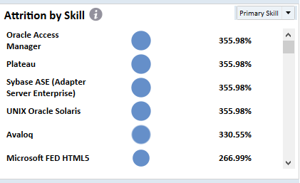
I am new to Qlikview we are replicating a tableau dashboard to Qlikview and we need a heat map exactly or somewhat similar to screenshot. Any help will be appreciated.
Thanks,
Nikita
- « Previous Replies
-
- 1
- 2
- Next Replies »
Accepted Solutions
- Mark as New
- Bookmark
- Subscribe
- Mute
- Subscribe to RSS Feed
- Permalink
- Report Inappropriate Content
here you go
- Mark as New
- Bookmark
- Subscribe
- Mute
- Subscribe to RSS Feed
- Permalink
- Report Inappropriate Content
please post some sample data
If a post helps to resolve your issue, please accept it as a Solution.
- Mark as New
- Bookmark
- Subscribe
- Mute
- Subscribe to RSS Feed
- Permalink
- Report Inappropriate Content
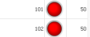
In Qlikview, we call straight object. Here, First one is simple attribute and then Image path with image Representative and then Metric which you showed in Qlikview. I am assuming, you want similar image
- Mark as New
- Bookmark
- Subscribe
- Mute
- Subscribe to RSS Feed
- Permalink
- Report Inappropriate Content
Hi..I found this topic.. It shows how to create a heatmap using extension..
- Mark as New
- Bookmark
- Subscribe
- Mute
- Subscribe to RSS Feed
- Permalink
- Report Inappropriate Content
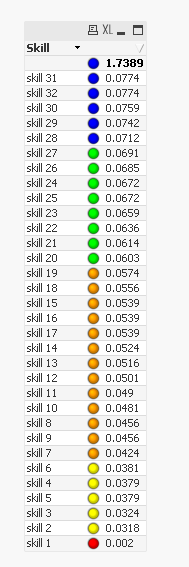
Hi Vineeth,
PFB Dummy data ,
We want the bubble size to vary according to the actual column. It is not very prominent in the screenshot as the values are almost equal.
| Skill | DUL_ATTR_KPI_ACTUAL |
| skill 1 | 0.002 |
| skill 2 | 0.0318 |
| skill 3 | 0.0324 |
| skill 4 | 0.0379 |
| skill 5 | 0.0379 |
| skill 6 | 0.0381 |
| skill 7 | 0.0424 |
| skill 8 | 0.0456 |
| skill 9 | 0.0456 |
| skill 10 | 0.0481 |
| skill 11 | 0.049 |
| skill 12 | 0.0501 |
| skill 13 | 0.0516 |
| skill 14 | 0.0524 |
| skill 15 | 0.0539 |
| skill 16 | 0.0539 |
| skill 17 | 0.0539 |
| skill 18 | 0.0556 |
| skill 19 | 0.0574 |
| skill 20 | 0.0603 |
| skill 21 | 0.0614 |
| skill 22 | 0.0636 |
| skill 23 | 0.0659 |
| skill 24 | 0.0672 |
| skill 25 | 0.0672 |
| skill 26 | 0.0685 |
| skill 27 | 0.0691 |
| skill 28 | 0.0712 |
| skill 29 | 0.0742 |
| skill 30 | 0.0759 |
| skill 31 | 0.0774 |
| skill 32 | 0.0774 |
- Mark as New
- Bookmark
- Subscribe
- Mute
- Subscribe to RSS Feed
- Permalink
- Report Inappropriate Content
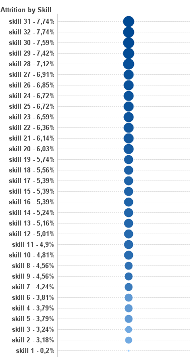
Hi Anil,
I don't want a image in between those all the bubbles whose size vary according to the actual values. Refer the data below.
| Skill | DUL_ATTR_KPI_ACTUAL |
| skill 1 | 0.002 |
| skill 2 | 0.0318 |
| skill 3 | 0.0324 |
| skill 4 | 0.0379 |
| skill 5 | 0.0379 |
| skill 6 | 0.0381 |
| skill 7 | 0.0424 |
| skill 8 | 0.0456 |
| skill 9 | 0.0456 |
| skill 10 | 0.0481 |
| skill 11 | 0.049 |
| skill 12 | 0.0501 |
| skill 13 | 0.0516 |
| skill 14 | 0.0524 |
| skill 15 | 0.0539 |
| skill 16 | 0.0539 |
| skill 17 | 0.0539 |
| skill 18 | 0.0556 |
| skill 19 | 0.0574 |
| skill 20 | 0.0603 |
| skill 21 | 0.0614 |
| skill 22 | 0.0636 |
| skill 23 | 0.0659 |
| skill 24 | 0.0672 |
| skill 25 | 0.0672 |
| skill 26 | 0.0685 |
| skill 27 | 0.0691 |
| skill 28 | 0.0712 |
| skill 29 | 0.0742 |
| skill 30 | 0.0759 |
| skill 31 | 0.0774 |
| skill 32 | 0.0774 |
- Mark as New
- Bookmark
- Subscribe
- Mute
- Subscribe to RSS Feed
- Permalink
- Report Inappropriate Content
Does you mean, You want bubbles in between which based on Values. Then i would go for Mini Gauge settings and then call up ascending order. If thought, I will share QVW with you? Or else bit description required
- Mark as New
- Bookmark
- Subscribe
- Mute
- Subscribe to RSS Feed
- Permalink
- Report Inappropriate Content
Please share It will be helpful.I think we are on the same page now that it what I need.
- Mark as New
- Bookmark
- Subscribe
- Mute
- Subscribe to RSS Feed
- Permalink
- Report Inappropriate Content
Unfortunately we don't have such capability in qlikview, but does the below help?
If a post helps to resolve your issue, please accept it as a Solution.
- Mark as New
- Bookmark
- Subscribe
- Mute
- Subscribe to RSS Feed
- Permalink
- Report Inappropriate Content
Hi Nikita,
sending you sample that could approach your solution in Tableau.
This is screenshot. Please find attached .qvw.
BR
Martin
- « Previous Replies
-
- 1
- 2
- Next Replies »