Unlock a world of possibilities! Login now and discover the exclusive benefits awaiting you.
- Qlik Community
- :
- All Forums
- :
- QlikView App Dev
- :
- Searching for a Extension (QlikView or Qlik Sense)...
- Subscribe to RSS Feed
- Mark Topic as New
- Mark Topic as Read
- Float this Topic for Current User
- Bookmark
- Subscribe
- Mute
- Printer Friendly Page
- Mark as New
- Bookmark
- Subscribe
- Mute
- Subscribe to RSS Feed
- Permalink
- Report Inappropriate Content
Searching for a Extension (QlikView or Qlik Sense) to extend Scatter Chart
Hi Community,
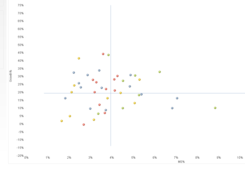
I am looking for a QlikView or Qlik Sense Extension to extend the possibilities of the default QlikView Scatter Chart. At the moment, I am using a Scatter Chart. We are talking about Sales Data. X-Axis shows the Market Share in % and Y-Axis shows the Growths in %. Each bubble is a specific Sales Sub Region. Colors are identifying the Sales Region. It is implemented like; you can select a Date (Month Year) and the charts calculates the Market Share in % of this Date and compares the Sales with the previous month for the Growth in %. The lines you can see are just an average across the Sales-Regions, it just generates a kind of quadrants to compare the values. It is not important for that question.
What I am looking for, is a possibility to show the "dynamics" this means, I like to show for example if the Growths in % increases from previous month to the selected month etc.
To be honest, to create an own new extension for this question is over the top for this project and no possibility.
I would like to use an existing extension, but cannot find a fitting one.
I am looking forward to your ideas.
BR
Philipp