Unlock a world of possibilities! Login now and discover the exclusive benefits awaiting you.
- Qlik Community
- :
- All Forums
- :
- QlikView App Dev
- :
- Re: Replacement for Straight table
- Subscribe to RSS Feed
- Mark Topic as New
- Mark Topic as Read
- Float this Topic for Current User
- Bookmark
- Subscribe
- Mute
- Printer Friendly Page
- Mark as New
- Bookmark
- Subscribe
- Mute
- Subscribe to RSS Feed
- Permalink
- Report Inappropriate Content
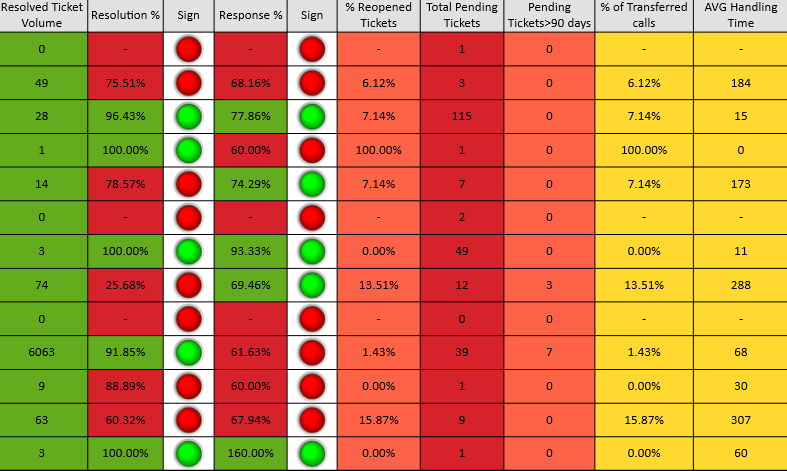
Replacement for Straight table
Hi All,
I have made some pdf reports where I want to change the look and feel of all the tables used.
Have already changed multiple tables to different other charts to showcase it in a different way with an amazing UI but need more suggestions on the below one.
Can any of you please share some innovative ideas,on how better I can change the below table with a very unique look and feel as this report goes to higher management in our company.
Any sample qvw's or screenshots will be highly appreciated.
Thanks a lot!!!
- Tags:
- qlikview_scripting
- Mark as New
- Bookmark
- Subscribe
- Mute
- Subscribe to RSS Feed
- Permalink
- Report Inappropriate Content
How about having a column chooser using list box and conditional expression?? and dynamic range chooser for ">"90" days" using a slider?? Colour of the text can also be changed to a light shade and colours of background to some persistent colours.
- Mark as New
- Bookmark
- Subscribe
- Mute
- Subscribe to RSS Feed
- Permalink
- Report Inappropriate Content
Hi Anjali
Refer this link Qlik Demos
This will give you more insights,
Vikas
If the issue is solved please mark the answer with Accept as Solution & like it.
If you want to go quickly, go alone. If you want to go far, go together.
- Mark as New
- Bookmark
- Subscribe
- Mute
- Subscribe to RSS Feed
- Permalink
- Report Inappropriate Content
Thats a great idea Shiva.Thanks .
But in pdf reports,we will not be giving any option to higher management right to make their own selections.It will anyway look static to them.
Could you please suggest any other chart with sample screenshot or qvw ?
Thanks in advance.