Unlock a world of possibilities! Login now and discover the exclusive benefits awaiting you.
- Qlik Community
- :
- Forums
- :
- Analytics
- :
- New to Qlik Analytics
- :
- Multi-level Race track or circle chart - is one av...
- Subscribe to RSS Feed
- Mark Topic as New
- Mark Topic as Read
- Float this Topic for Current User
- Bookmark
- Subscribe
- Mute
- Printer Friendly Page
- Mark as New
- Bookmark
- Subscribe
- Mute
- Subscribe to RSS Feed
- Permalink
- Report Inappropriate Content
Multi-level Race track or circle chart - is one available?
Hi,
Some good news - Qlik Sense Enterprise is about to be implemented within my organisation. I've been presented with a challenge that is currently done in MS PowerPoint.
What I was wondering is whether there is an extension available that closely renders the following or can be easily adapted to suit. I'm not a programmer but certainly have an interest in some of the excellent 3rd party extensions available for QS. Some really blow my mind and this open and extendable functionality is one of the aspects that drew me towards Qlik in comparison to Tableau and MS Power BI.
The PowerPoint chart looks like this:
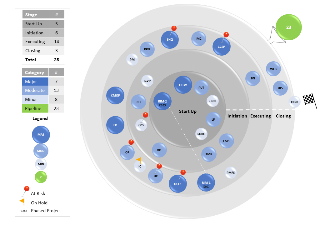
This chart is used to show the stage and status of projects within the organisation. The concepts are based loosely on PRINCE2.
There are 4 stages --> Start up, Initiation, Executing and Closing. Each project is sized and colour coded according to it's impact: Major, Moderate, Minor and Pipeline (not yet started - shown above as the green ball on a funnel). The checker flag is the start and finish line for this clockwise-direction chart and where the project sits within each stage indicates how far each project has progressed within one of the Initiation, Executing or Closing stages.
The ability to flag or tag a project with a visible icon in terms of those that are At Risk, On Hold or Phased over medium to longer terms are required.
Each project must be selectable/filterable within the respective track.
I look forward to comments, advice or anything that points me in the right direction.
Thanks kindly,
Wayde