Unlock a world of possibilities! Login now and discover the exclusive benefits awaiting you.
- Qlik Community
- :
- All Forums
- :
- Integration, Extension & APIs
- :
- Straight table is getting collapsed.
- Subscribe to RSS Feed
- Mark Topic as New
- Mark Topic as Read
- Float this Topic for Current User
- Bookmark
- Subscribe
- Mute
- Printer Friendly Page
 s29124141
- Mark as New
- Bookmark
- Subscribe
- Mute
- Subscribe to RSS Feed
- Permalink
- Report Inappropriate Content
Straight table is getting collapsed.
Hi All, I have straight table created through visualization api as well as qlik-visual, In both the approaches, the table is not getting fully expanded. Table gets expanded if I resize the window or if I re-arrange any columns. Basically the chart is not repainted. I tried invoking resize method, still no luck Please advice.
<div id="transactionTable" class="transaction-chart" style="height:350px;">
 </div>
app.visualization.create('table', transactionDimensions, { title: "Transaction Details" }).then(function (vis) {
     vis.show("transactionTable");
     vis.resize();
});
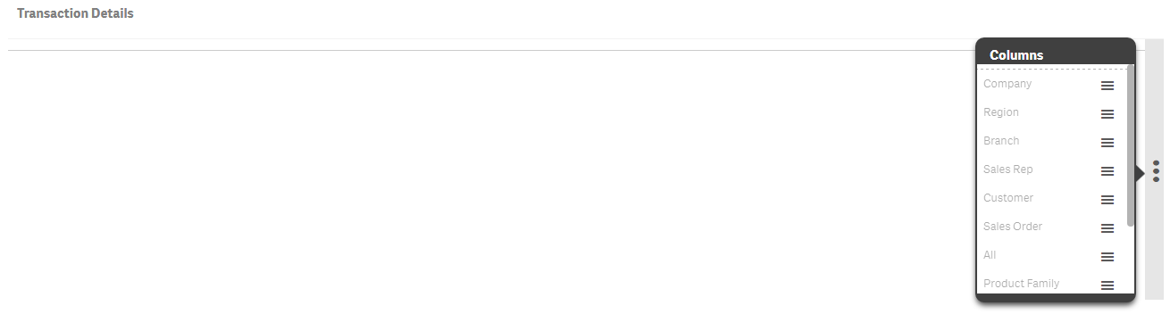
Below is the table displayed in the UI.
Accepted Solutions
- Mark as New
- Bookmark
- Subscribe
- Mute
- Subscribe to RSS Feed
- Permalink
- Report Inappropriate Content
Hi Praveena,
I totally agree with you: setting a fixed width is not the way to go. However, I guess that if you have enough width space in your screen, you would like to use it all. So I'd suggest that you use one of the following:
- Use media queries: that is, define different CSS rules depending on the size or the type of the screen.
- Instead of pixels, use units that are relative to the size of the screen: you could check out the viewport units Viewport units: vw, vh, vmin, vmax - Web Design Weekly So, if you set the width to width: 20vw, the container will take 20% of the width of the screen, regardless of the size of the device.
I agree with Erik that the % unit can be useful as well. You need to be careful with these though because unlike the viewport units, they reference the parent container and not the viewport.
s29124141
- Mark as New
- Bookmark
- Subscribe
- Mute
- Subscribe to RSS Feed
- Permalink
- Report Inappropriate Content
Hi All, Can someone please help me to fix the above issue?
- Mark as New
- Bookmark
- Subscribe
- Mute
- Subscribe to RSS Feed
- Permalink
- Report Inappropriate Content
Hello Praveeena,
What you're showing is how Qlik represents the tables when the enclosing container is smaller than the amount of space needed to display the data.
I see in your html code that the transactionTable container has a height of 350px but apparently it has no width.
Could you try modifying your HTML container to something similar to this?
- <div id="transactionTable" class="transaction-chart" style="height:350px; width: 500px">
- </div>
s29124141
- Mark as New
- Bookmark
- Subscribe
- Mute
- Subscribe to RSS Feed
- Permalink
- Report Inappropriate Content
Thanks for the response David. I cannot set the fixed width, since we need responsive table, setting the fixed width will be a problem. Qlik Sense table displays as much columns as possible before showing the 3 dots to select invisible columns. But here in my case, none of the columns are getting displayed. Seems like the rendering of the table is not complete. Is there any way we can force the render method explicitly?
 ErikWetterberg
- Mark as New
- Bookmark
- Subscribe
- Mute
- Subscribe to RSS Feed
- Permalink
- Report Inappropriate Content
Hi,
I think David is right, you need to det the width. If you cannot set it in pixels, perhaps you could try percent? 100% or 90% or something.
Hope this helps
Erik Wetterberg
- Mark as New
- Bookmark
- Subscribe
- Mute
- Subscribe to RSS Feed
- Permalink
- Report Inappropriate Content
Hi Praveena,
I totally agree with you: setting a fixed width is not the way to go. However, I guess that if you have enough width space in your screen, you would like to use it all. So I'd suggest that you use one of the following:
- Use media queries: that is, define different CSS rules depending on the size or the type of the screen.
- Instead of pixels, use units that are relative to the size of the screen: you could check out the viewport units Viewport units: vw, vh, vmin, vmax - Web Design Weekly So, if you set the width to width: 20vw, the container will take 20% of the width of the screen, regardless of the size of the device.
I agree with Erik that the % unit can be useful as well. You need to be careful with these though because unlike the viewport units, they reference the parent container and not the viewport.