Unlock a world of possibilities! Login now and discover the exclusive benefits awaiting you.
- Qlik Community
- :
- Forums
- :
- Analytics
- :
- New to Qlik Analytics
- :
- Re: Chart colours with Set Expression
- Subscribe to RSS Feed
- Mark Topic as New
- Mark Topic as Read
- Float this Topic for Current User
- Bookmark
- Subscribe
- Mute
- Printer Friendly Page
- Mark as New
- Bookmark
- Subscribe
- Mute
- Subscribe to RSS Feed
- Permalink
- Report Inappropriate Content
Chart colours with Set Expression
Hi,
I have a line chart showing a KPI across years. It uses a full load of data from 5 DHBs. There is one line for all DHBs using the set expression
avg({<DHB=>} LOS)
and another line using
avg({<DHB={'A'}>} LOS)
The chart works as expected, but I'd like to change its colours. At the moment the "all DHBs" line is pale blue and the A line is pale red - these are automatic colours.
If I use custom colours by expression, something like
if([DRG] = 'A', red(), RGB(179,179,179))
which worked before I used set expressions, both lines are grey.
Is this because DHB 'A' is included in the 'All DHBs' set?
Is there anything I can do about it?
Thanks!
Steve
- « Previous Replies
-
- 1
- 2
- Next Replies »
- Mark as New
- Bookmark
- Subscribe
- Mute
- Subscribe to RSS Feed
- Permalink
- Report Inappropriate Content
Thanks, Anil,
I may have added confusion by showing a chart where the expression worked! In the one with the five lines I selected the colours using the formula above, so I know the method works. (It would be nice to have a legend, but I couldn't do that.)
So: my problem is with the grey chart at the top, headed Trauma Call Ratio. I'm using the same colour method but only getting grey.
Did that clarify anything? Please feel free to ask questions!
Regards,
Steve
- Mark as New
- Bookmark
- Subscribe
- Mute
- Subscribe to RSS Feed
- Permalink
- Report Inappropriate Content
Hi Steve
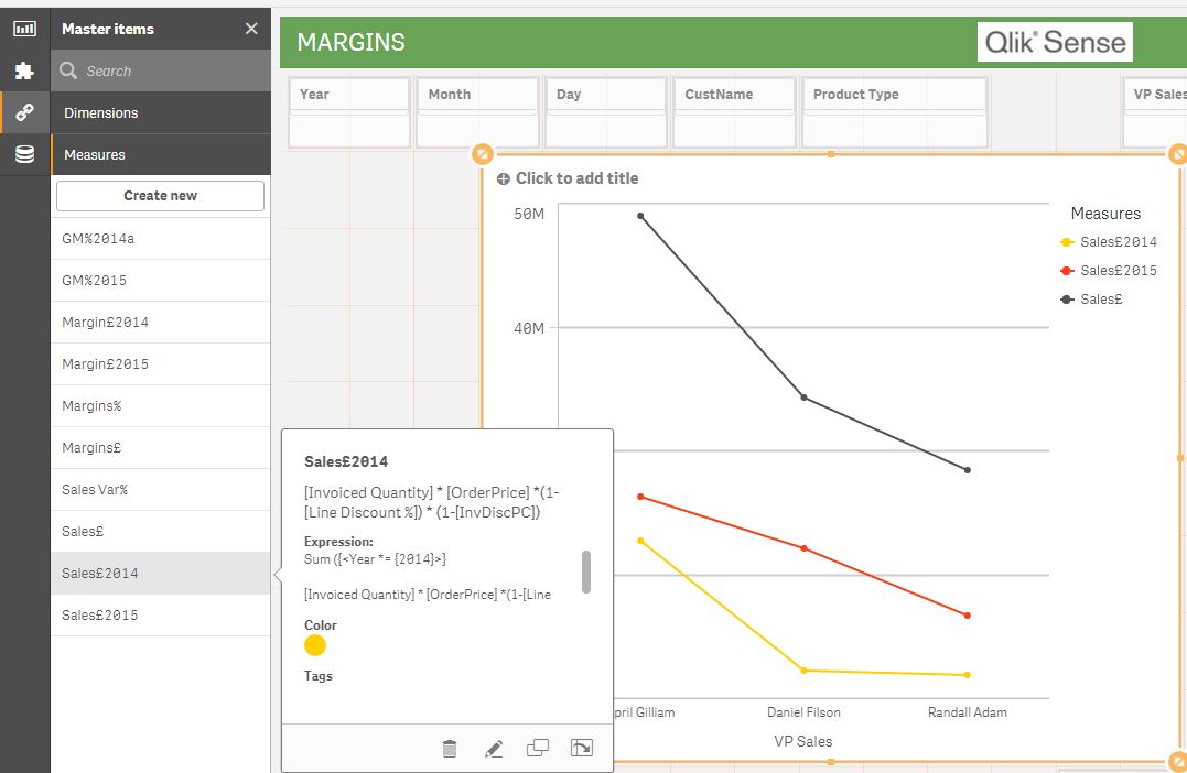
Cant you use the master measure color option (use master items / measures / choose the appropriate color)
Once this is set up the line will display the correct color when color is set to auto if the appropriate master measure is used
NB
- The color by expression will not work as this is based on the dimension not the expression.
- The color option for dimensions will be introduced in the next June 2017 release. But your issue is coloring a measure (I think). but it can only be achieved by using a master measure as described above
- Mark as New
- Bookmark
- Subscribe
- Mute
- Subscribe to RSS Feed
- Permalink
- Report Inappropriate Content
Thanks, Robert,
I'll have a look at the master color expression.
At the moment I have to say that I may end up sticking with the standard colors (or the modified mater color). The benefit of a color change is very slight - mainly pleasing my boss...
- Mark as New
- Bookmark
- Subscribe
- Mute
- Subscribe to RSS Feed
- Permalink
- Report Inappropriate Content
Hi Steve
This work.
- Mark as New
- Bookmark
- Subscribe
- Mute
- Subscribe to RSS Feed
- Permalink
- Report Inappropriate Content
Thanks, Robert, this looks useful.
Steve
- « Previous Replies
-
- 1
- 2
- Next Replies »