Unlock a world of possibilities! Login now and discover the exclusive benefits awaiting you.
- Qlik Community
- :
- Forums
- :
- Analytics
- :
- App Development
- :
- Re: Number format within a Chart
- Subscribe to RSS Feed
- Mark Topic as New
- Mark Topic as Read
- Float this Topic for Current User
- Bookmark
- Subscribe
- Mute
- Printer Friendly Page
- Mark as New
- Bookmark
- Subscribe
- Mute
- Subscribe to RSS Feed
- Permalink
- Report Inappropriate Content
Number format within a Chart
Shown is my set expression within a measure on a chart:
if(vMeasurement = 'Count',
Count({$<MI_Priority = {'Critical','High'},FY_Year = {'$(vFYYear)'}>}[Incident Number]),
Sum({$<MI_Priority = {'Critical','High'},FY_Year = {'$(vFYYear)'}>}[Duration])
)
By the if statement, I will either be displaying a number or a duration. How do I change the formatting of the number within the chart? I've tried using custom, and adding 'Interval' to the part of the expression with the sum of the duration, but I can't get it to work.
- « Previous Replies
-
- 1
- 2
- Next Replies »
- Mark as New
- Bookmark
- Subscribe
- Mute
- Subscribe to RSS Feed
- Permalink
- Report Inappropriate Content
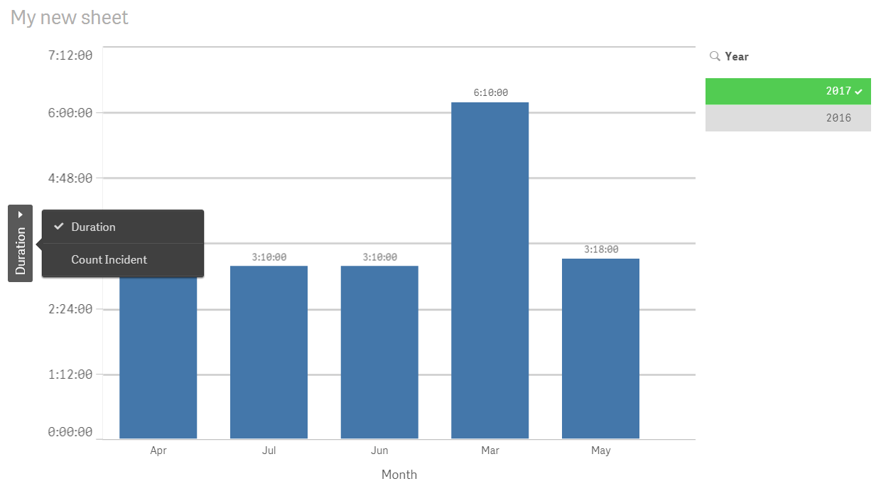
Actually --- this is what it looks like for the user. They can choose from the Measures they want to view on the Y axis.
- Mark as New
- Bookmark
- Subscribe
- Mute
- Subscribe to RSS Feed
- Permalink
- Report Inappropriate Content
Thank you for all the suggestions.
I thought within a chart, within a measure, when you select the "Number formatting" you can select custom, and then format the result accordingly. As an example:
If I'm counting the number of records, I want the display to be a number. ex: 7
If I'm summing the duration, I want the display to be a duration. ex: 05:25
What is being displayed within the chart will be controlled by a button which the user selects, either "Count" or "Duration." Please note, I do not want two charts. I'd like one chart, that toggles between "Count" and "Duration".
Both views are displayed below.

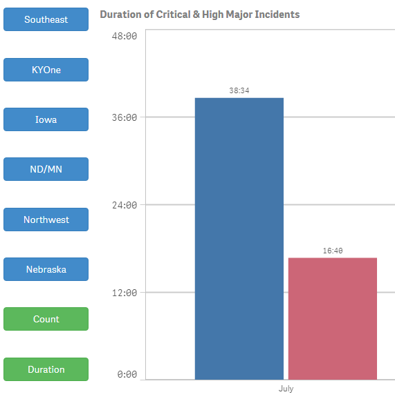
Hope this helps. In summary, if the user clicks on "Count", the first chart should be displayed. If the user clicks on "Duration", the second chart should be displayed.
Thanks for all your assistance!!
- Mark as New
- Bookmark
- Subscribe
- Mute
- Subscribe to RSS Feed
- Permalink
- Report Inappropriate Content
Ok - I get it. Did you look at the last image I sent? The user can essentially toggle on the measures by selecting that little carrot that shows on the Y axis. Then there is no need for 2 buttons 🙂
- Mark as New
- Bookmark
- Subscribe
- Mute
- Subscribe to RSS Feed
- Permalink
- Report Inappropriate Content
I'll try that, but I'd like to stay within my original thought.
Throughout my app, I make use of the buttons. I'm gaining new user acceptance by using those buttons, and I like the way they work.
I had read somewhere you can control what is being displayed within a chart by properly formatting the set expression. That's what I originally tried.
- Mark as New
- Bookmark
- Subscribe
- Mute
- Subscribe to RSS Feed
- Permalink
- Report Inappropriate Content
I will give that a try and post it - I haven't used that so it will be a good exercise for me 
- Mark as New
- Bookmark
- Subscribe
- Mute
- Subscribe to RSS Feed
- Permalink
- Report Inappropriate Content
I've been doing some additional testing.
If I have the measure formatted as 'Auto', and have this set expression,
Interval(Sum({$<MI_Priority = {'Critical','High'},FY_Year = {'$(vFYYear)'},$(vDivision) = {'Yes'}>}[Duration]),'h:mm')
the display is correctly formatted as 'hh:mm'
But, once I put that statement within an IF statement,
if(vMeasurement = 'Count',
Count({$<MI_Priority = {'Critical','High'},FY_Year = {'$(vFYYear)'},$(vDivision) = {'Yes'}>}[Incident Number]),
Interval(Sum({$<MI_Priority = {'Critical','High'},FY_Year = {'$(vFYYear)'},$(vDivision) = {'Yes'}>}[Duration]),'h:mm')
)
it is incorrectly formatted as 'hh.#####'
- Mark as New
- Bookmark
- Subscribe
- Mute
- Subscribe to RSS Feed
- Permalink
- Report Inappropriate Content
Greg -
I think you need another right paren at the end of yours ---
Try this:
If(vMeasurement = 'Count',
Count({$<MI_Priority = {'Critical','High'},FY_Year = {'$(vFYYear)'},$(vDivision) = {'Yes'}>}[Incident Number]),
If vMeasurement = 'Duration', Interval(Sum({$<MI_Priority = {'Critical','High'},FY_Year = {'$(vFYYear)'},$(vDivision) = {'Yes'}>}[Duration]),'h:mm')))
If you don't want to do that format --- then you at least need an additional parenthesis on yours.
if(vMeasurement = 'Count',
Count({$<MI_Priority = {'Critical','High'},FY_Year = {'$(vFYYear)'},$(vDivision) = {'Yes'}>}[Incident Number]),
Interval(Sum({$<MI_Priority = {'Critical','High'},FY_Year = {'$(vFYYear)'},$(vDivision) = {'Yes'}>}[Duration]),'h:mm')
))
- Mark as New
- Bookmark
- Subscribe
- Mute
- Subscribe to RSS Feed
- Permalink
- Report Inappropriate Content
Thanks, but no doesn't work. You 1 to many ')'.
I've read a lot of posts regarding the formatting of data that is within an 'IF' statement. But nothing to do with a duration.
- Mark as New
- Bookmark
- Subscribe
- Mute
- Subscribe to RSS Feed
- Permalink
- Report Inappropriate Content
Since I'm new too - I was wondering how you were creating your buttons in QS. Did you use the extension qsVariable?
If you haven't checked this -- check it out.
Cycle dimensions using a variable button or dropdown
- Mark as New
- Bookmark
- Subscribe
- Mute
- Subscribe to RSS Feed
- Permalink
- Report Inappropriate Content
The buttons I've displayed up above were created using and extension named 'Sheet Navigation & Actions.' I believe my co-worker located it. It provides great flexibility in design and usability. When we created this an app for an iPad, to worked out well.
- « Previous Replies
-
- 1
- 2
- Next Replies »