Unlock a world of possibilities! Login now and discover the exclusive benefits awaiting you.
- Qlik Community
- :
- Forums
- :
- Analytics
- :
- New to Qlik Analytics
- :
- Median value on x-axis
- Subscribe to RSS Feed
- Mark Topic as New
- Mark Topic as Read
- Float this Topic for Current User
- Bookmark
- Subscribe
- Mute
- Printer Friendly Page
- Mark as New
- Bookmark
- Subscribe
- Mute
- Subscribe to RSS Feed
- Permalink
- Report Inappropriate Content
Median value on x-axis
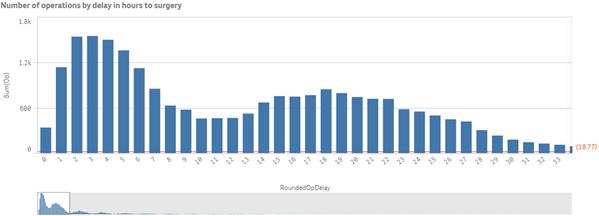
I have a bar chart (histogram, really) where the x-axis is a rounded number of hours (the delay in hours between admission to hospital and the start of surgery), and the y-axis is the number of cases.
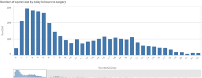
Is there a way to show a vertical line at the median number of hours?
RoundedOpDelay is a dimension, calculated on data load. However, I also have a separate numeric field called Delay(Hrs) to two decimal places if that works better.
Thanks,
Steve
- « Previous Replies
-
- 1
- 2
- Next Replies »
Accepted Solutions
- Mark as New
- Bookmark
- Subscribe
- Mute
- Subscribe to RSS Feed
- Permalink
- Report Inappropriate Content
Hadn't noticed that there is no X/Y option for the ref line (unlike that other product). What a disappointment.
You could color the bar closest to the median as a sort of workaround.
-Rob
- Mark as New
- Bookmark
- Subscribe
- Mute
- Subscribe to RSS Feed
- Permalink
- Report Inappropriate Content
you can try this Expression
median(TOTAL [Delay(Hrs)])
- Mark as New
- Bookmark
- Subscribe
- Mute
- Subscribe to RSS Feed
- Permalink
- Report Inappropriate Content
Thanks, Tim,
I have a KPI box that shows the median value as a number using your formula, and maybe I should be satisfied with that. It would be really impressive, though, to have a different-coloured vertical line on the chart.
To chart this as a second dimension I would need something to use as a Y-axis number, probably matching the maximum number of operations per RoundedOpDelay (or the chart range).
Any suggestions?
Thanks again,
Steve
- Mark as New
- Bookmark
- Subscribe
- Mute
- Subscribe to RSS Feed
- Permalink
- Report Inappropriate Content
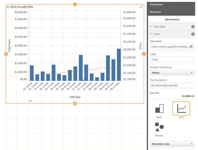
what about adding this expression median(TOTAL [Delay(Hrs)]) and display as line
the screenshot is only an example
regards
tim
- Mark as New
- Bookmark
- Subscribe
- Mute
- Subscribe to RSS Feed
- Permalink
- Report Inappropriate Content
Thanks, Tim,
If you were to group your Total Sales into, say, $500 blocks and chart them on the X-axis, you would be able to chart the number of times you hit each group of $500. Looking at your example, there would be a value of 1 for <$500, 6 for $1000, 3 for $1500, 4 for $2000, 0 for $2500, 2 for $3000, 0 for $3500 and 1 for $4000. (Be patient here; I'm sitting with a ruler pressed on the screen and people are laughing at me.)
Your data doesn't readily lend itself to my histogram, but this is the sort of thing I'm hoping for:
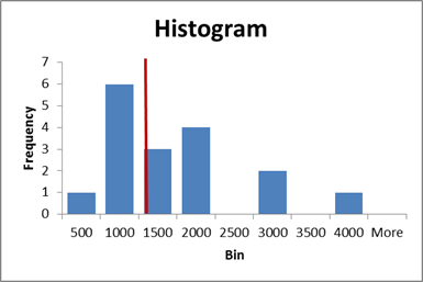
The columns represent the $500 groups; the value is a count of order dates, and the vertical red line represents the median order value.
On my bar chart at the top, the vertical red line would probably turn up at about 17 hours, as there's a long tail out to the right.
Thanks for your interest!
Steve
- Mark as New
- Bookmark
- Subscribe
- Mute
- Subscribe to RSS Feed
- Permalink
- Report Inappropriate Content
The Reference Line option for Bar Chart should be available under Add-ons, Reference Lines.
-Rob
- Mark as New
- Bookmark
- Subscribe
- Mute
- Subscribe to RSS Feed
- Permalink
- Report Inappropriate Content
Thanks Rob,
I can add the median value as a reference line, but it plots against the Y-axis as a horizontal line, rather than on the x axis, vertically.
Thanks for your help!
Steve
- Mark as New
- Bookmark
- Subscribe
- Mute
- Subscribe to RSS Feed
- Permalink
- Report Inappropriate Content
Hadn't noticed that there is no X/Y option for the ref line (unlike that other product). What a disappointment.
You could color the bar closest to the median as a sort of workaround.
-Rob
- Mark as New
- Bookmark
- Subscribe
- Mute
- Subscribe to RSS Feed
- Permalink
- Report Inappropriate Content
Hi,
In case anybody is looking for this answer - seems unlikely - here's what I did:

I used color by expression, using this:
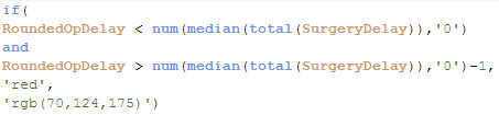
I had hoped to find the RGB value for the standard colors but in the end I used a color picker and found the closest I could.
Thanks for the suggestion, Rob.
Steve
- Mark as New
- Bookmark
- Subscribe
- Mute
- Subscribe to RSS Feed
- Permalink
- Report Inappropriate Content
To use a color from the standard palette, you can use the color(n) function. e.g. "color(2)" for the red color. These are slightly less saturated versions than the auto colors, but at least you get consistency.
-Rob
- « Previous Replies
-
- 1
- 2
- Next Replies »