Unlock a world of possibilities! Login now and discover the exclusive benefits awaiting you.
- Qlik Community
- :
- Forums
- :
- Analytics
- :
- App Development
- :
- Re: Top 10 year analysis
- Subscribe to RSS Feed
- Mark Topic as New
- Mark Topic as Read
- Float this Topic for Current User
- Bookmark
- Subscribe
- Mute
- Printer Friendly Page
- Mark as New
- Bookmark
- Subscribe
- Mute
- Subscribe to RSS Feed
- Permalink
- Report Inappropriate Content
Top 10 year analysis
All - I am trying to get a conceptual grasp of what I think is a set analysis question. I have a sample data set I'm using (baby name frequencies by year from the US Social Security Administration). The data is very simple:
| Name | Gender | Frequency | Year |
|---|---|---|---|
| Mary | F | 10987 | 2016 |
| Richard | M | 11321 | 2016 |
| Mary | F | 9123 | 2015 |
| Richard | M | 10873 | 2015 |
| Tom | M | 7643 | 2014 |
| etc | etc | etc | etc |
What I'd like to accomplish is to allow the user to select a year and a gender, find the top 10 baby names for that given year by frequency (or the max of the years if they happen to select multiple years), then display a line chart for those 10 names to show how the frequency has changed for them for the past 10 years.
As you can probably guess, I've failed up until this point. If this type of question is answered elsewhere, please feel free to redirect me.
I've created a measure to try and capture the male names between a certain date range:
Num(Sum({$<[Gender] = {'M'}, [Year]={">$(=Max(Year)-10) <=$(=Max([Year]))"} >}Frequency),'#,##0')
I created a line chart and restricted the names to the top 10. I picked 2015 as a year anddid not get the intended results so I changed it to a pivot and see:
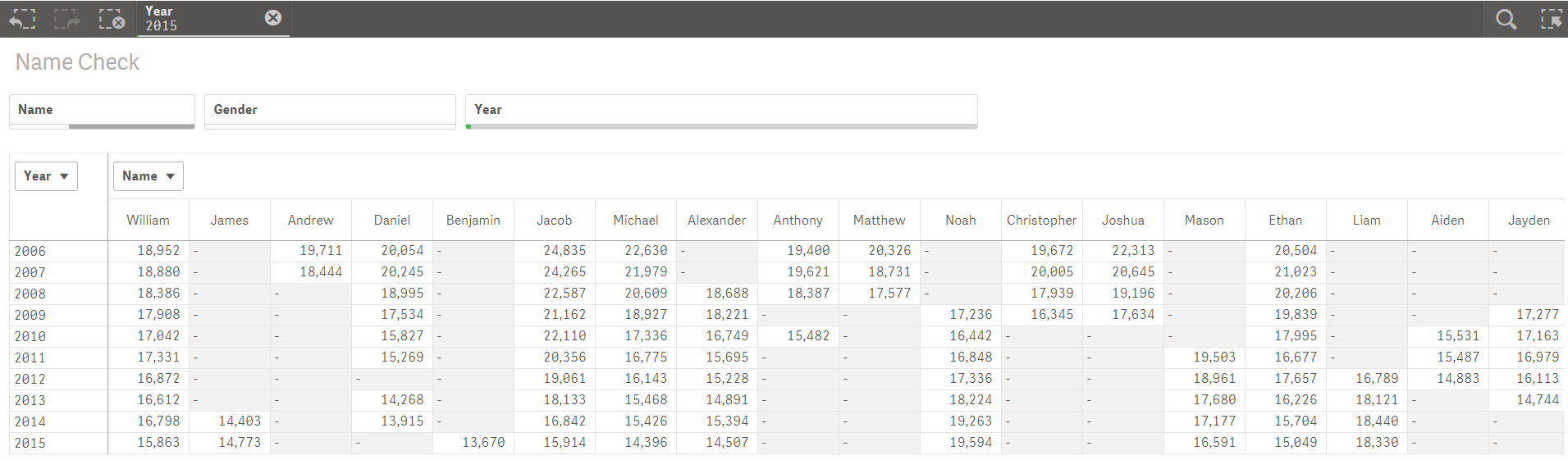
It is not quite where I'm headed. I'd like to find the top 10 names from 2015 (the year selected) and show only those 10 trended over the past 10 years. I've got the 10 years part correct but not the grouping logic.
Any help or direction is appreciated. QVF file is attached.
- Tags:
- 'set analysis'
Accepted Solutions
- Mark as New
- Bookmark
- Subscribe
- Mute
- Subscribe to RSS Feed
- Permalink
- Report Inappropriate Content
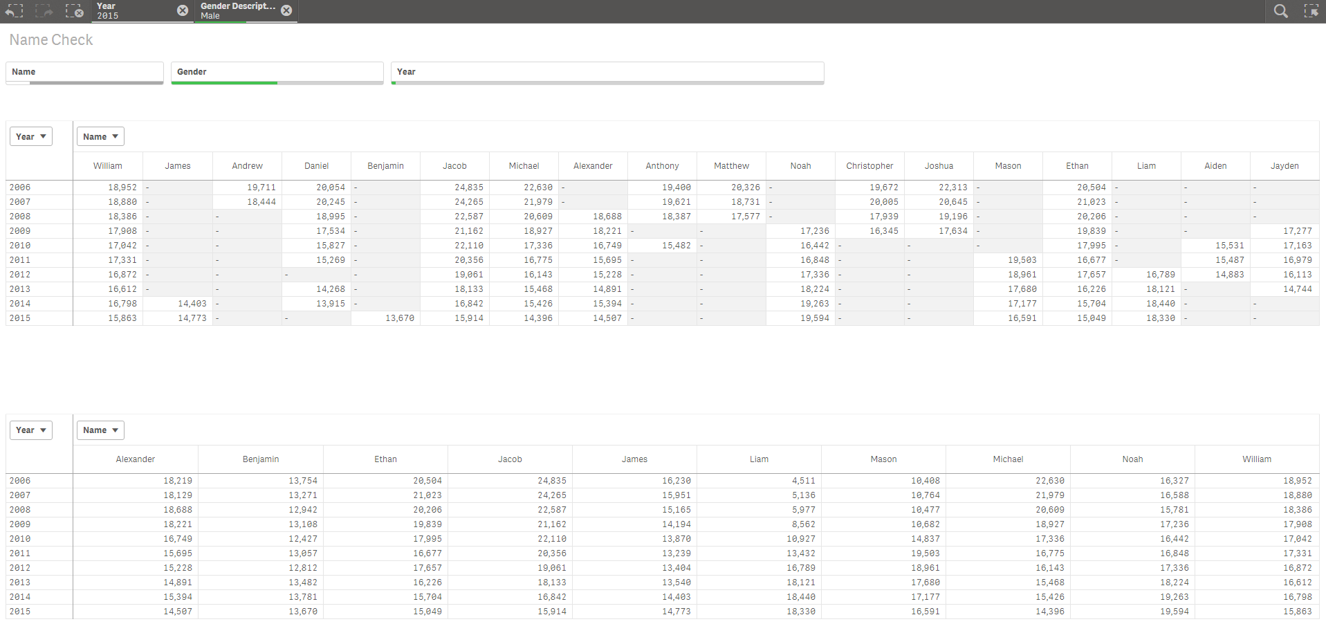
Try this
num(Sum({<Name = {"=Num(Rank(Sum(Frequency))) < 11"}, [Year]={">$(=Max(Year)-10) <=$(=Max([Year]))"}>}Frequency),'#,##0')
- Mark as New
- Bookmark
- Subscribe
- Mute
- Subscribe to RSS Feed
- Permalink
- Report Inappropriate Content
Try this
num(Sum({<Name = {"=Num(Rank(Sum(Frequency))) < 11"}, [Year]={">$(=Max(Year)-10) <=$(=Max([Year]))"}>}Frequency),'#,##0')
- Mark as New
- Bookmark
- Subscribe
- Mute
- Subscribe to RSS Feed
- Permalink
- Report Inappropriate Content
Brilliant - thank you Sunny!